Lecture 08: Data Visualization: Introduction
ggplot2 package
2025-02-05
A ggplot2 example
 Source code: here
- Start by giving data to
ggplot:
- Start by giving data to
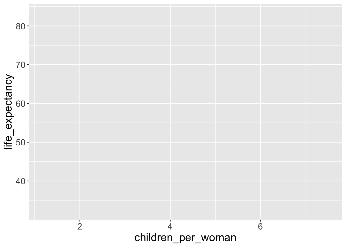
1ggplot(data = gapminder2010)- 1
-
We replace
<data.frame>with the object name of the target data frame

That “worked” (as in, we didn’t get an error). But because we didn’t give ggplot() any variables/columns to be mapped to aesthetic components of the graph, we just got an empty square or a blank canvas.
- For mappping columns to aesthetics, we use the
aes()function:
- For mappping columns to aesthetics, we use the
ggplot(data = gapminder2010,
2       mapping = aes(x = children_per_woman,
y = life_expectancy)) - 2
-
We replaced
<column of the data.frame>with the unquoted column name
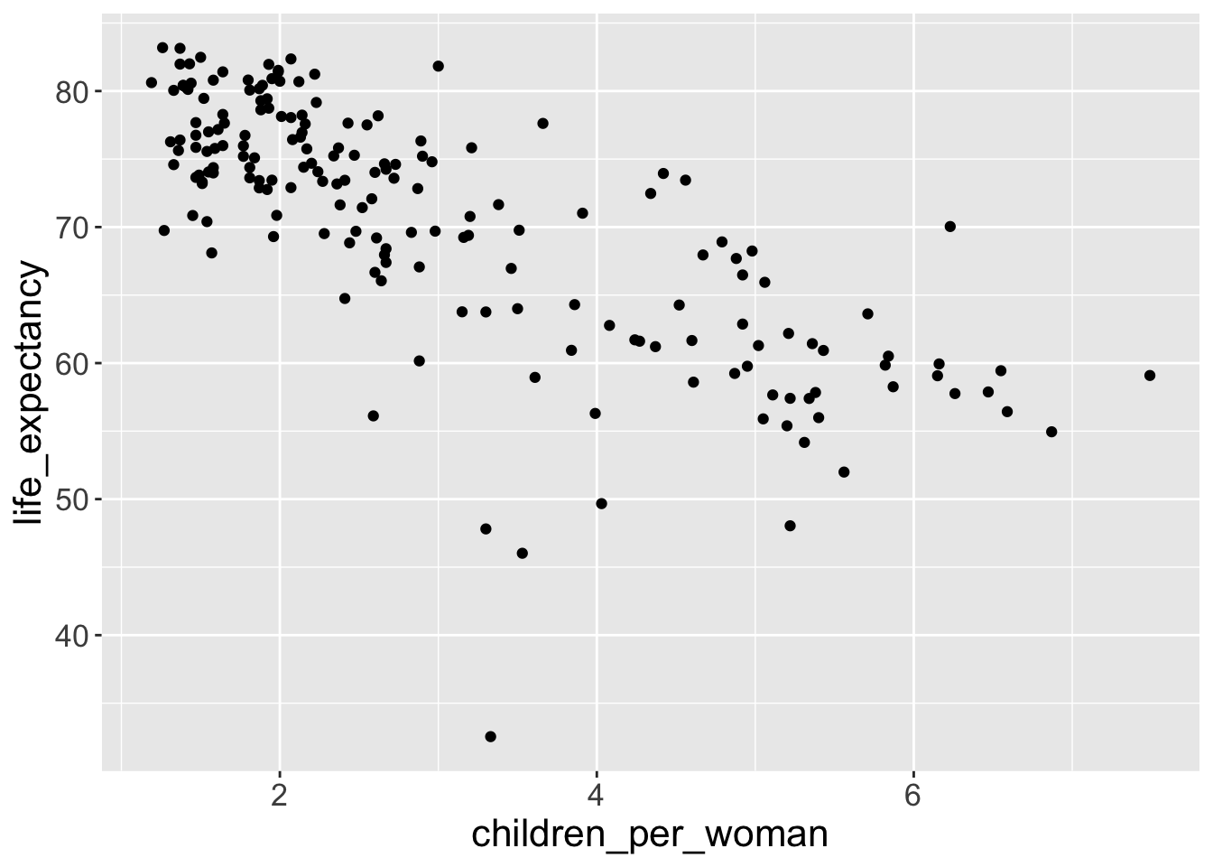
That’s better, now we have x-axis and y-axis, which correspond to faimily size (column name: children_per_woman) and life expectancy (column name: life_expectancy).
Notice how ggplot() defines the axis based on the range of data given. But it’s still not a very interesting graph, because we didn’t tell what it is we want to draw on the graph.
- This is done by adding (literally
+) geometries to our graph. For example, scatterplot use the “point” to represent data:
- This is done by adding (literally
- 3
-
+add up a new layer onto the old layers - 4
-
We replace
geom_<type of geometry>()withgeom_point()
Important
Notice how geom_point() warns you that it had to remove some missing values (if the data is missing for at least one of the variables, then it cannot plot the points).
Exercise-01: geometry of missingness
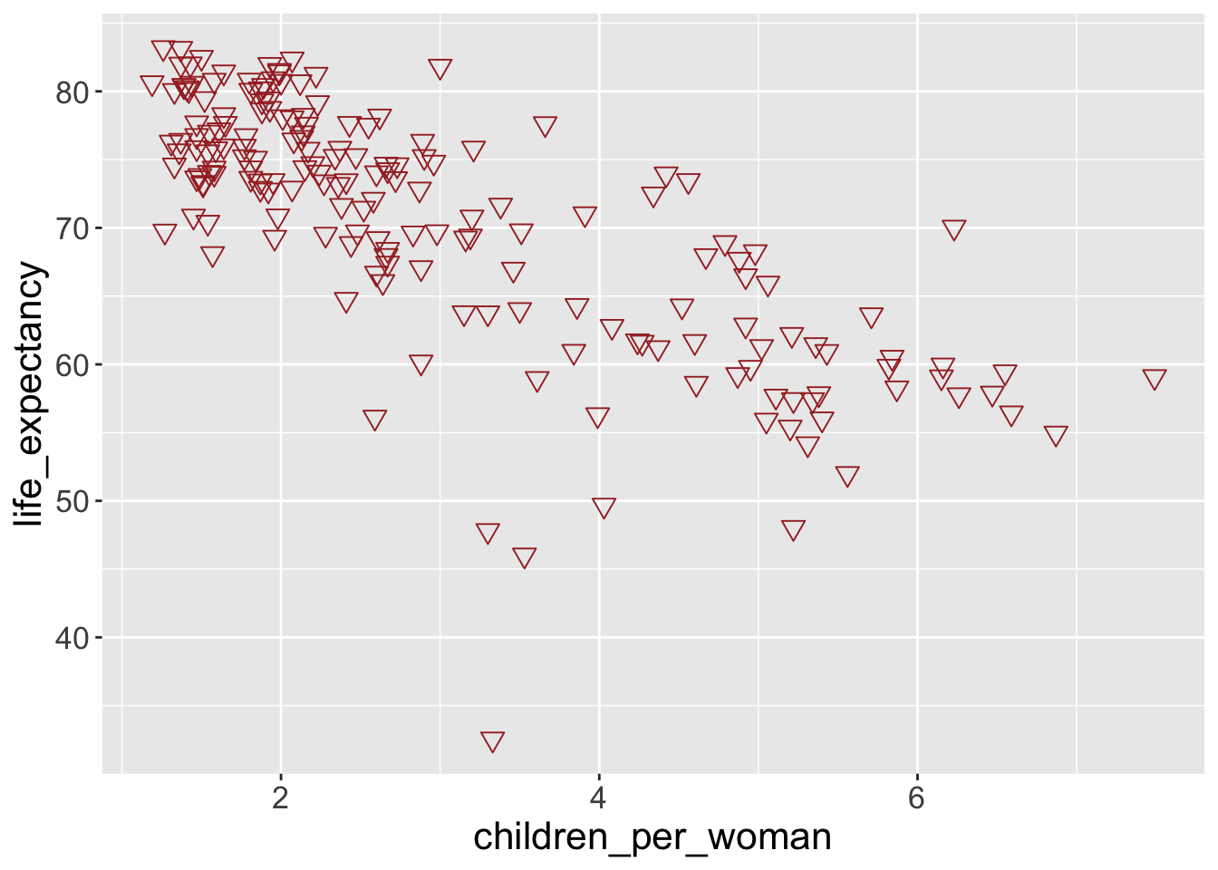
Aim: It would be useful to explore the pattern of missing data in these two variables. The naniar package provides a ggplot geometry that allows us to do this, by replacing NA values with values 10% lower than the minimum in the variable.
Try and modify the previous graph, using the geom_miss_point() from this package. (hint: don’t forget to load the package first using library(naniar))
Questions: What can you conclude from this exploration? Are the data missing at random?
To open a “Install Packages” window below, press and then search “Install” in the dropdown menu.
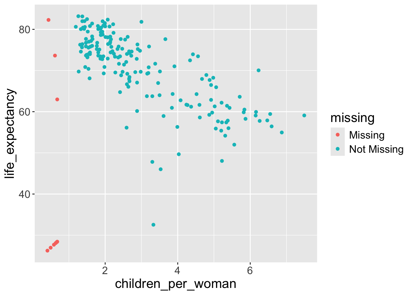
- The data do not seem to be missing at random (MAR):
- it seems to be the case that when data is missing for one variable it is often also missing for the other.
- And there seem to be more missing data for
children_per_womanthanlife_expectancy. - However, we only have 9 cases with missing data, so perhaps we should not make very strong conclusions from this. But it gives us more questions that we could follow up on: are the countries with missing data generaly lacking other statistics? Is it harder to obtain data for fertility than for life expectancy?
A (not full) list of geometries in ggplot2
Here is a list of some frequently used geometries1:
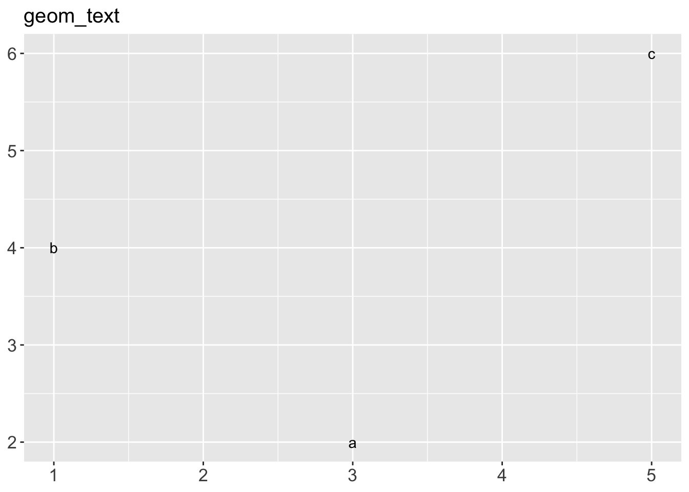
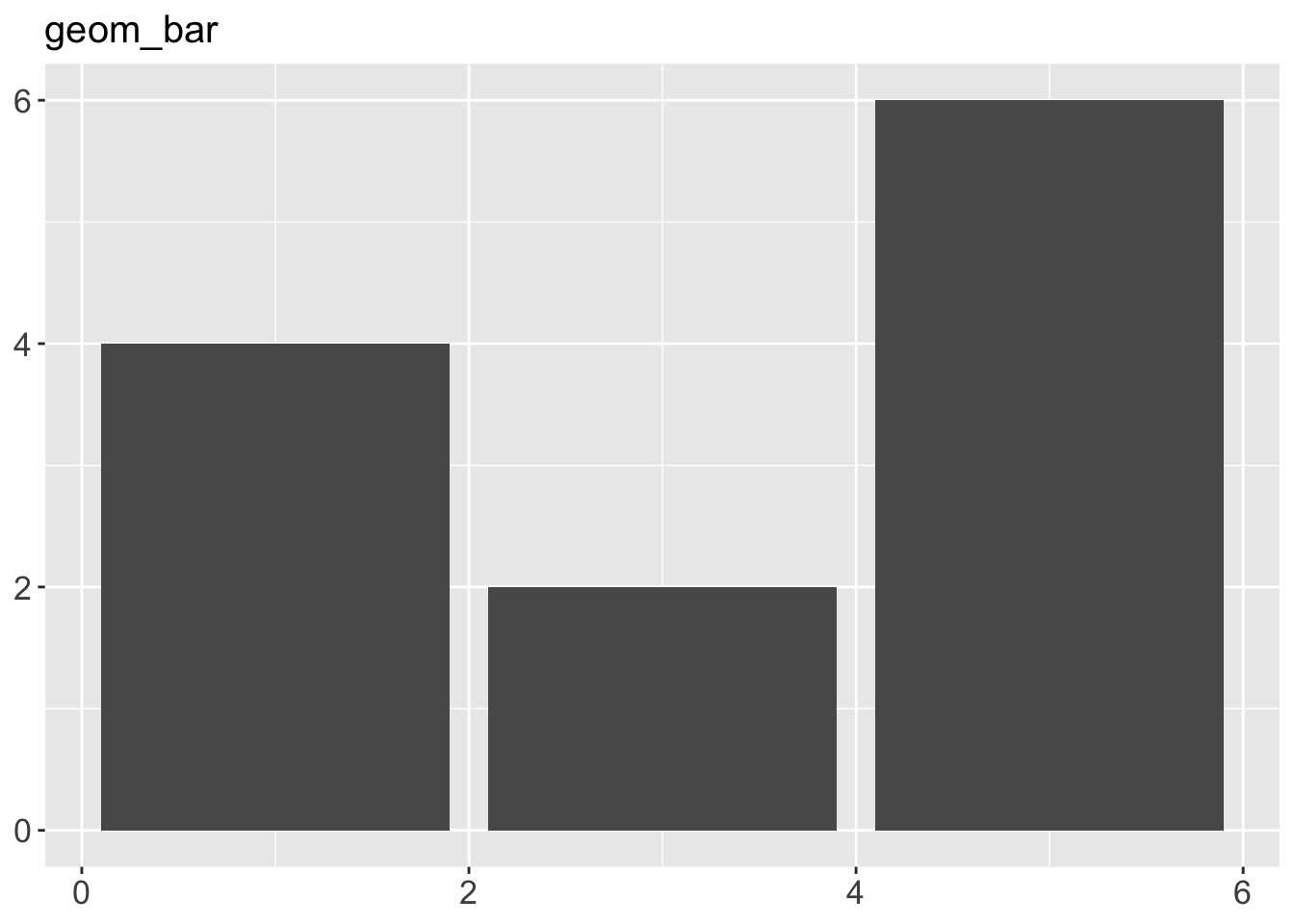
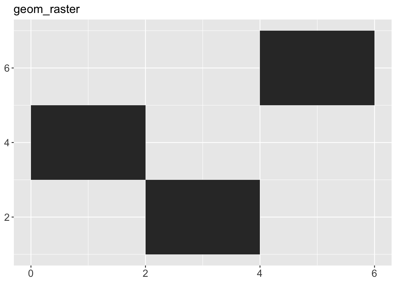
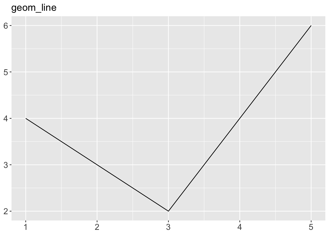
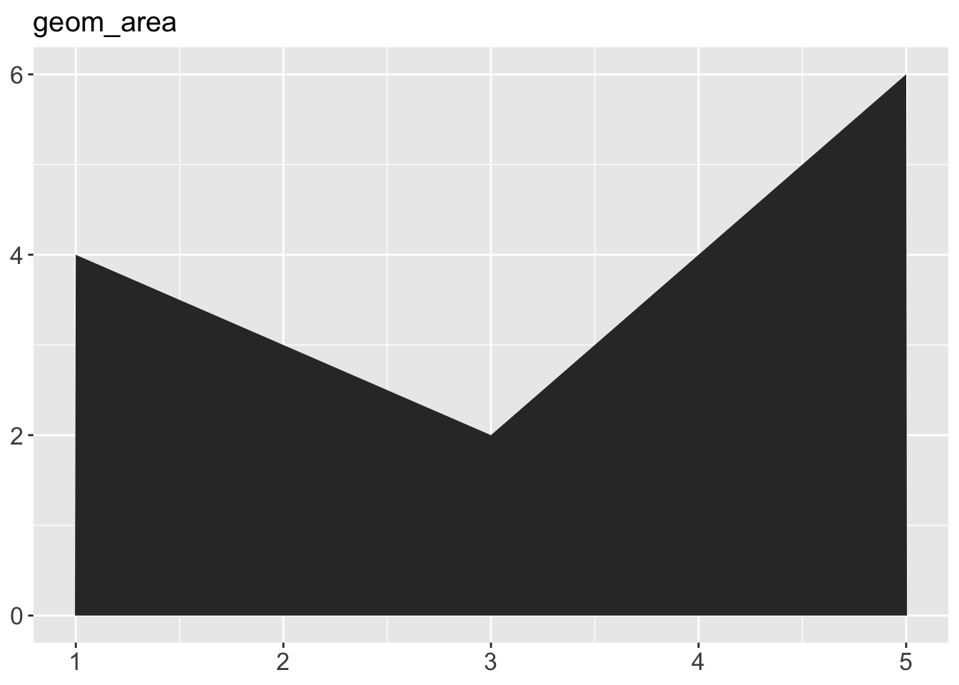
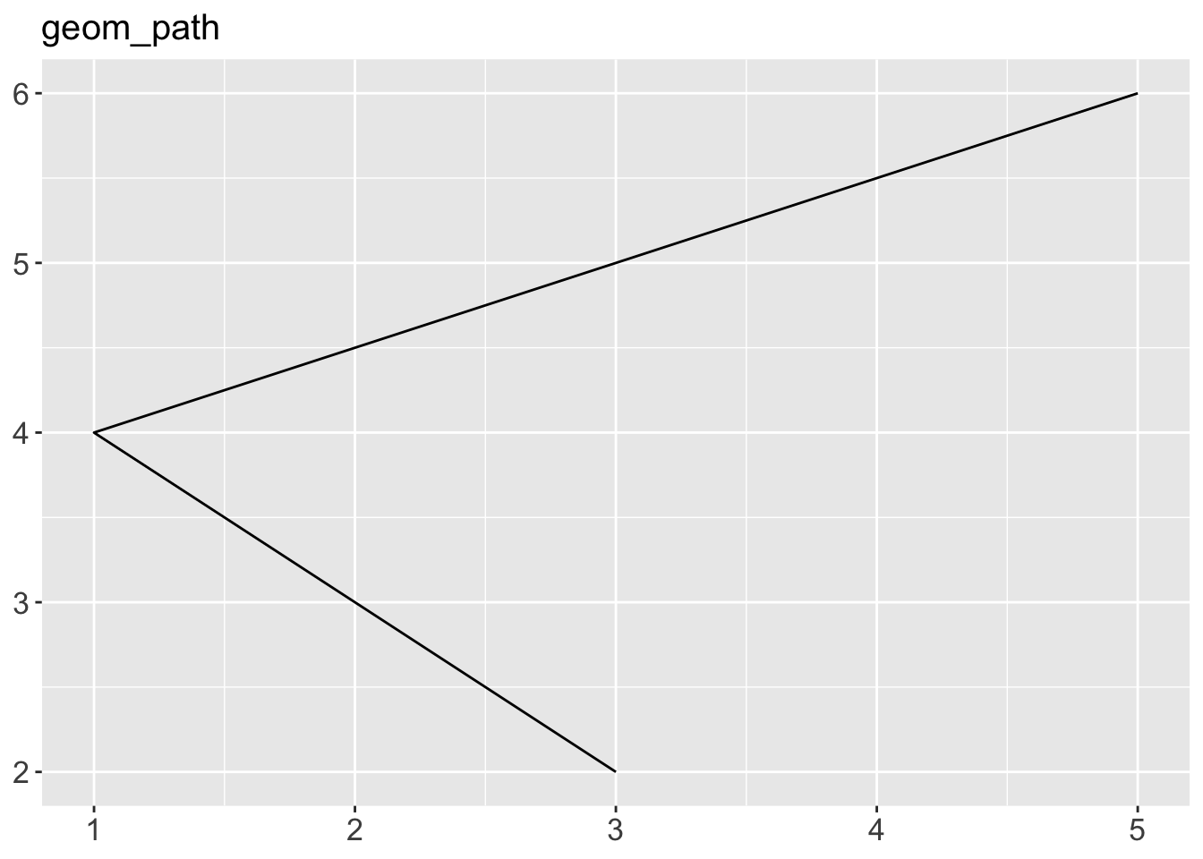
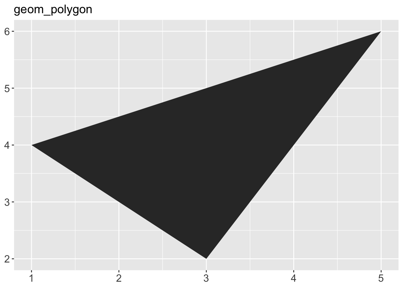
geom_area()draws an area plot, which is a line plot filled to the y-axis (filled lines). Multiple groups will be stacked on top of each other.geom_bar(stat = "identity")makes a bar chart. We need stat = “identity” because the default stat automatically counts values (so is essentially a 1d geom, see Section 5.4). The identity stat leaves the data unchanged. Multiple bars in the same location will be stacked on top of one another.geom_line()makes a line plot. The group aesthetic determines which observations are connected; see Chapter 4 for more detail. geom_line() connects points from left to right; geom_path() is similar but connects points in the order they appear in the data. Both geom_line() and geom_path() also understand the aesthetic linetype, which maps a categorical variable to solid, dotted and dashed lines.geom_point()produces a scatterplot. geom_point() also understands the shape aesthetic.geom_polygon()draws polygons, which are filled paths. Each vertex of the polygon requires a separate row in the data. It is often useful to merge a data frame of polygon coordinates with the data just prior to plotting. Chapter 6 illustrates this concept in more detail for map data.geom_rect(),geom_tile()andgeom_raster()draw rectangles.geom_rect()is parameterised by the four corners of the rectangle, xmin, ymin, xmax and ymax.geom_tile()is exactly the same, but parameterised by the center of the rect and its size, x, y, width and height.geom_raster()is a fast special case ofgeom_tile()used when all the tiles are the same size. .geom_text()adds text to a plot. It requires a label aesthetic that provides the text to display, and has a number of parameters (angle, family, fontface, hjust and vjust) that control the appearance of the text.
Code
df <- data.frame(
  x = c(3, 1, 5),
  y = c(2, 4, 6),
  label = c("a","b","c")
)
p <- ggplot(df, aes(x, y, label = label)) +
  labs(x = NULL, y = NULL) + # Hide axis label
  theme(plot.title = element_text(size = 15)) # Shrink plot title
p + geom_point() + ggtitle("geom_point")
p + geom_text() + ggtitle("geom_text")
p + geom_bar(stat = "identity") + ggtitle("geom_bar")
p + geom_tile() + ggtitle("geom_raster")
p + geom_line() + ggtitle("geom_line")
p + geom_area() + ggtitle("geom_area")
p + geom_path() + ggtitle("geom_path")
p + geom_polygon() + ggtitle("geom_polygon")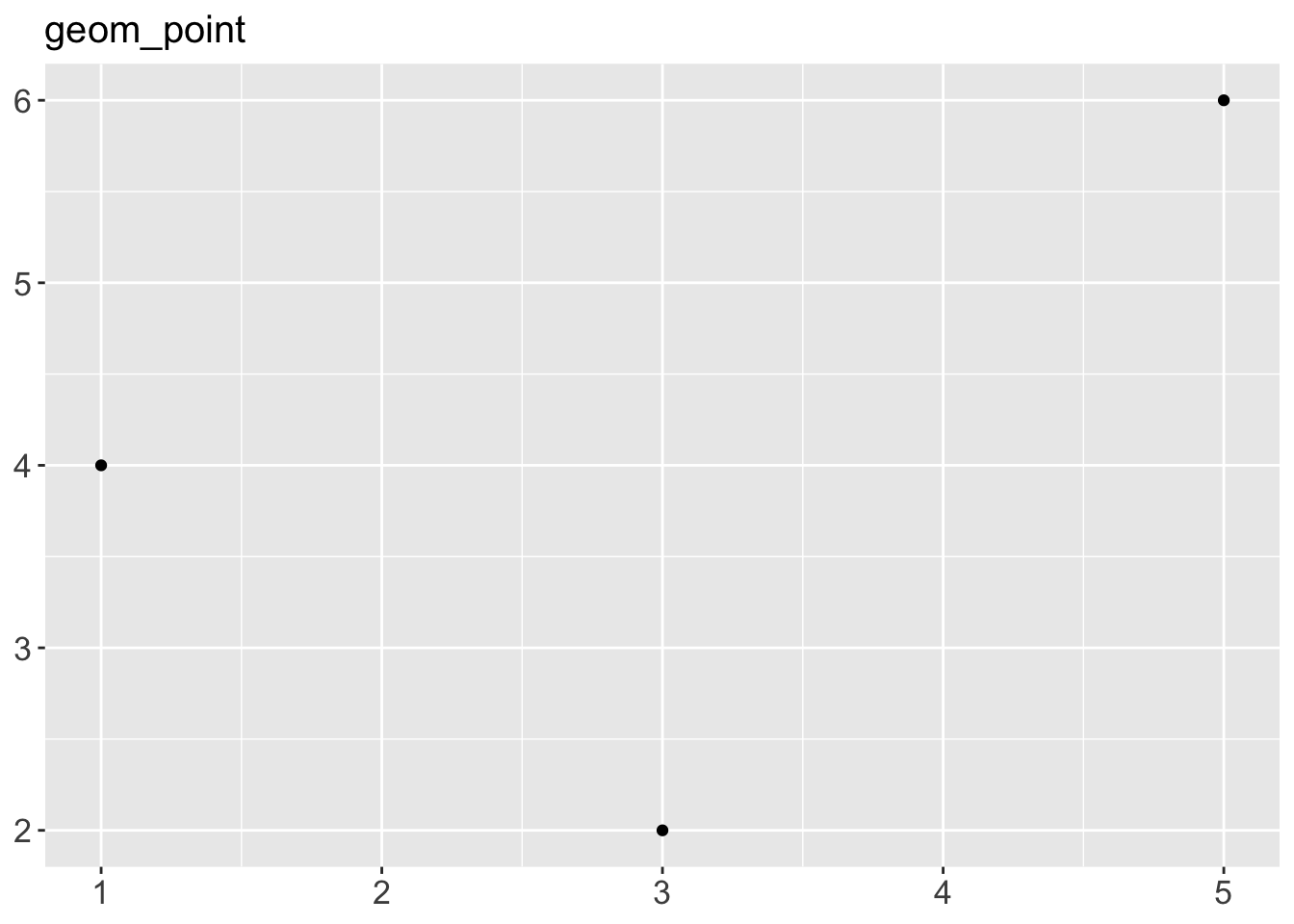
- For example, we can change the transparency of the points in our scatterplot using
alphaargument ingeom_point()(alphavaries between 0-1 with zero being transparent and 1 being opaque):
ggplot(data = gapminder2010,
       mapping = aes(x = children_per_woman,
                     y = life_expectancy)) +
4 geom_point(alpha = 0.5)- 4
-
Arguments in
geom_point()adjusts the characteristics of points

Adding transparency to points is useful when data is very packed, as you can then see which areas of the graph are more densely occupied with points.
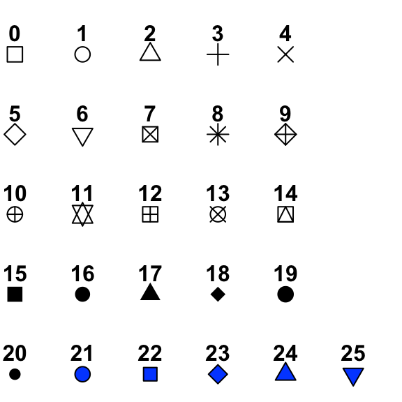
Exercise-02
Aim: Try changing the size, shape and color of the points (hint: web search “ggplot2 point shapes” to see how to make a triangle)
You can find out R colors’ name using colors() functions. Below is the index for point shapes.
Changing aesthetics based on data
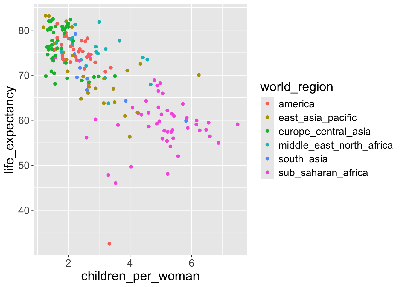
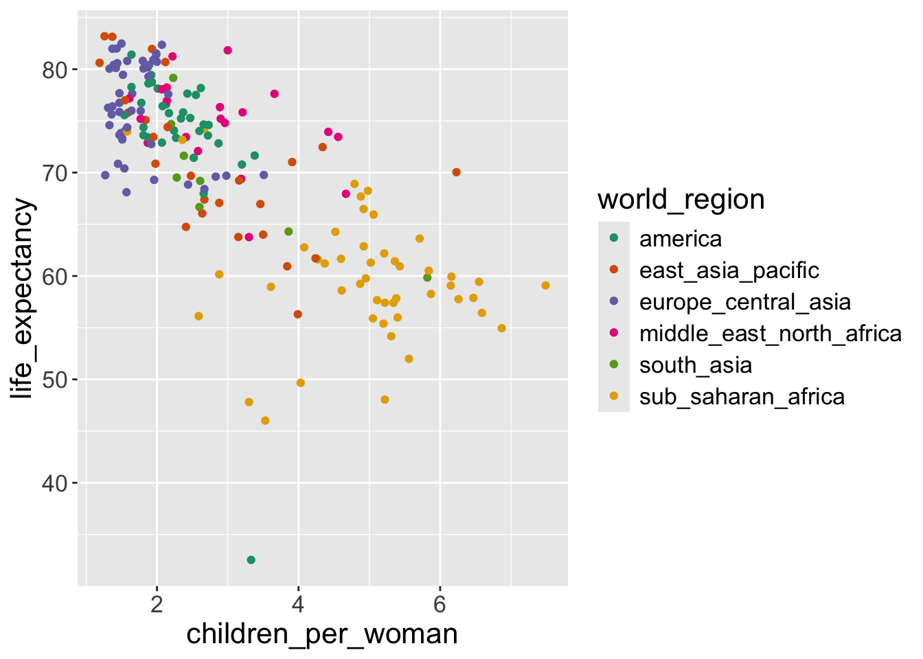
In the above exercise we changed the color of the points by defining it ourselves. However, it would be better if we colored the points based on a variable of interest.
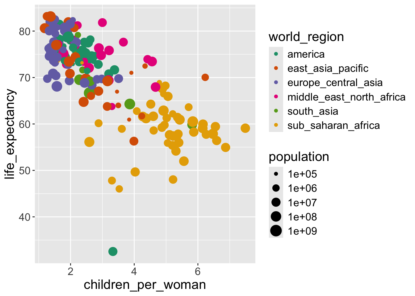
For example, to explore our question of how different world regions really are, we want to color the countries in our graph accordingly.
We can do this by passing this information to the color aesthetic inside the aes() function:

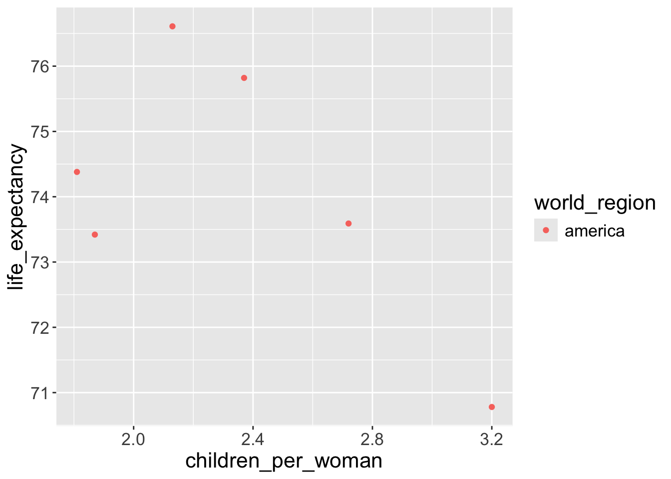
- We changed the points’ color based on their world regions.
For example, if we look at the points with red color, when world_region == america, geom_point() function maps the point’s color as red and x-axis as value of children_per_woman and y-axis as the value of life_expectancy :
| children_per_woman | life_expectancy | world_region | color |
|---|---|---|---|
| 2.37 | 75.82 | america | red |
| 2.13 | 76.61 | america | red |
| 1.87 | 73.42 | america | red |
| 2.72 | 73.59 | america | red |
| 3.20 | 70.78 | america | red |
| 1.81 | 74.38 | america | red |
Aesthetics: inside or outside aes()?
The previous examples illustrate an important distinction between aesthetics defined inside or outside of
aes():- if you want the aesthetic to change based on the data it goes inside
aes()
- if you want the aesthetic to change based on the data it goes inside
ggplot(gapminder2010) +
  geom_point(aes(x = children_per_woman,
                 y = life_expectancy,
1 color = world_region))- 1
- Each world region will has different colors
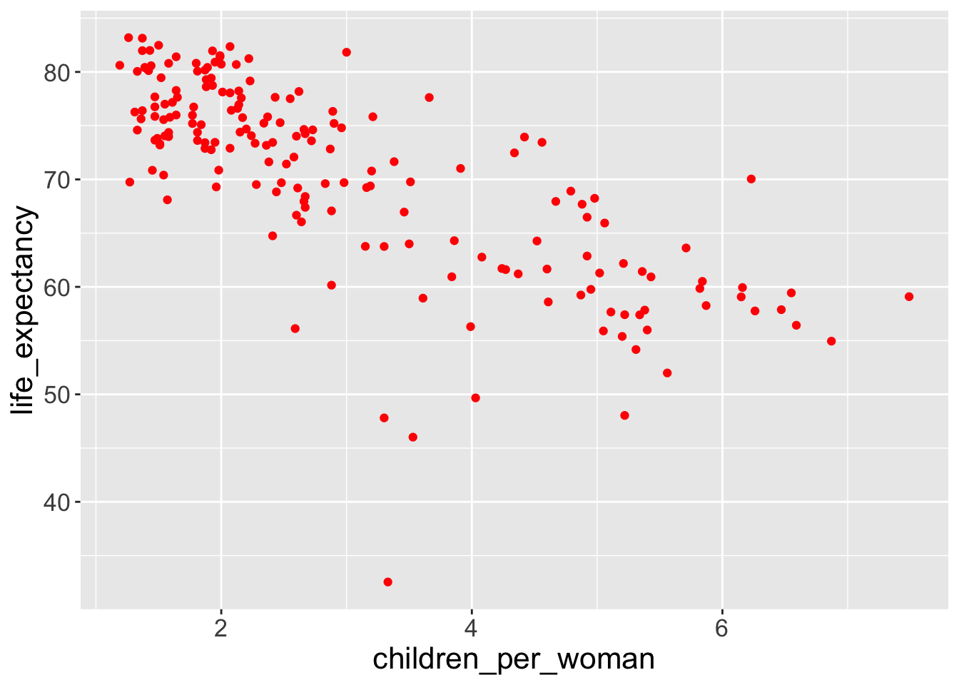
ggplot(gapminder2010) +
  geom_point(aes(x = children_per_woman,
                 y = life_expectancy),
2 color = "red")- 2
- All points will have same color - red
Exercise-03
Question 1: What’s gone wrong with this code? Why are the points not blue?
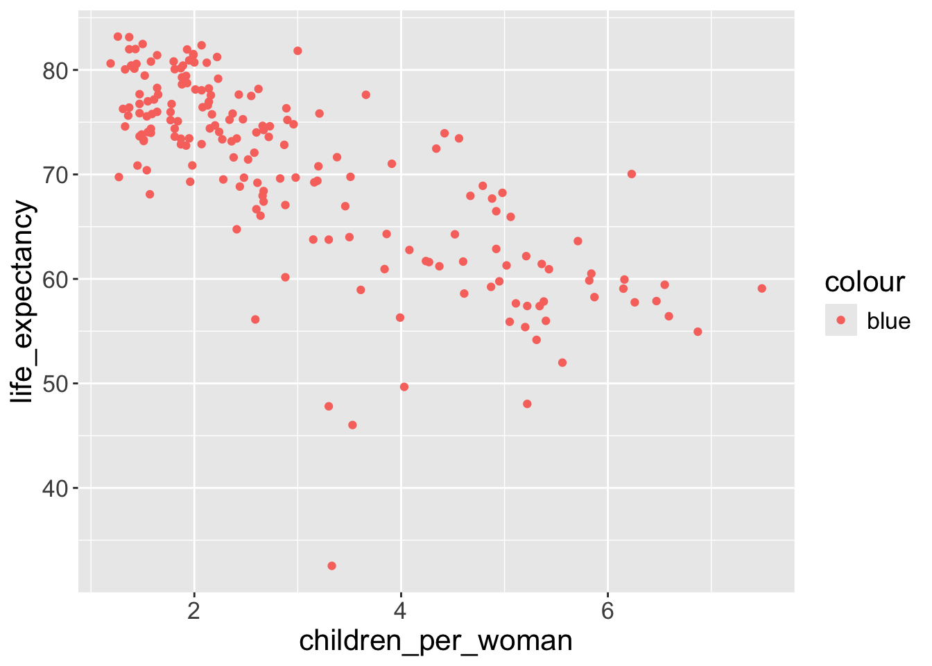
The argument colour = "blue" is included within the mapping argument, and as such, it is treated as an aesthetic, which is a mapping between a variable and a value. In the expression, colour = "blue", “blue” is interpreted as a categorical variable which only takes a single value “blue”. If this is confusing, consider how colour = 1:234 and colour = 1 are interpreted by aes().
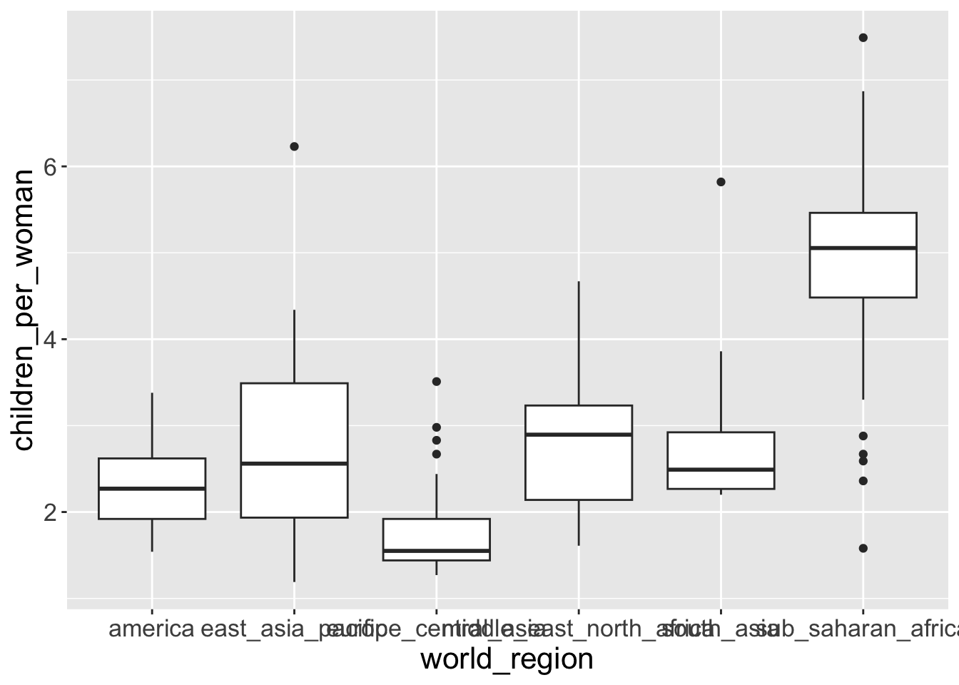
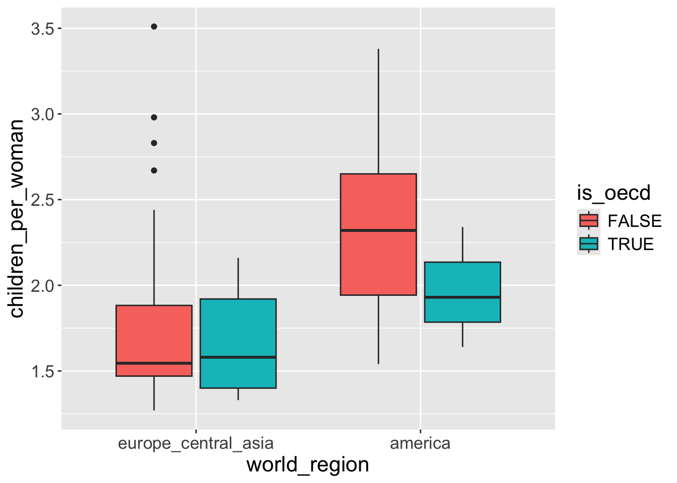
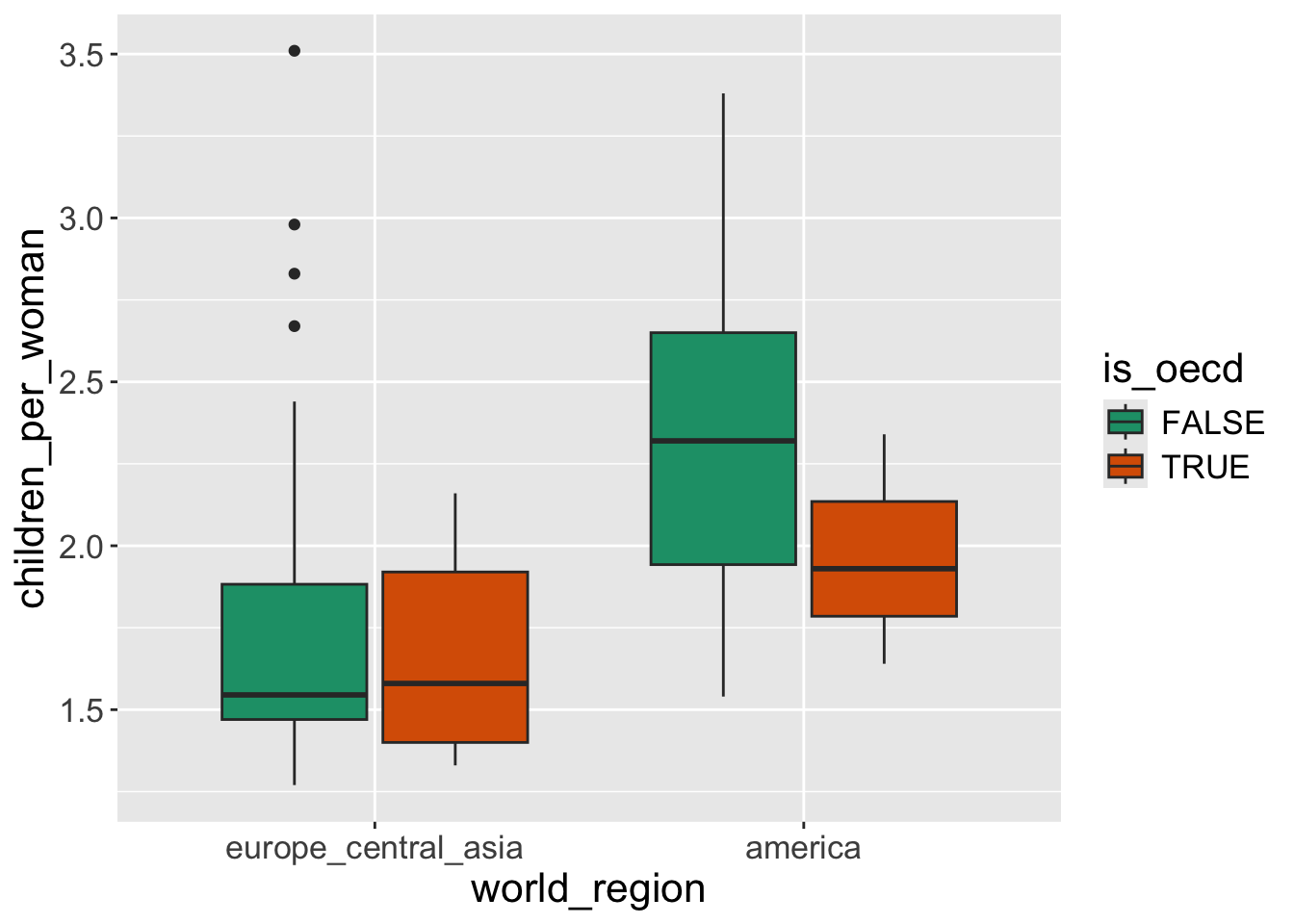
Question 2: Make a boxplot that shows the distribution of children_per_woman (y-axis) for each world_region (x-axis). (Hint: using geom_boxplot())
Bonus: Color the inside of the boxplots by income_groups.
- To color the inside of the boxplot we use the fill geometry.
ggplot2will automatically split the data into groups and make a boxplot for each.
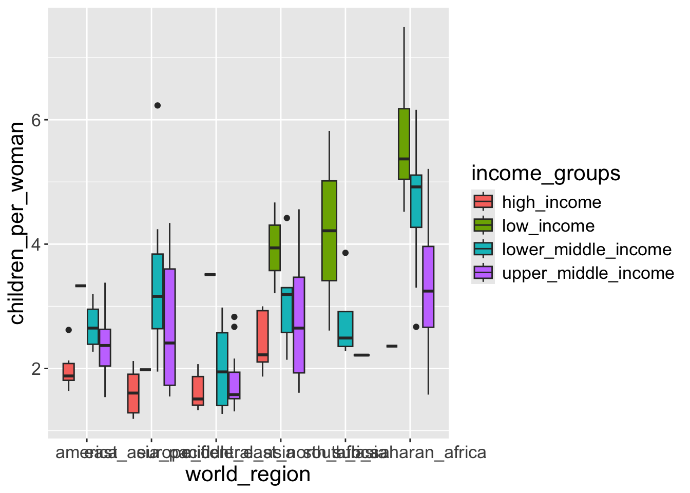
Some groups have too few observations (possibly only 1) and so we get odd boxplots with only a line representing the median, because there isn’t enough variation in the data to have distinct quartiles.
Also, the labels on the x-axis are all overlapping each other. We will see how to solve this later.
Multiple Geometries
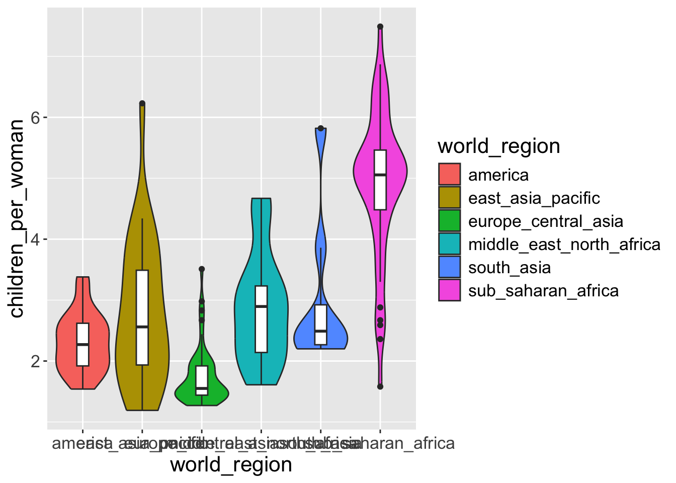
Often, we may want to overlay several geometries on top of each other. For example, add a violin plot together with a boxplot so that we get both representations of the data in a single graph.
- Let’s start by making a violin plot:
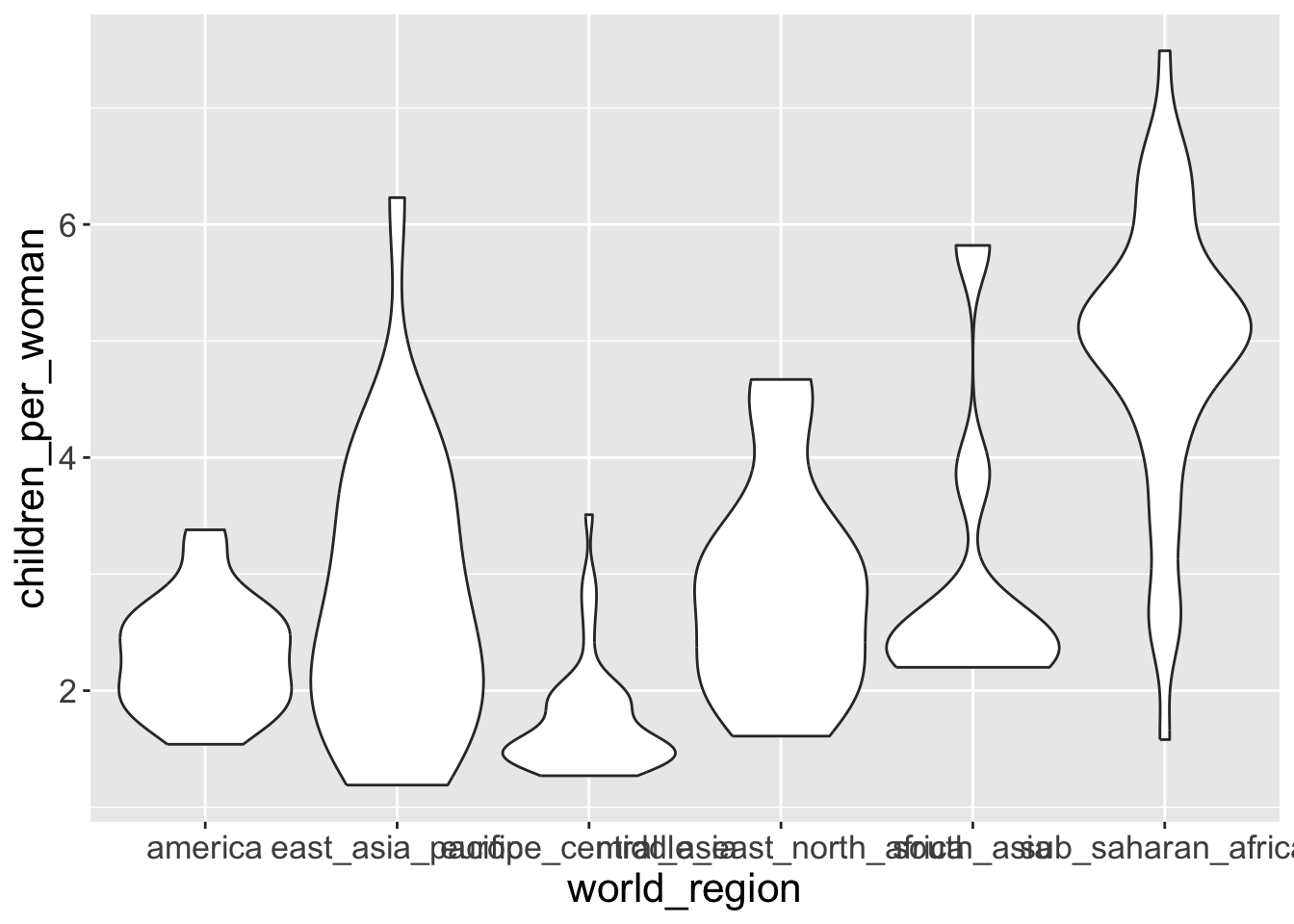
The shape represents the density estimate of the variable: the more data points in a specific range, the larger the violin is for that range.
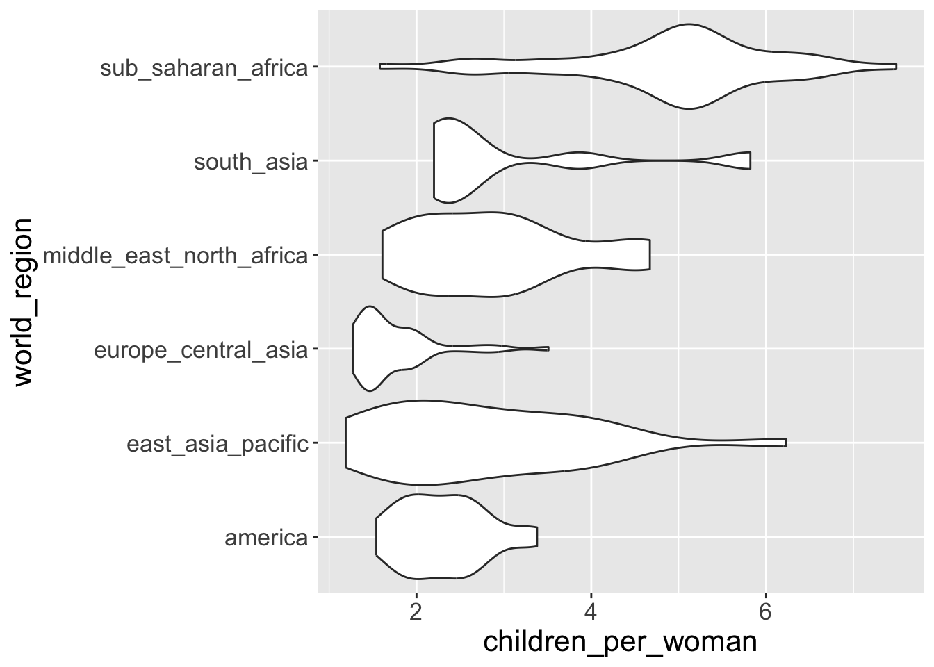
- We can flip x-axis and y-axis using
coord_flip(), meaning “flip Cartesian coordinates”
- To layer an “extra” boxplot on top of it we “add” (with
+) another geometry to the graph:
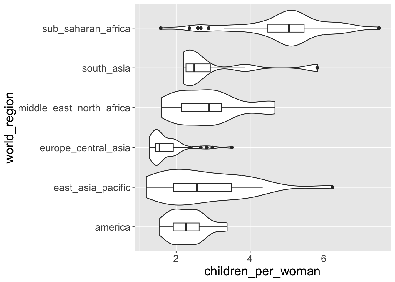
Note
The order in which you add the geometries defines the order they are “drawn” on the graph. For example, try swapping their order and see what happens.
ggplot(gapminder2010, aes(x = world_region, y = children_per_woman)) +
1  geom_boxplot(width = 0.2) +
  geom_violin(scale = "width") +
coord_flip()- 1
- If we switch the order of “boxplot” and “violin”. Boxplot is overlapped by violin plot.

Notice how we’ve shortened our code by omitting the names of the options data = gapminder2010 and mapping = aes(...) inside ggplot(). Because the data is always the first thing in the first place given to ggplot() and the mapping is always identified by the function aes(), this is often written in the more compact form as we just did.
Controlling aesthetics in individual geometries
Let’s say that, in the graph above, we wanted to color the violins by world region, but keep the boxplots without color.
As we’ve learned, because we want to color our geometries based on data, this goes inside the aes() part of the graph:
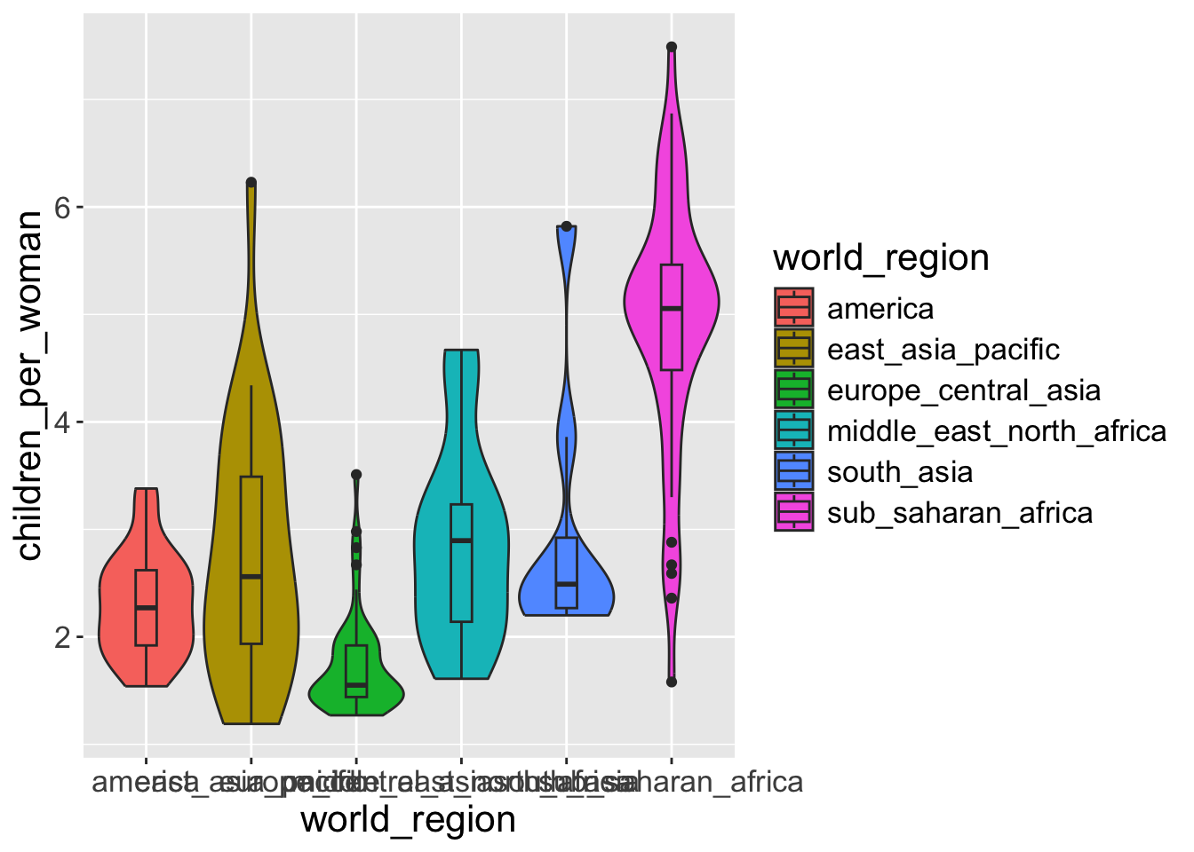
What if we want only violin plot to be colored not the boxplot
OK, this is not what we wanted. Both geometries (boxplots and violins) got colored.
It turns out that we can control aesthetics individually in each geometry, by puting the aes() inside the geometry function itself. Like this:
- 1
-
Notice that we remove the coloring syntax,
aes(fill = world_region), fromggplotwhich applies to all geometries - violine and boxplot - 2
-
Note that we add another
aesinsidegeom_violingeometry, which specify violin
Exercise-04
- Modify the graph above by coloring the inside of the boxplots by world region and the inside of the violins in grey color (hint: think about inside or outside
aesfor grey color. The code name for grey color in R is"grey").
Because we want to define the fill color of the violin “manually” it goes outside aes(). Whereas for the violin we want the fill to depend on a column of data, so it goes inside aes().
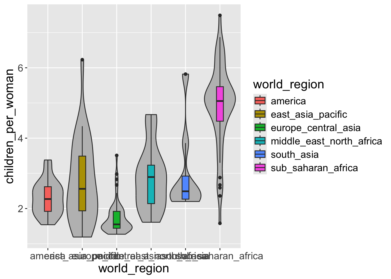
Although this graph looks appealing, the color is redundant with the x-axis labels. So, the same information is being shown with multiple aesthetics. This is not necessarily incorrect, but we should generally avoid too much gratuitous use of color in graphs. At the very least we should remove the legend from this graph.
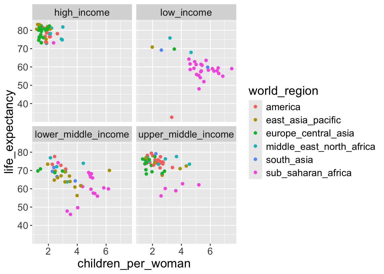
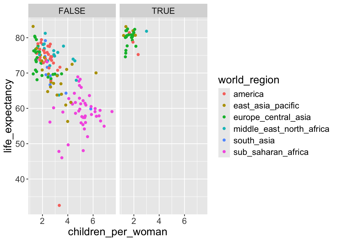
- For example, if we want to visualize the scatterplot above split by
income_groups:
- If instead we want a matrix of facets to display
income_groupsandeconomic_organisation, then we usefacet_grid():
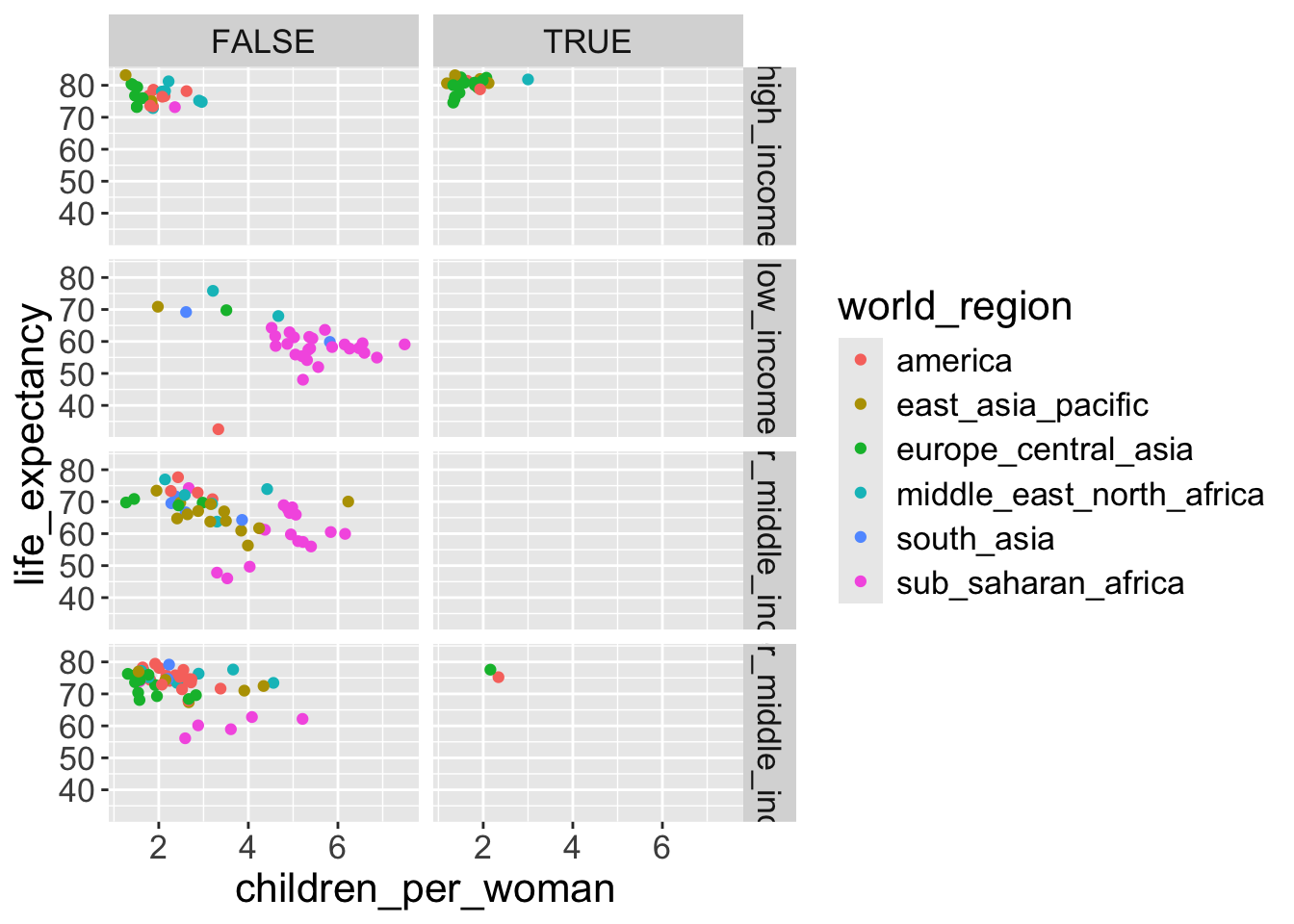
- Finally, with
facet_grid(), you can organise the panels just by rows or just by columns. Try running this code yourself:
# One column, facet by rows
ggplot(gapminder2010,
       aes(x = children_per_woman, y = life_expectancy, color = world_region)) +
  geom_point() +
  facet_grid(rows = vars(is_oecd))
# One row, facet by column
ggplot(gapminder2010,
       aes(x = children_per_woman, y = life_expectancy, color = world_region)) +
  geom_point() +
  facet_grid(cols = vars(is_oecd))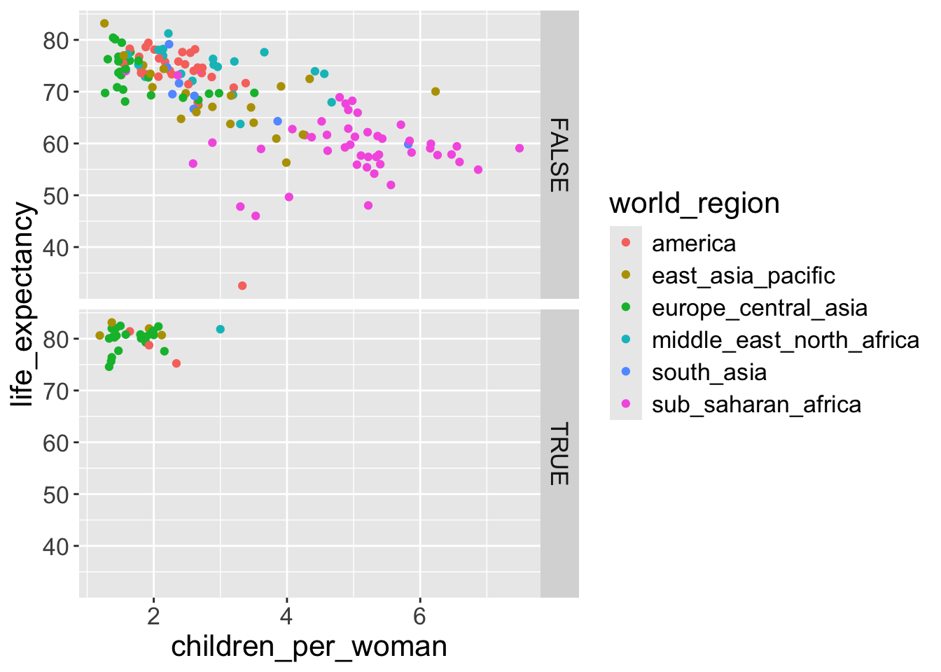
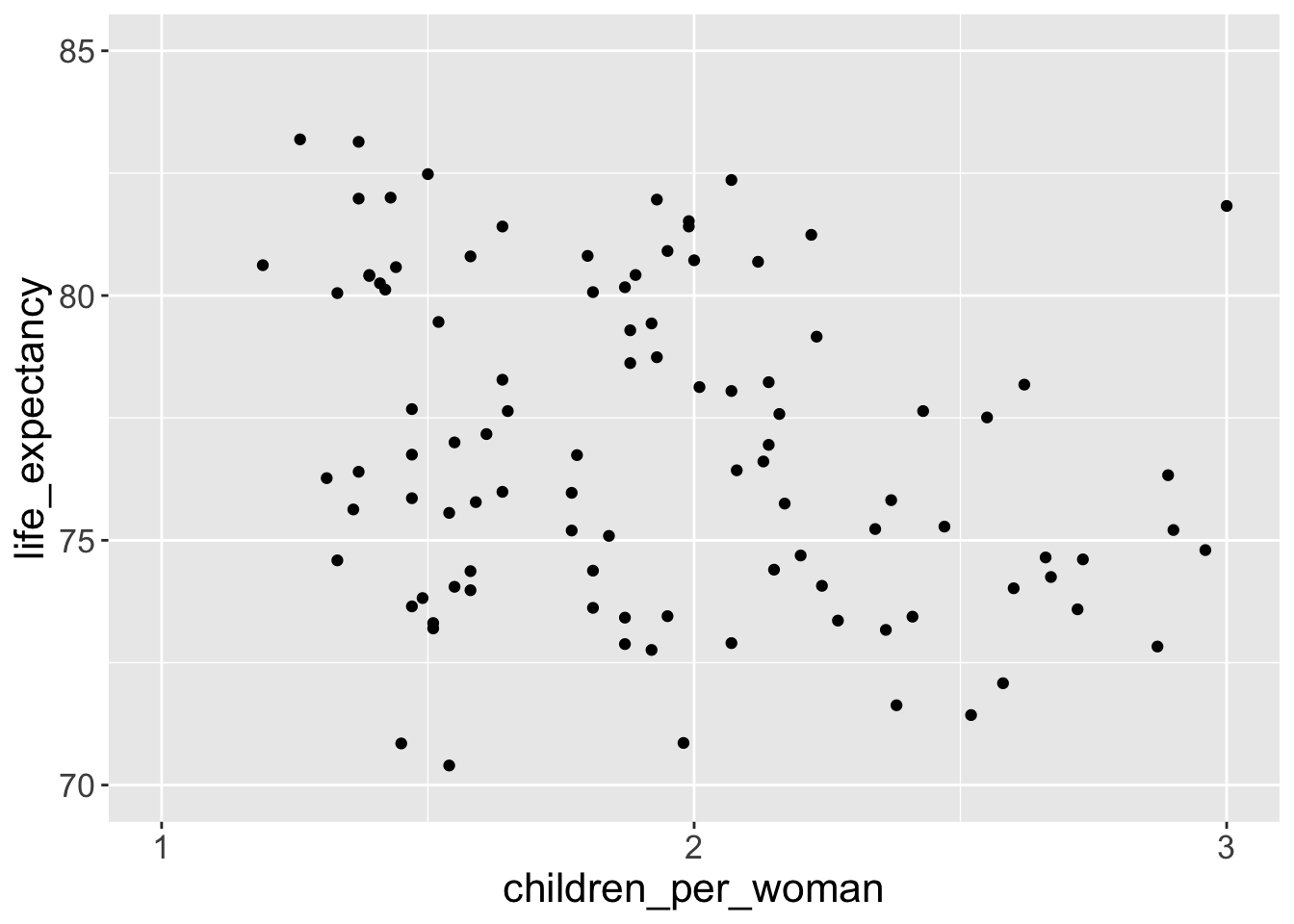
Change a numerical axis scale
Taking the graph from the previous exercise we can modify the x and y axis scales, for example to emphasis a particular range of the data and define the breaks of the axis ticks.
limits =with a vector with the length as 2 set the lower and upper limits of x or y axis.breaks =withseq(0, 3, by = 1)sets the x-axis ticks at the points of 0, 1, 2, 3
You can also apply transformations to the data. For example, consider the distribution of income across countries, represented using a histogram:
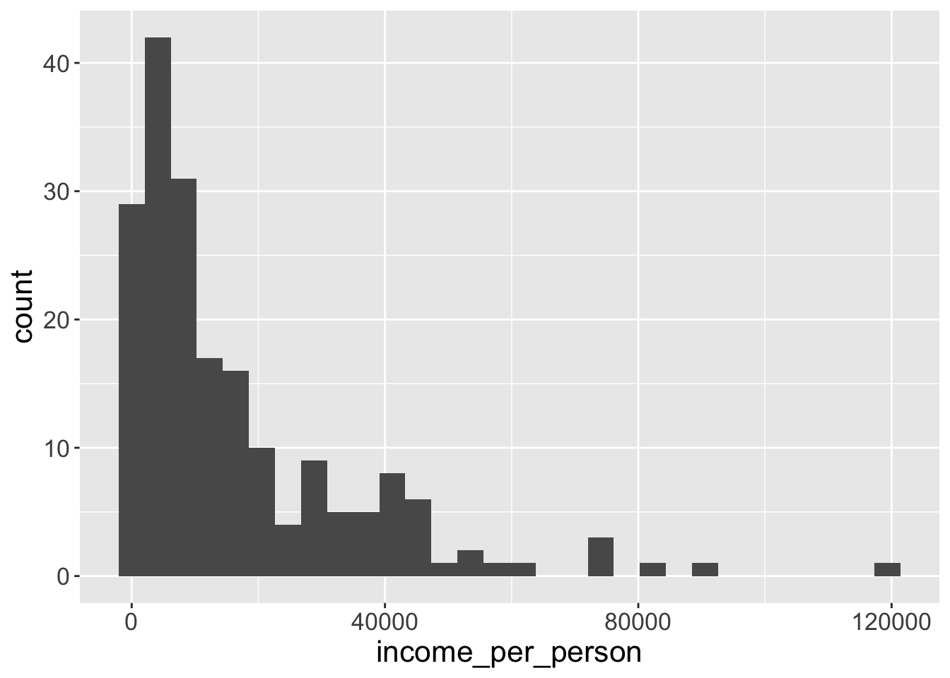
We can see that this distribution is highly skewed, with some countries having very large values, while others having very low values. One common data transformation to solve this issue is to log-transform our values. We can do this within the scale function:
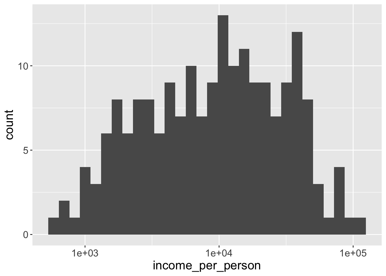
Notice how the interval between the x-axis values is not constant anymore, we go from $1000 to $10,000 and then to $100,000. That’s because our data is now plotted on a log-scale.
You could transform the data directly in the variable given to x:
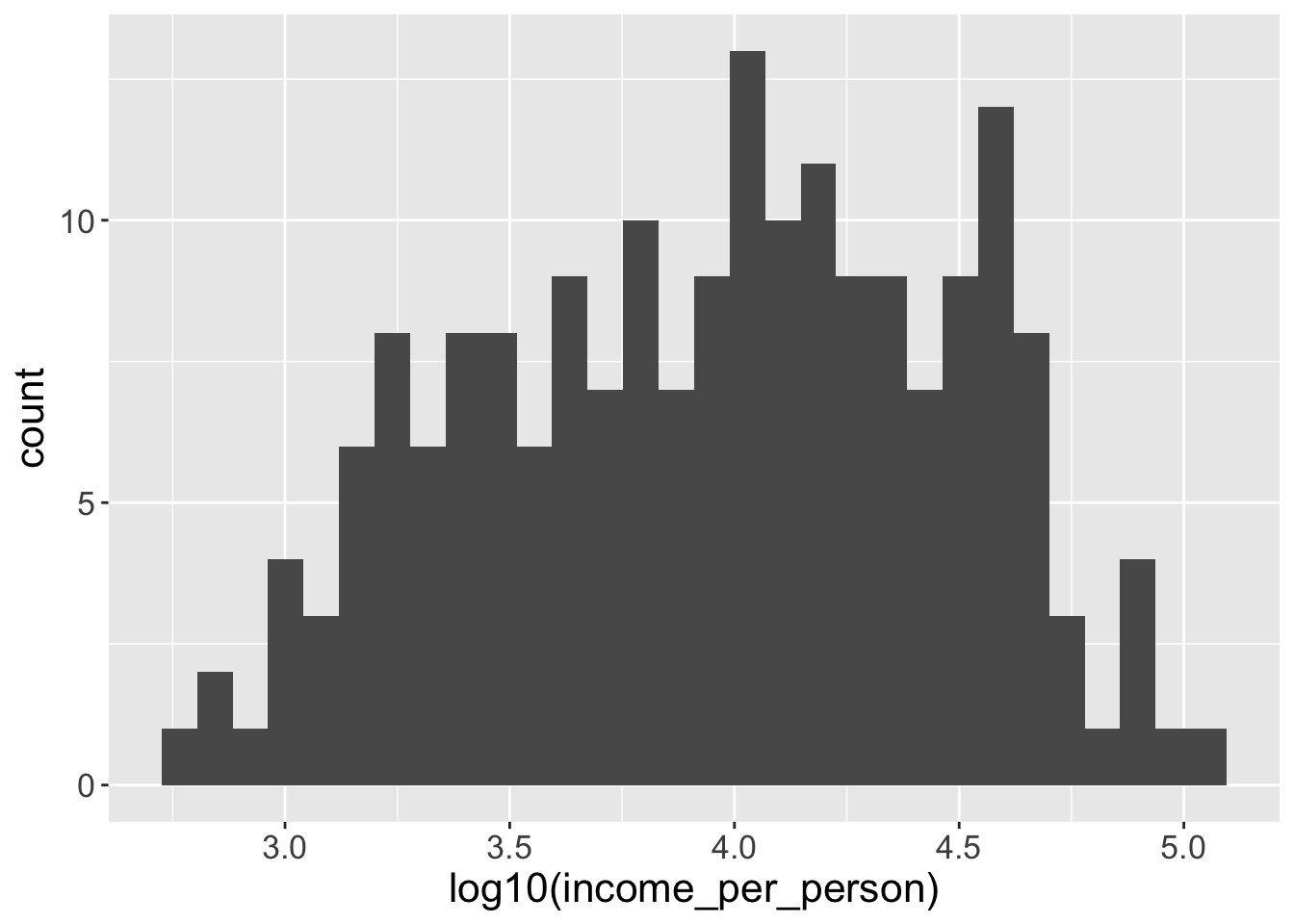
This is also fine, but in this case the x-axis scale would show you the log-transformed values, rather than the original values. (Try running the code yourself to see the difference!)
Change numerical fill/color scales
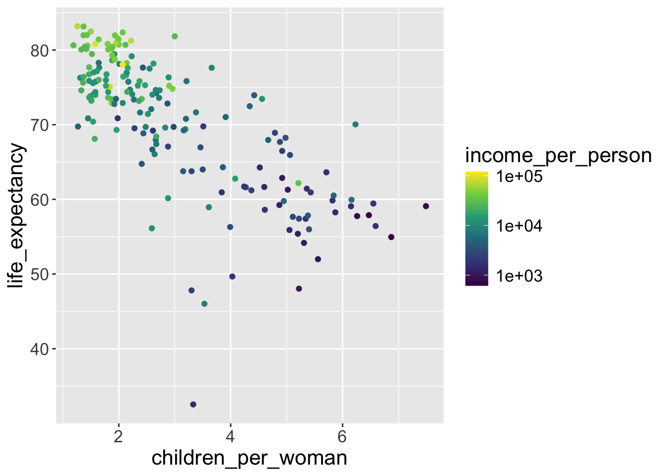
Let’s get back to our initial scatterplot and color the points by income:
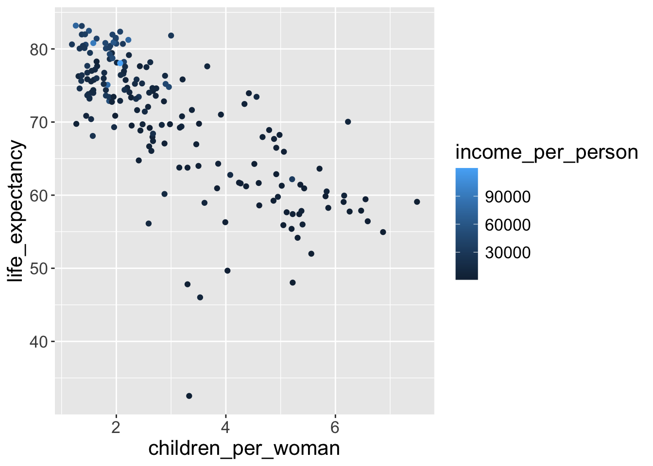
Because income_per_person is a continuous variable, ggplot created a gradient color scale.
We can change the default using scale_color_gradient(), defining two colors for the lowest and highest values (and we can also log-transform the data like before):
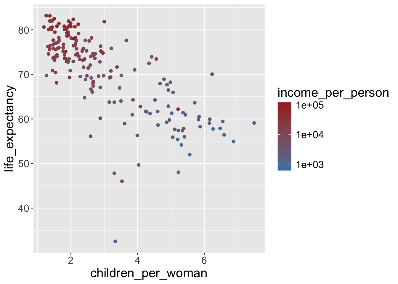
For continuous color scales we can use the viridis palette, which has been developed to be color-blind friendly and perceptually better:
Change a discrete axis scale
Earlier, when we did our boxplot, the x-axis was a categorical variable.
For categorical axis scales, you can use the scale_x_discrete() and scale_y_discrete() functions. For example, to limit which categories are shown and in which order:
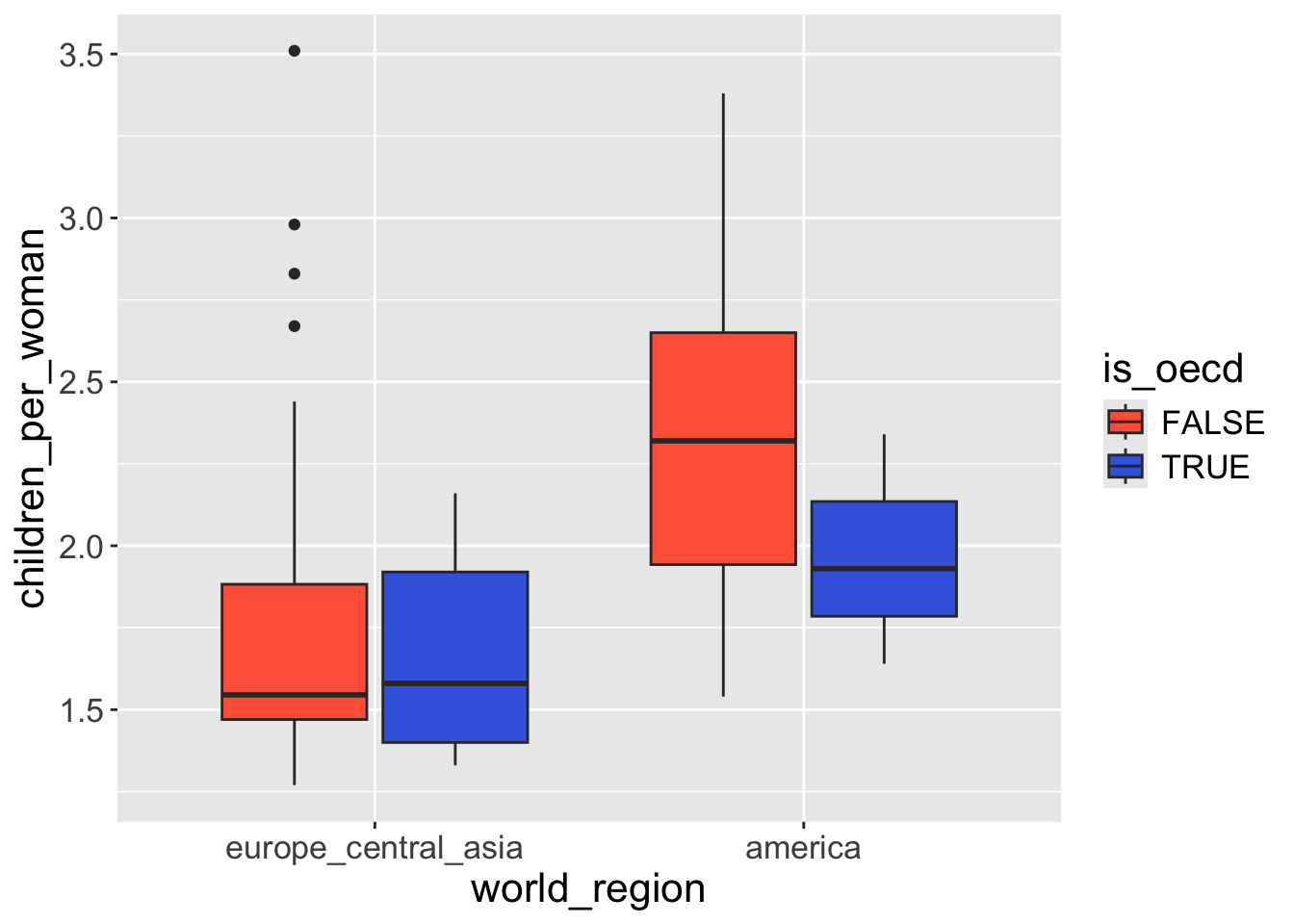
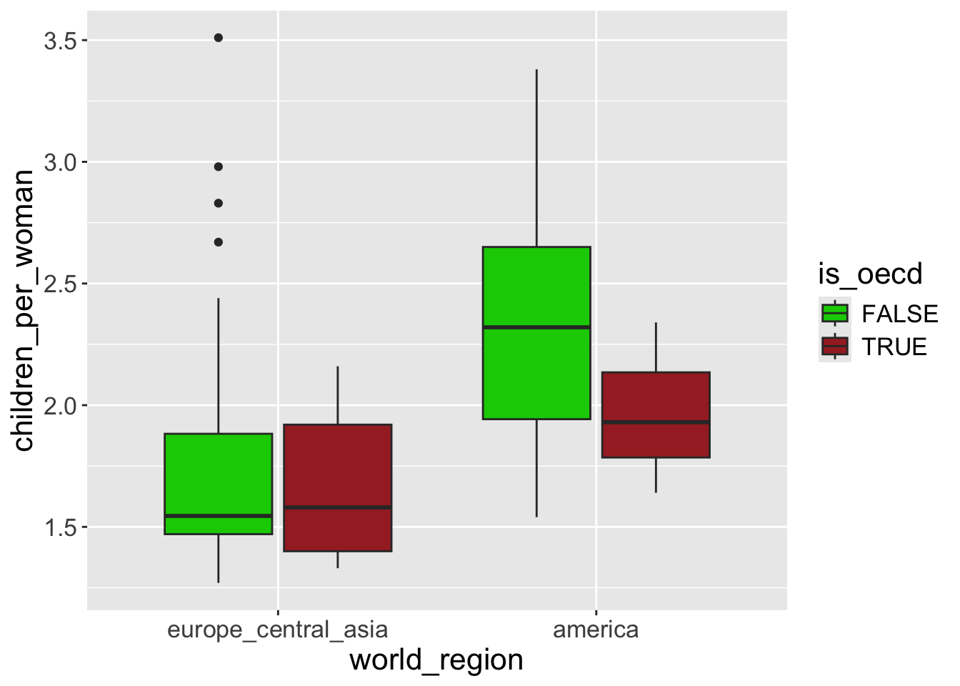
You can manually change specific group’s color using scale_fill_manual(values = ...) in which ... should follow the same order of the grouping factor.
Important
If you specify colors for “large area”, use fill, for example, in boxplot, we use geom_boxplot(aes(fill = ...)). This will draw colors for the whole box.
If you specify colors for points or line, use color. For example, geom_points(aes(color = ...)).
Question: if you use geom_boxplot(aes(color = ...)), what will happen? Does box be colored?
Change categorical color/fill scales
Taking the previous plot, let’s change the fill scale to define custom colors “manually”.
For color/fill scales there’s a very convenient variant of the scale function (“brewer”) that has some pre-defined palettes, including color-blind friendly ones:
You can see all the available palettes here. Note that some palettes only have a limited number of colors and ggplot will give a warning if it has fewer colors available than categories in the data.
Exercise-05
Modify the following code so that the point size is defined by the population size. The size should be on a log scale (Hint: use the scale_size_continuous geometry.).
To make points change by size, we add the size aesthetic within the aes() function:
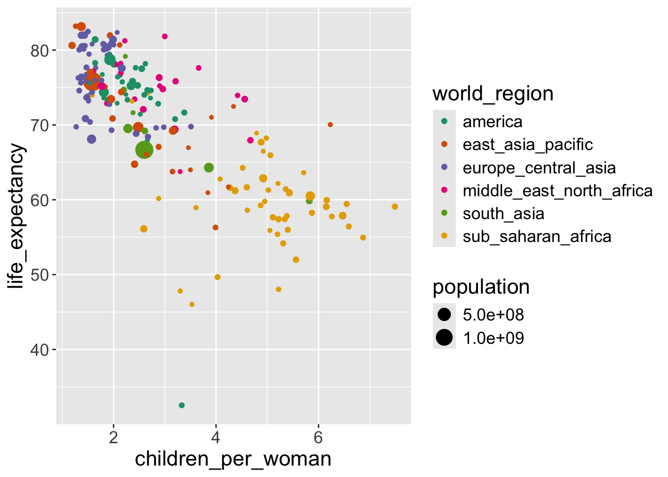
In this case the scale of the point’s size is on the original (linear) scale. To transform the scale, we can use scale_size_continuous():