
Lecture 09: Visualizing Numerical Data
ggplot2 package
2025-02-05
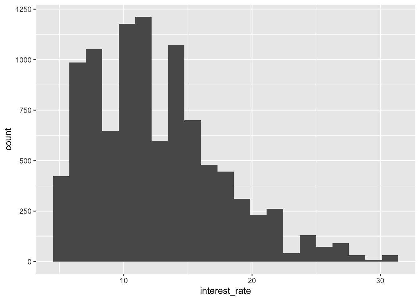
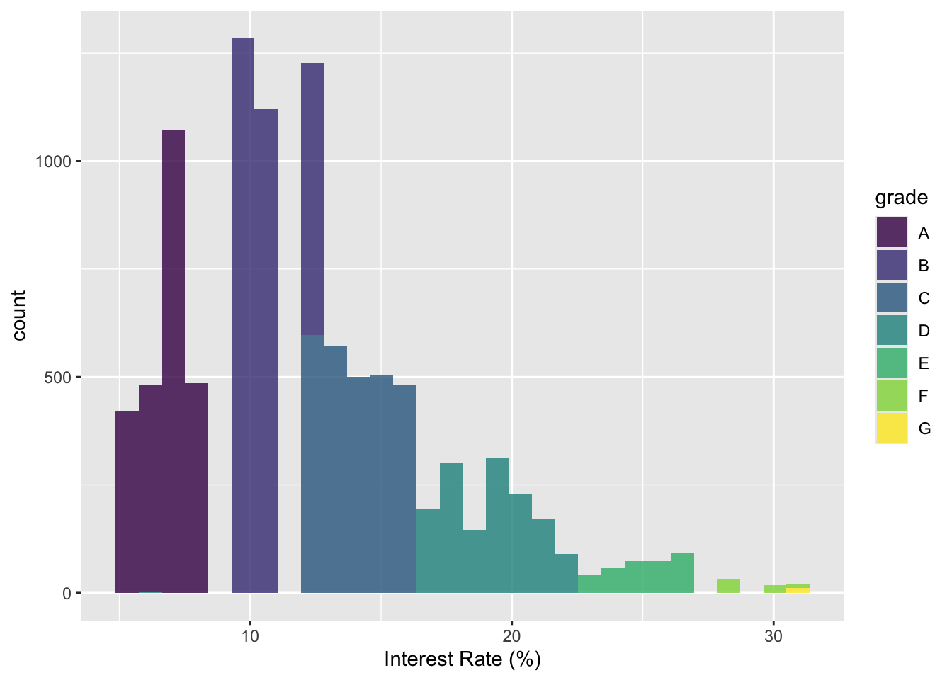
Histogram
`stat_bin()` using `bins = 30`. Pick better value with `binwidth`.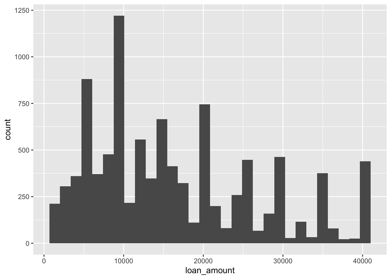
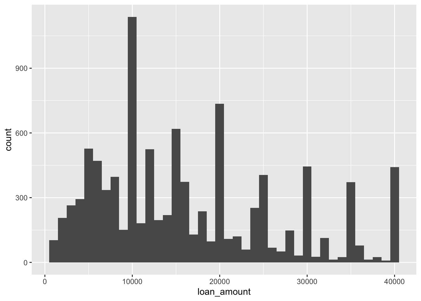
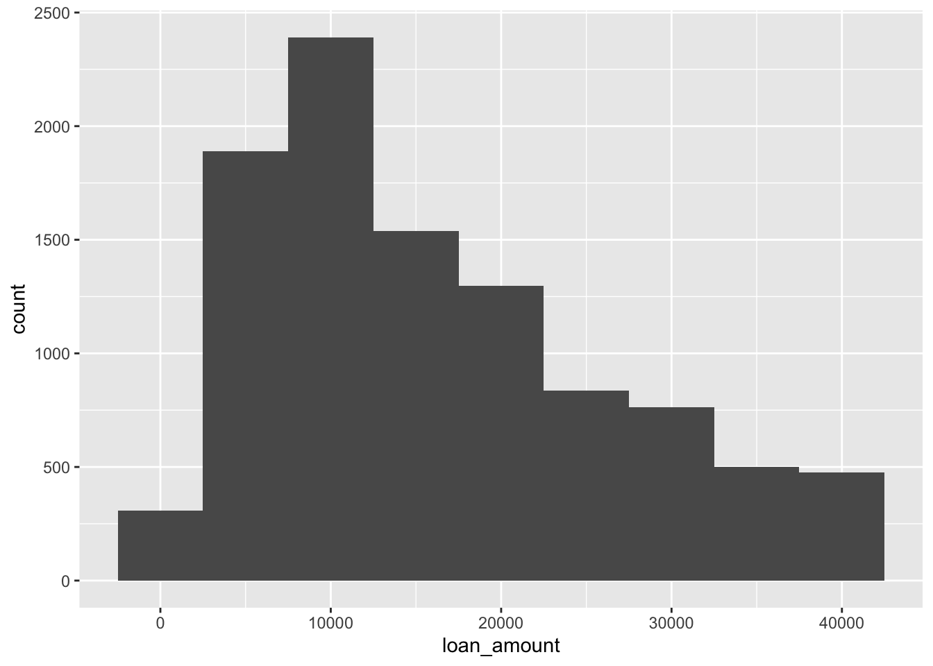
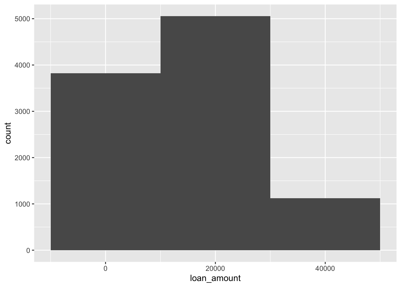
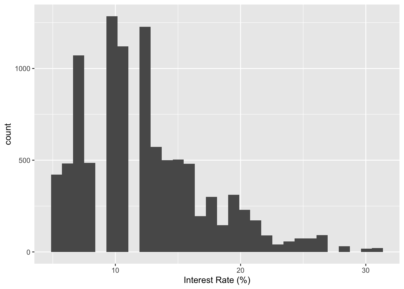
Histograms and binwidth
Your turn
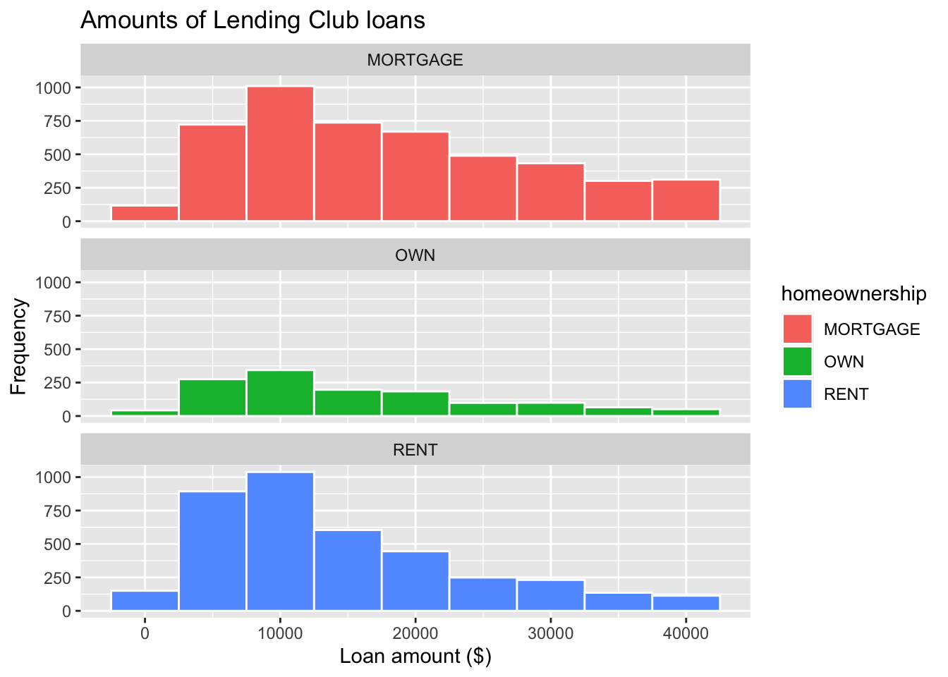
Customizing labels of histograms
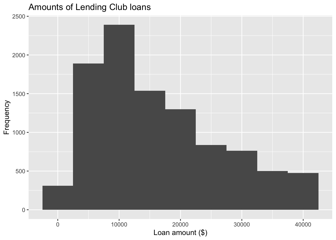
ggplot(loans, aes(x = loan_amount)) +
geom_histogram(binwidth = 5000) +
1 labs(
x = "Loan amount ($)",
y = "Frequency",
title = "Amounts of Lending Club loans"
) - 1
-
labs()can modify axis, legend, and plot labels. You can also usexlabandylabto modify labels for x and y axis, respectively.
Your turn
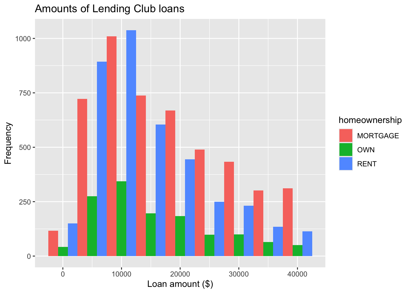
Fill with a categorical variable
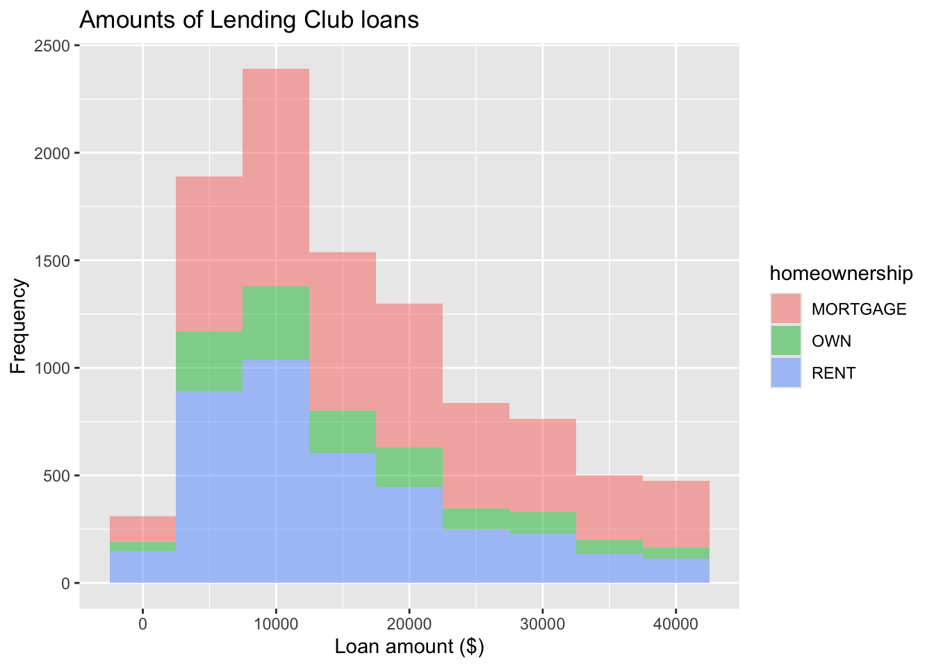
- 1
-
Add
homeownershipto fill with certain category - 2
-
Add
alpha=argument to set up transparency for the figure
Your turn
Facet with a categorical variable

Color of bar borders
Position of Histogram Bars
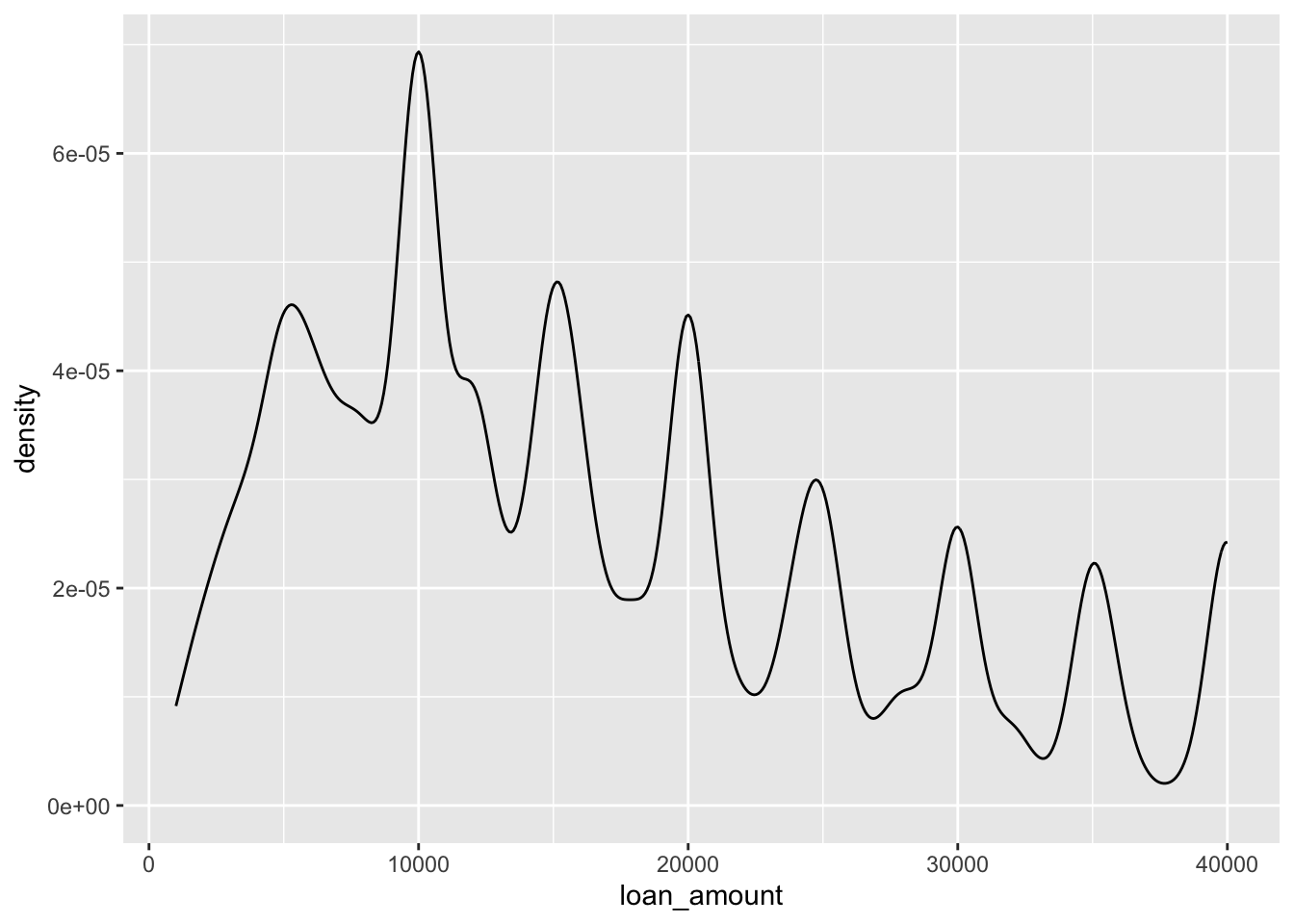
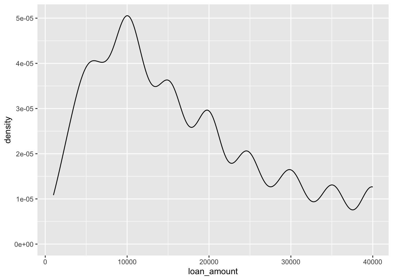
Density plot

Density plots and adjusting bandwidth
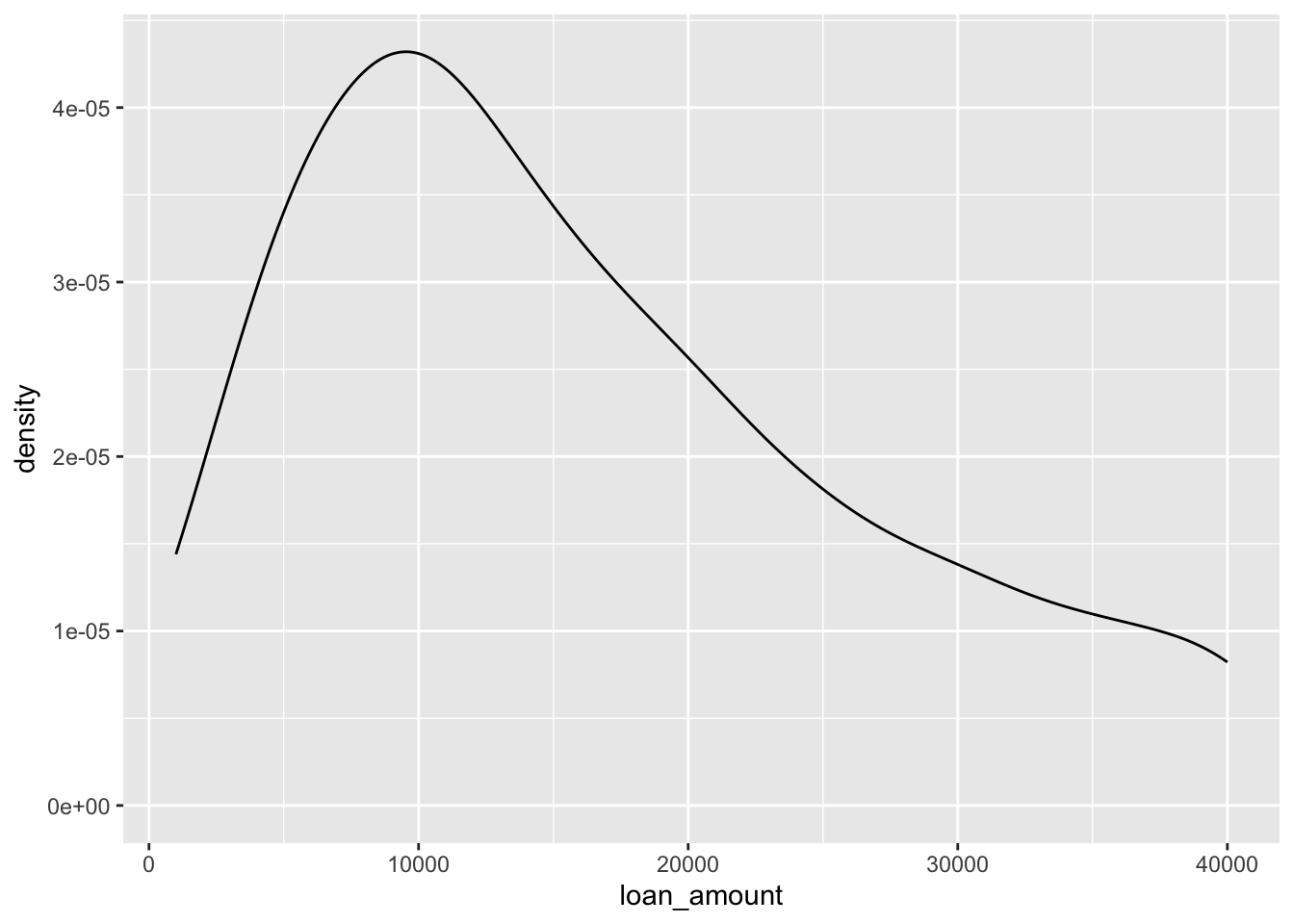
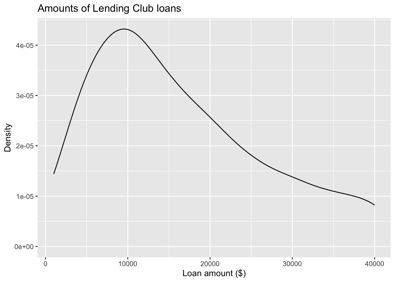
Customizing density plots
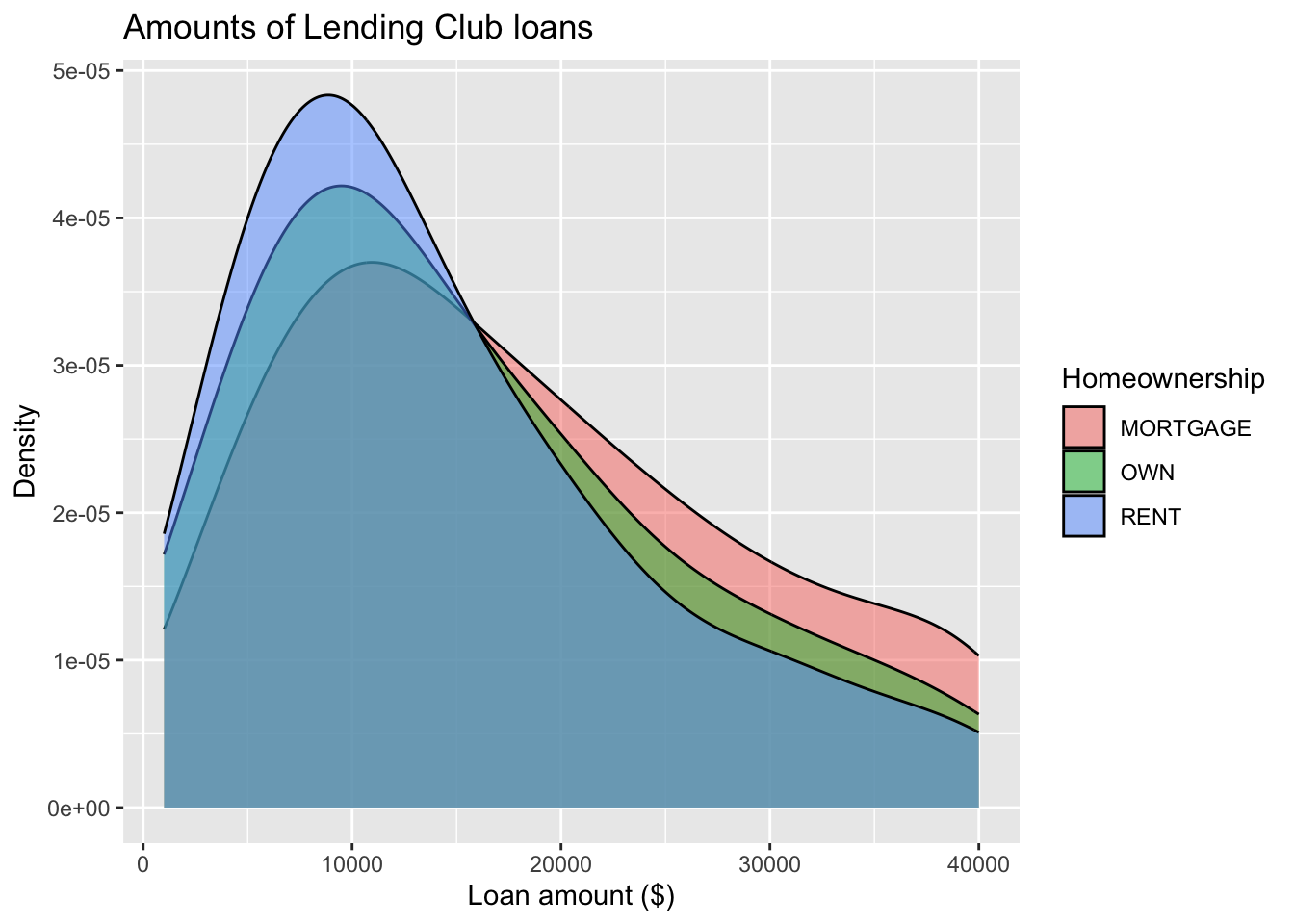
Adding a categorical variable
Box plot
- Boxplot visualises five summary statistics (the median, two hinges and two whiskers), and all “outlying” points individually.
- The lower and upper hinges correspond to the first and third quartiles (the 25th and 75th percentiles).
- The whiskers extend from the hinge to the smallest and largest value no further than 1.5 * IQR from the hinge (where IQR is the inter-quartile range, or distance between the first and third quartiles).
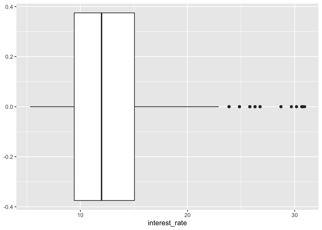
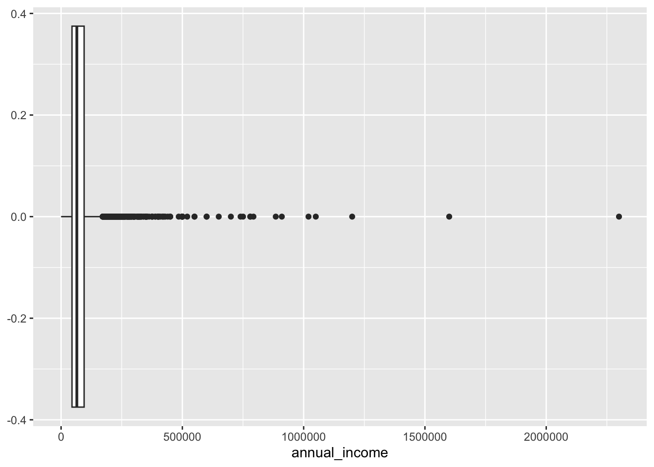
Box plot and outliers
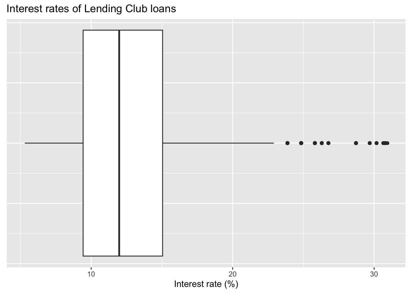
Customizing box plots
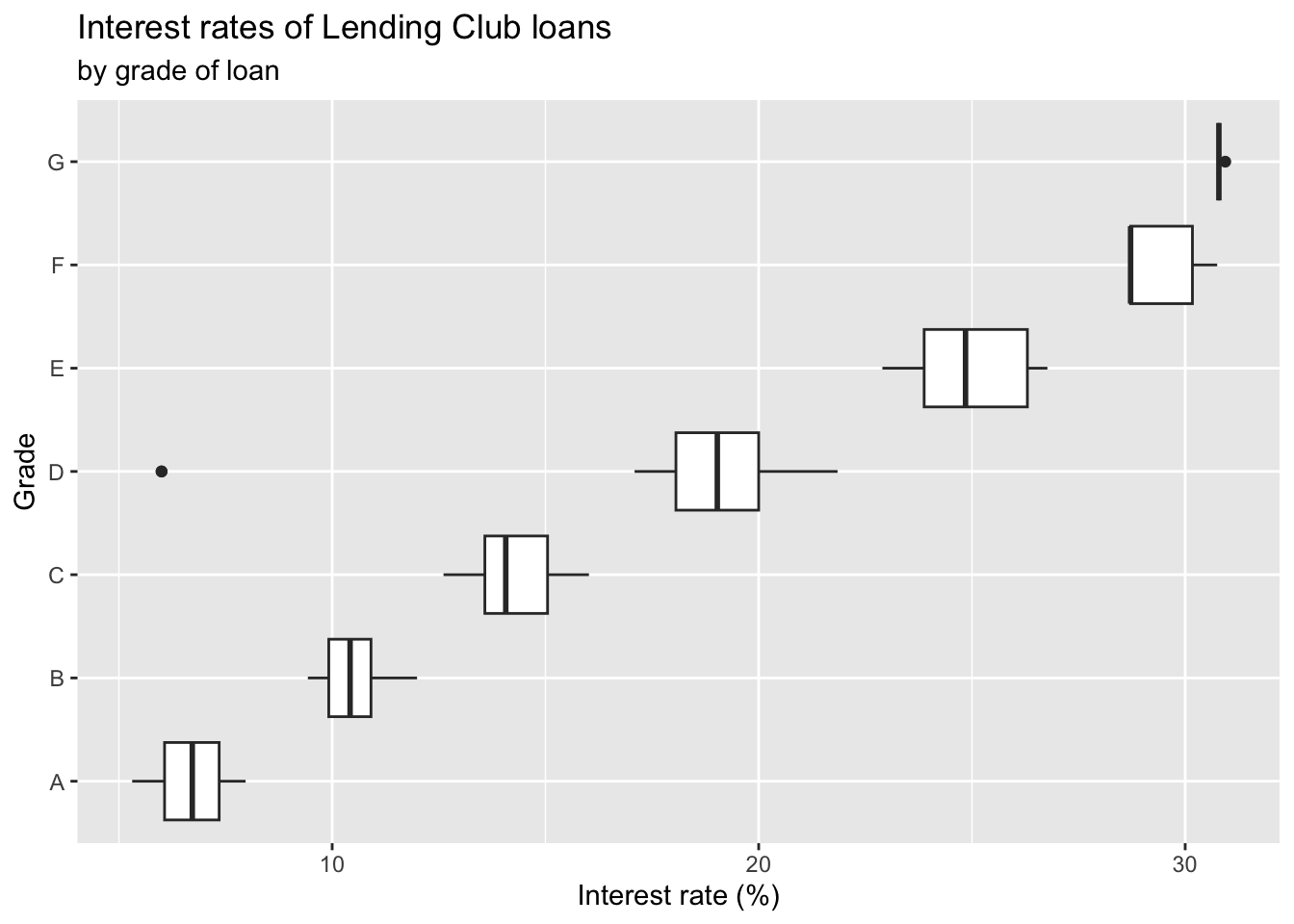
Adding a categorical variable
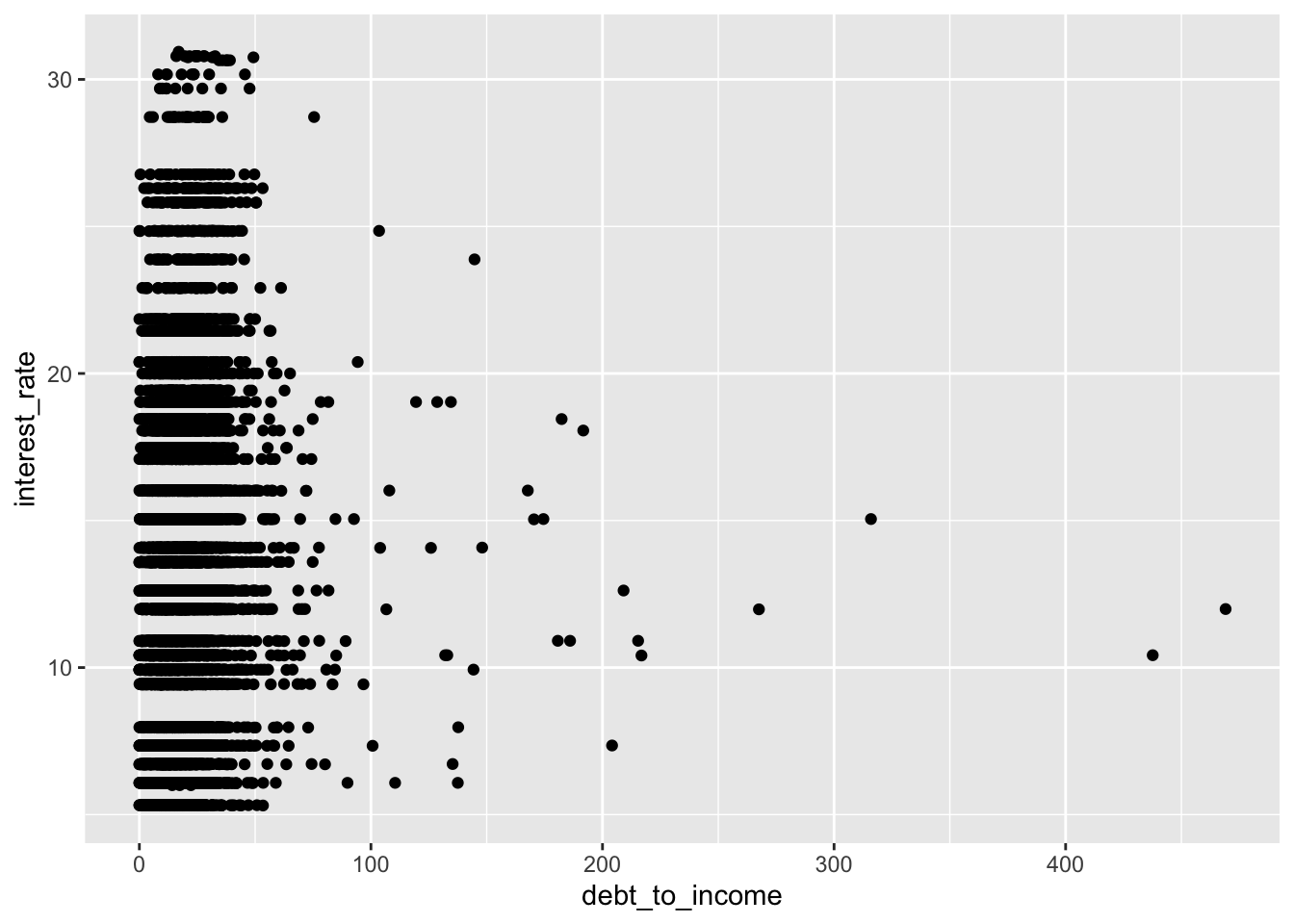
Scatterplot
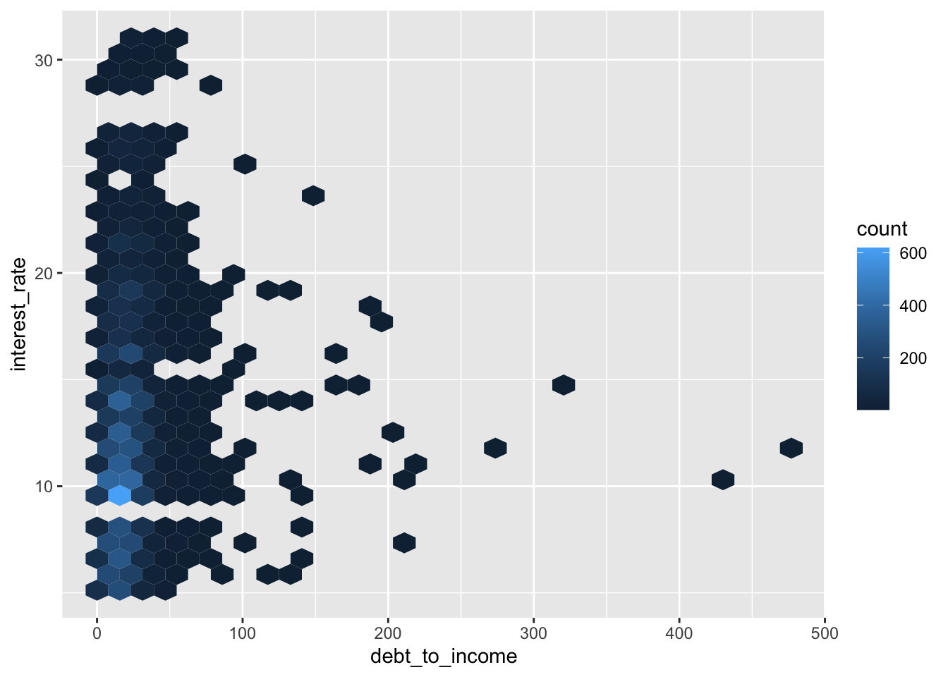
Hex plot
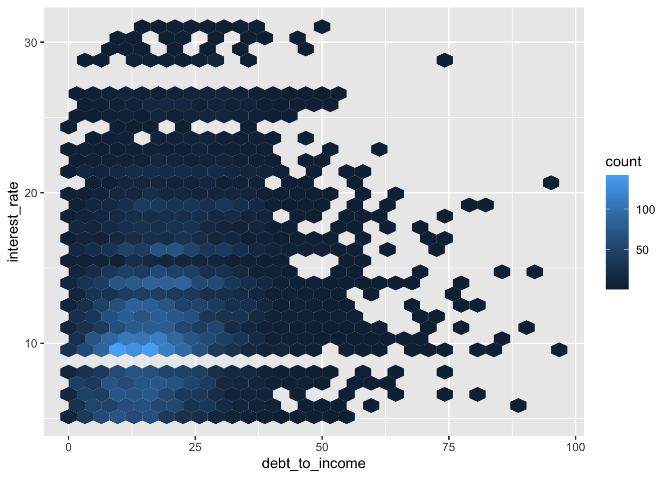
Hex plot
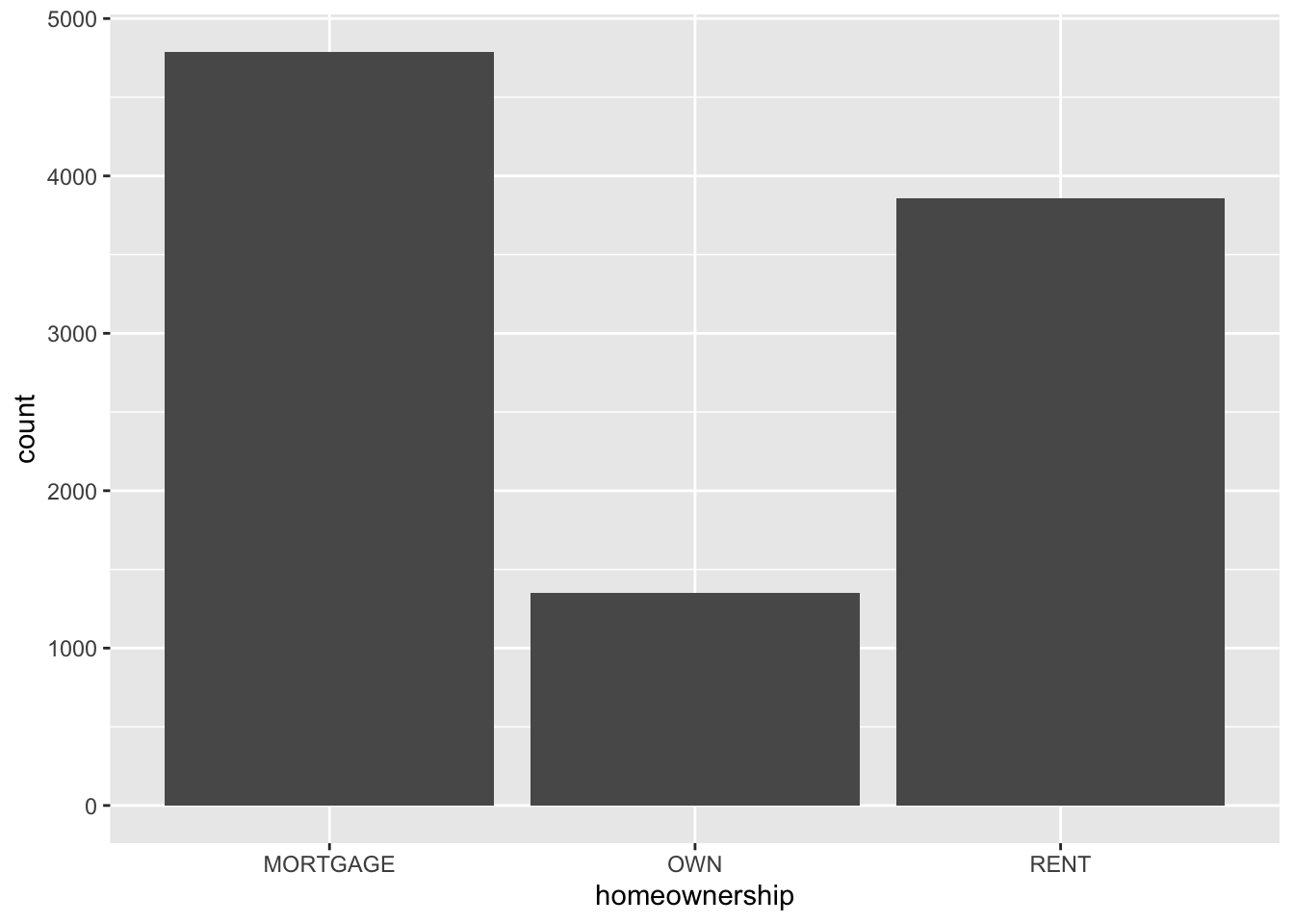
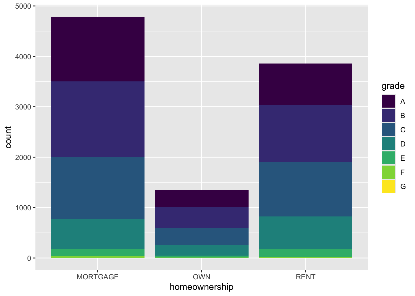
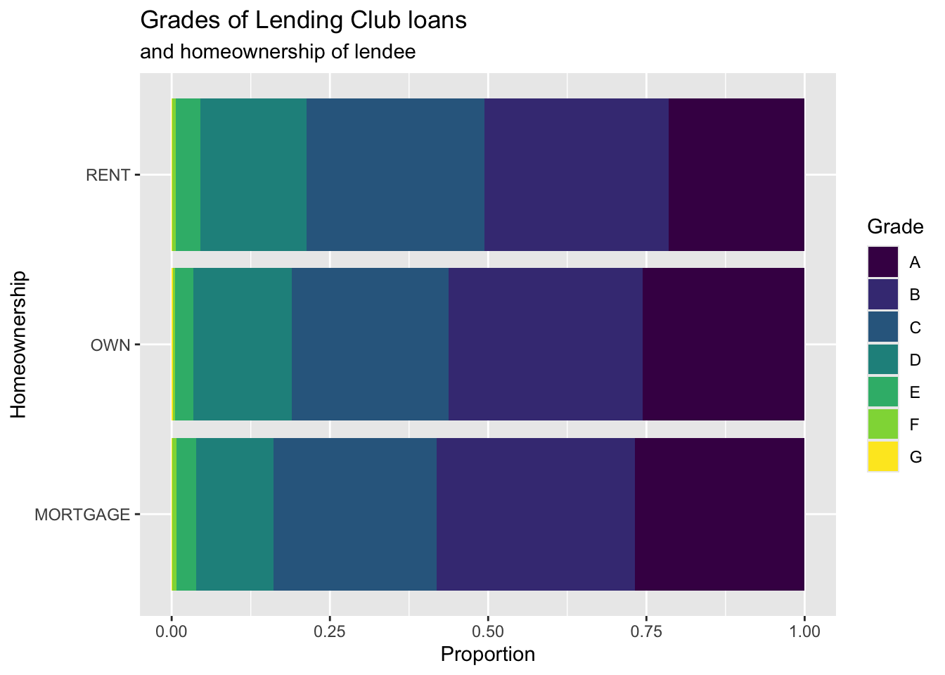
Bar plot
Segmented bar plot

Segmented bar plot
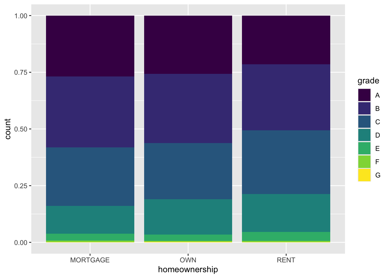
Question
Which bar plot is a more useful representation for visualizing the relationship between homeownership and grade?

Customizing bar plots
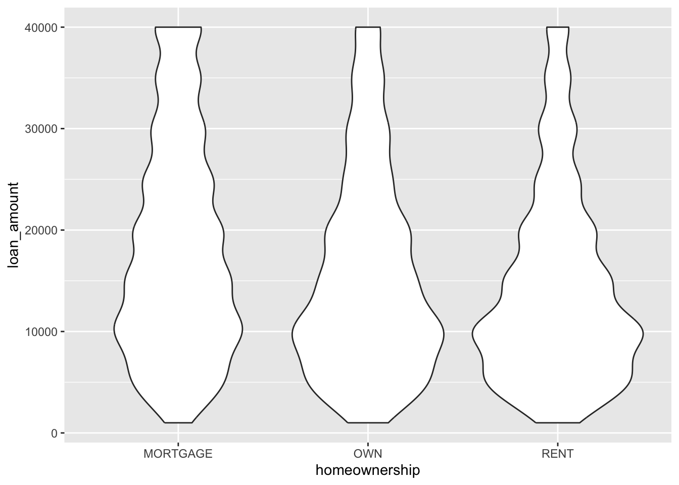
Violin plots
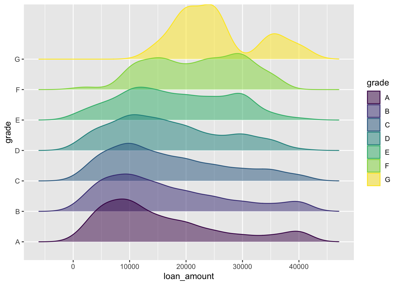
Ridge plots
Keep it simple
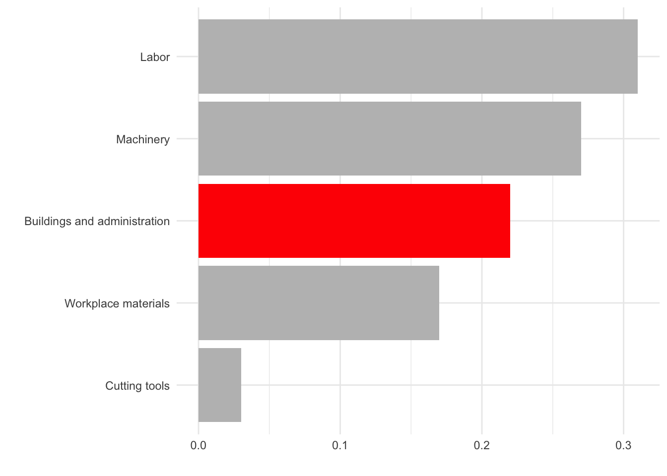
Use color to draw attention
Tell a story
Credit: Angela Zoss and Eric Monson, Duke DVS
Data
In September 2019, YouGov survey asked 1,639 GB adults the following question:
In hindsight, do you think Britain was right/wrong to vote to leave EU?
- Right to leave
- Wrong to leave
- Don’t know

Source: YouGov Survey Results, retrieved Oct 7, 2019
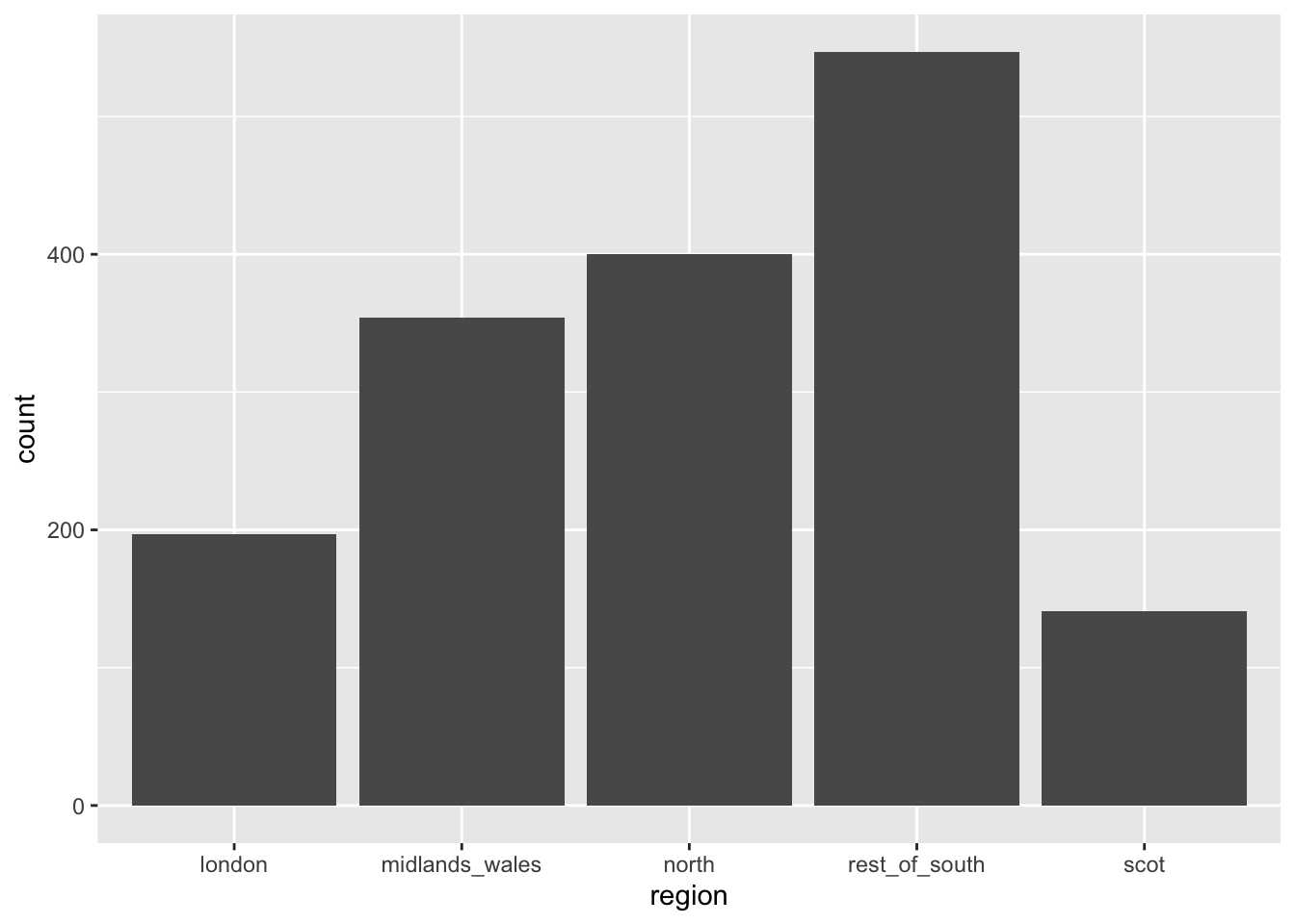
Alphabetical order is rarely ideal

Order by frequency
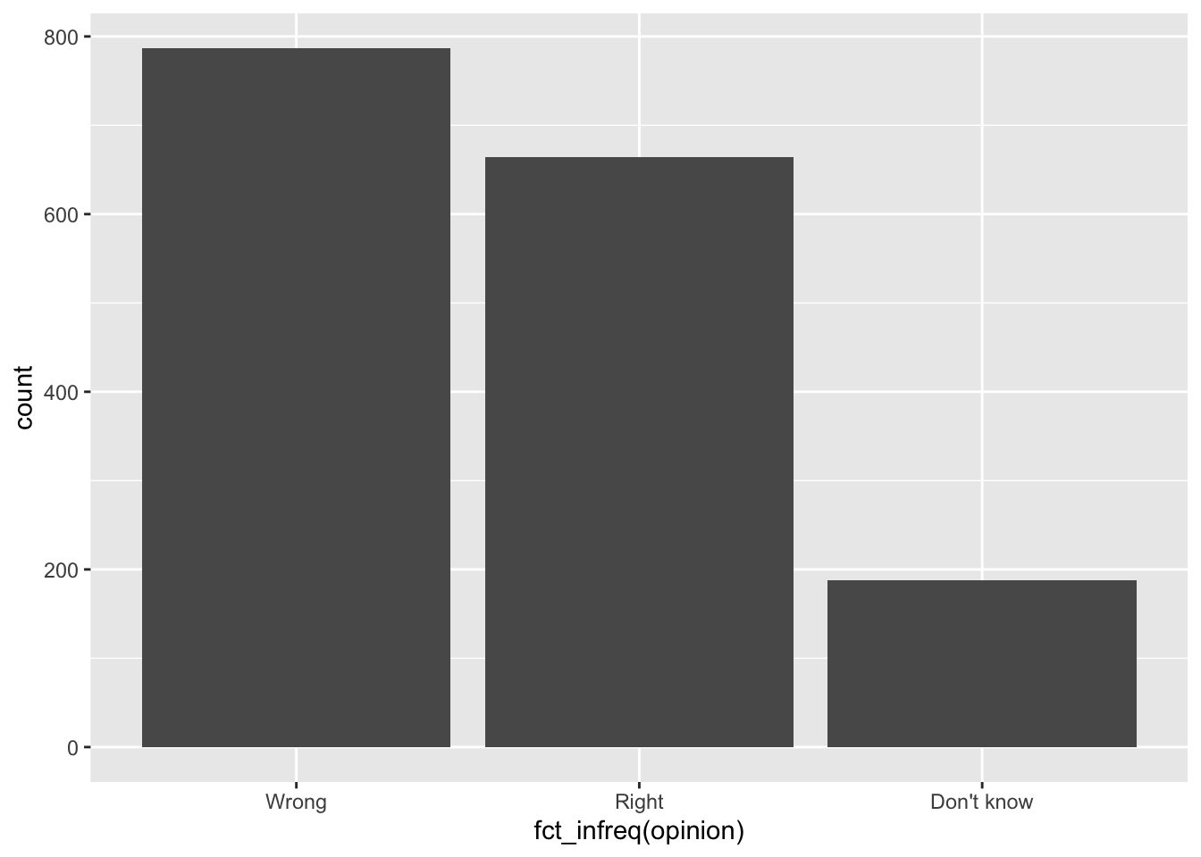
Clean up labels
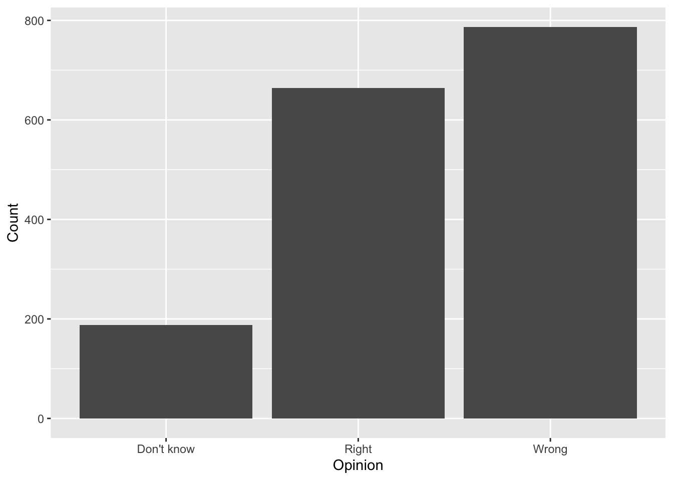
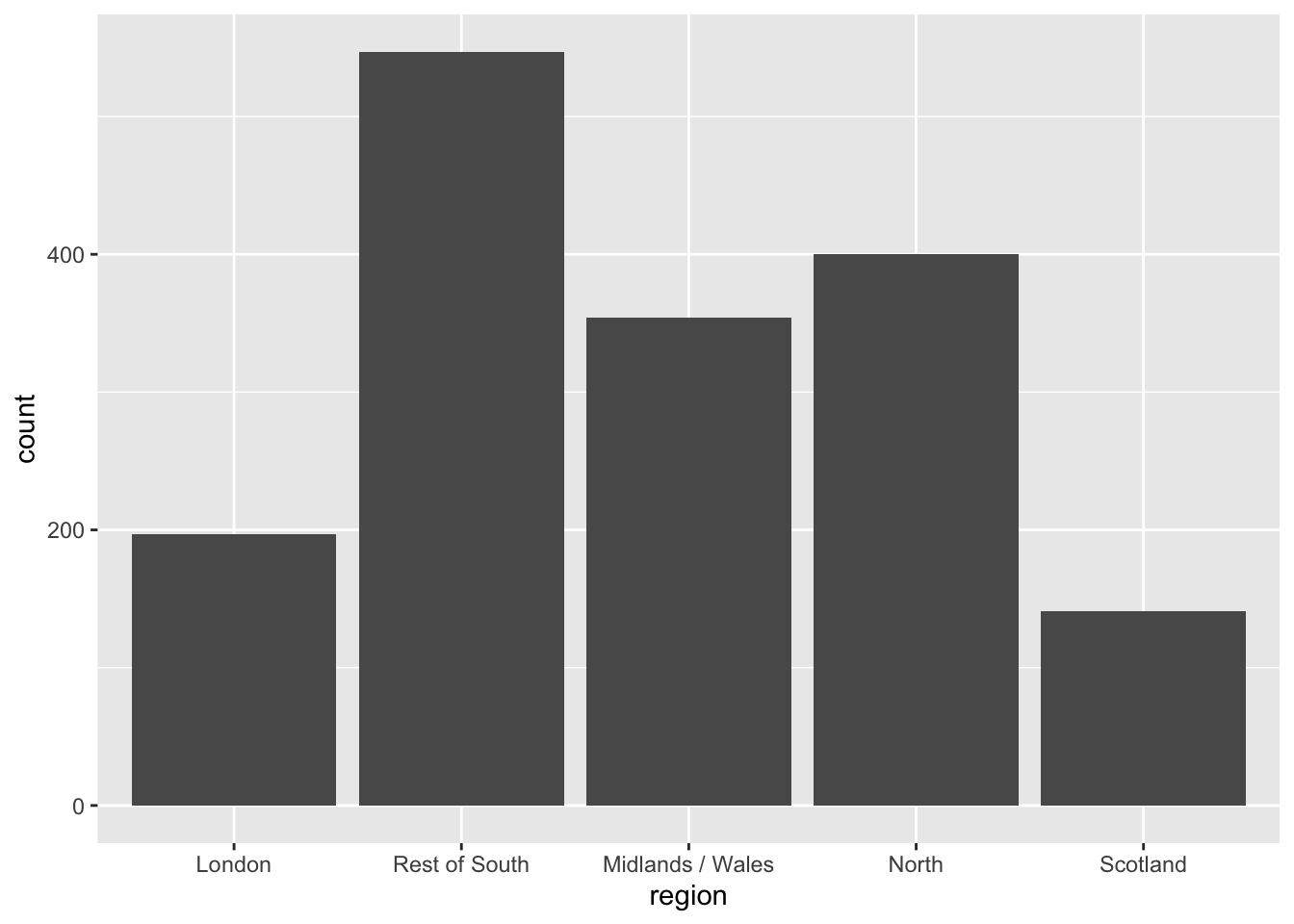
Alphabetical order is rarely ideal
Use inherent level order

Clean up labels
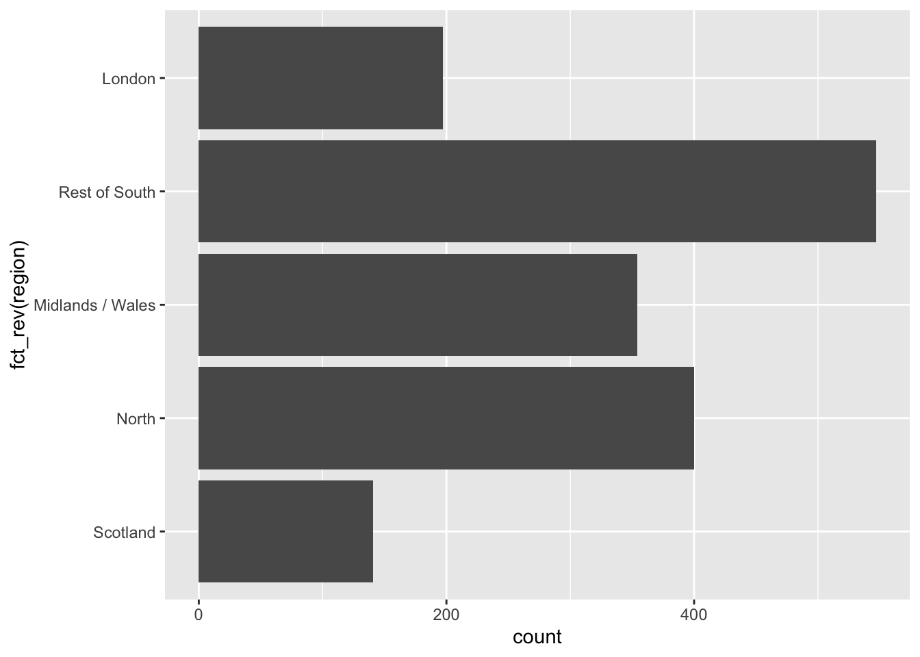
Long categories can be hard to read

Move them to the y-axis
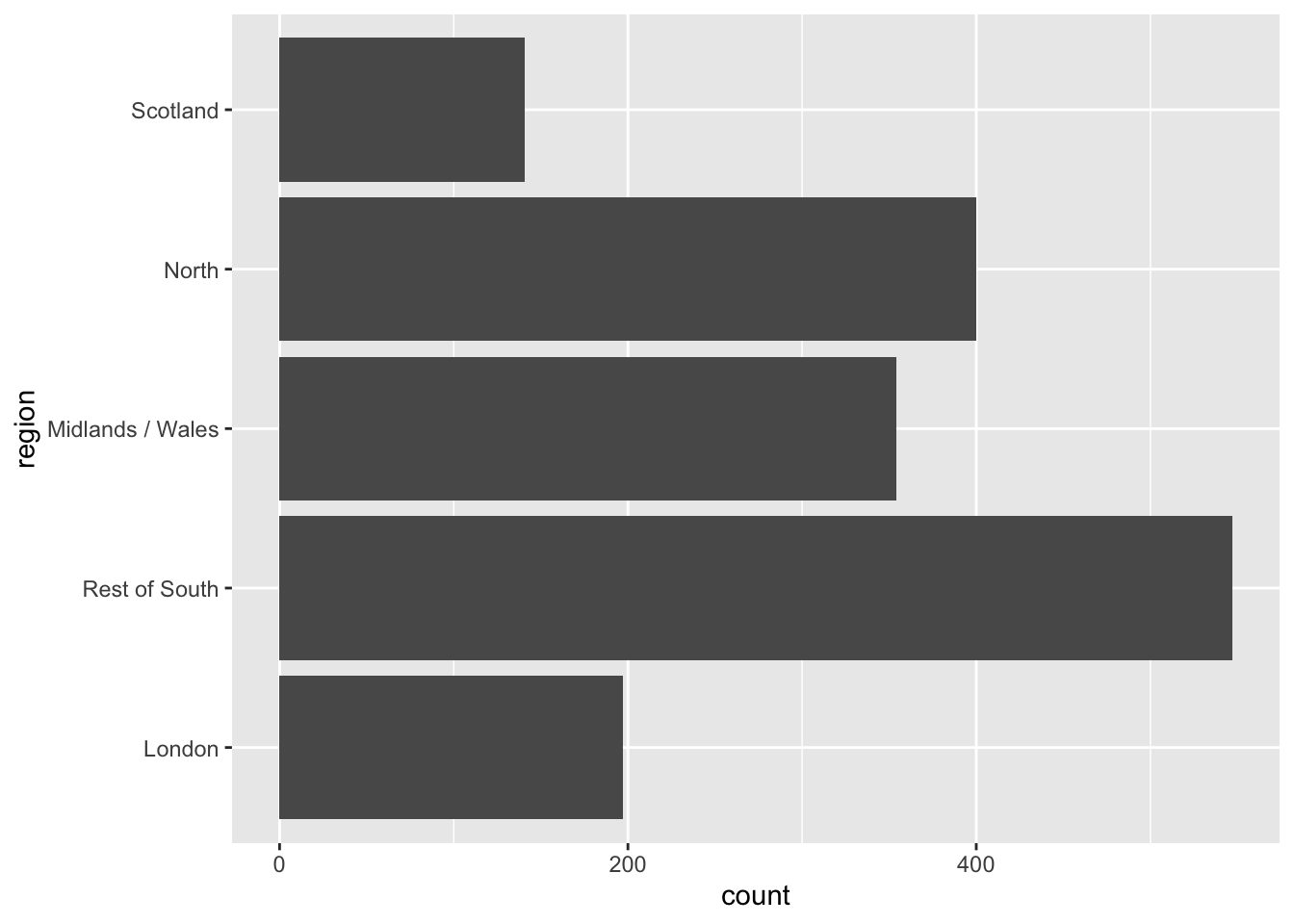
And reverse the order of levels
Clean up labels

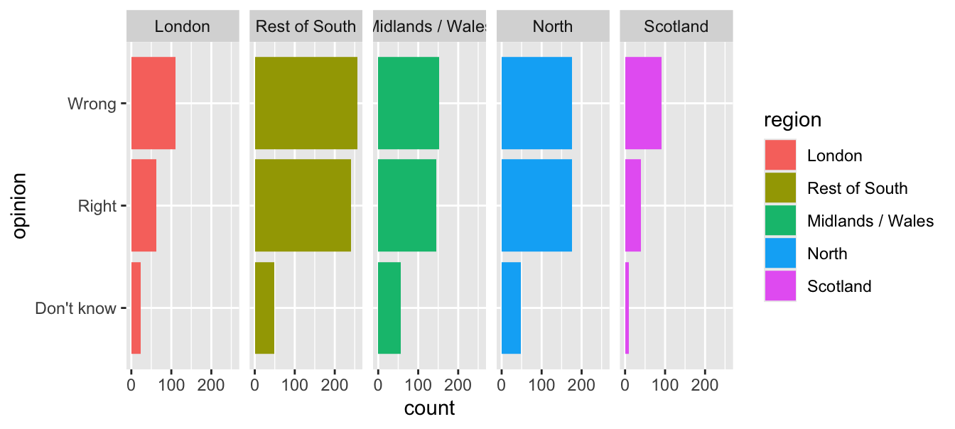
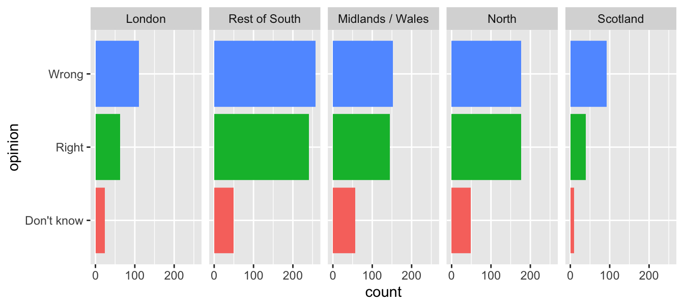
Segmented bar plots can be hard to read
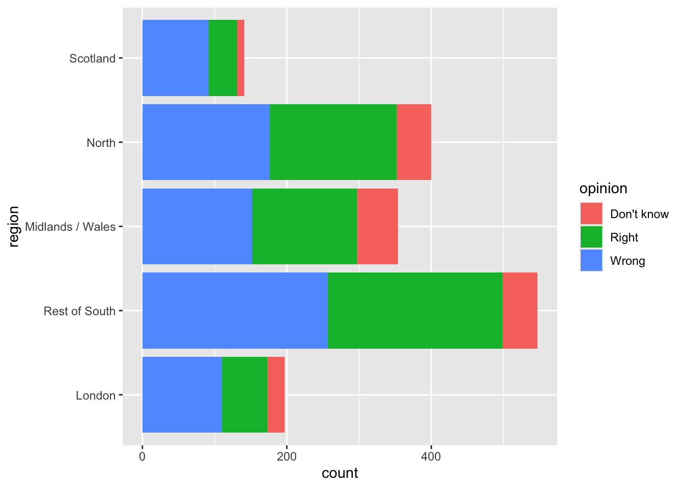
Use facets
Avoid redundancy?
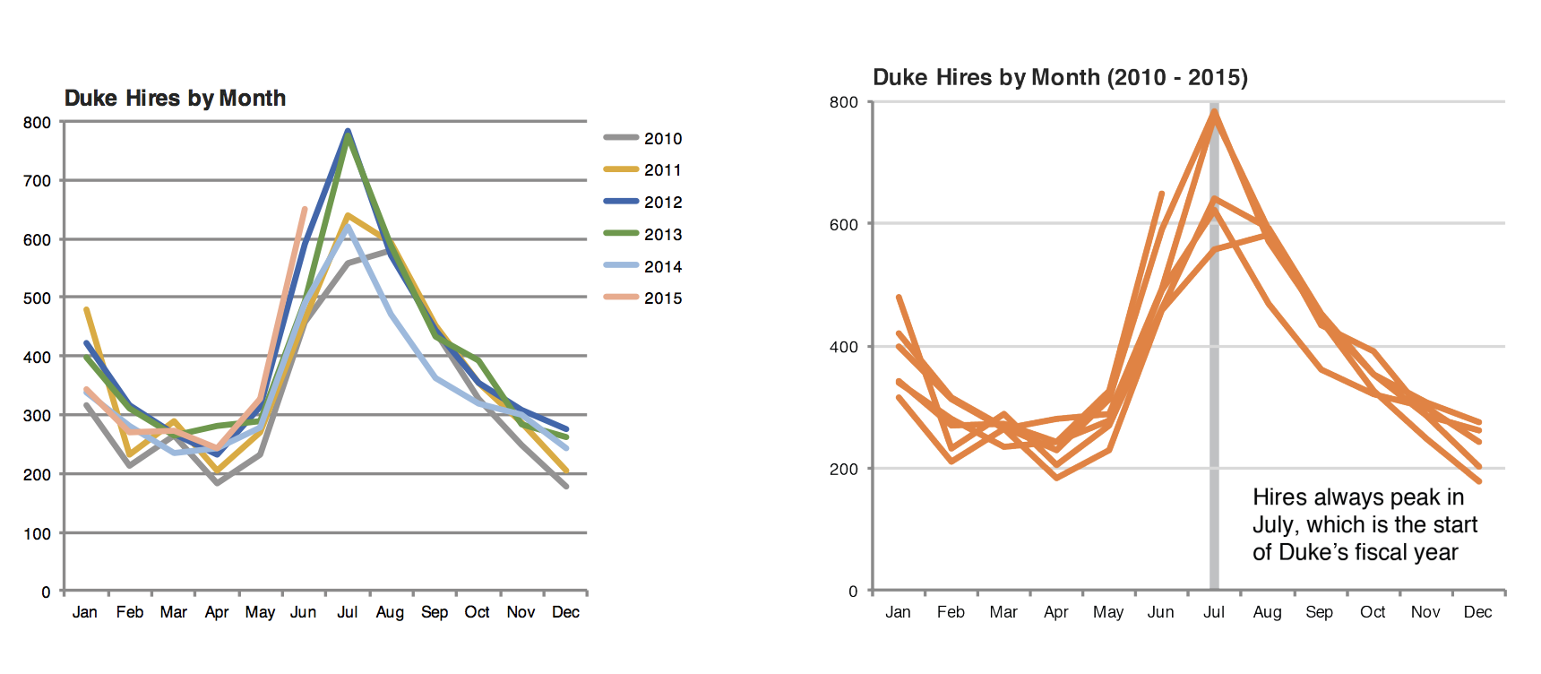
Redundancy can help tell a story
Be selective with redundancy
Use informative labels
A bit more info
ggplot(brexit, aes(y = opinion, fill = opinion)) +
  geom_bar() +
facet_wrap(~region, nrow = 1) +
guides(fill = "none") +
labs(
title = "Was Britain right/wrong to vote to leave EU?",
subtitle = "YouGov Survey Results, 2-3 September 2019", #<<
caption = "Source: https://d25d2506sfb94s.cloudfront.net/cumulus_uploads/document/x0msmggx08/YouGov%20-%20Brexit%20and%202019%20election.pdf", #<<
x = NULL, y = NULL
)Let’s do better
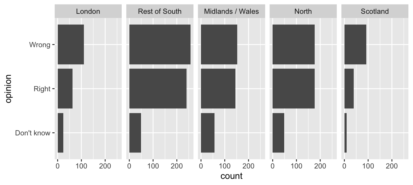
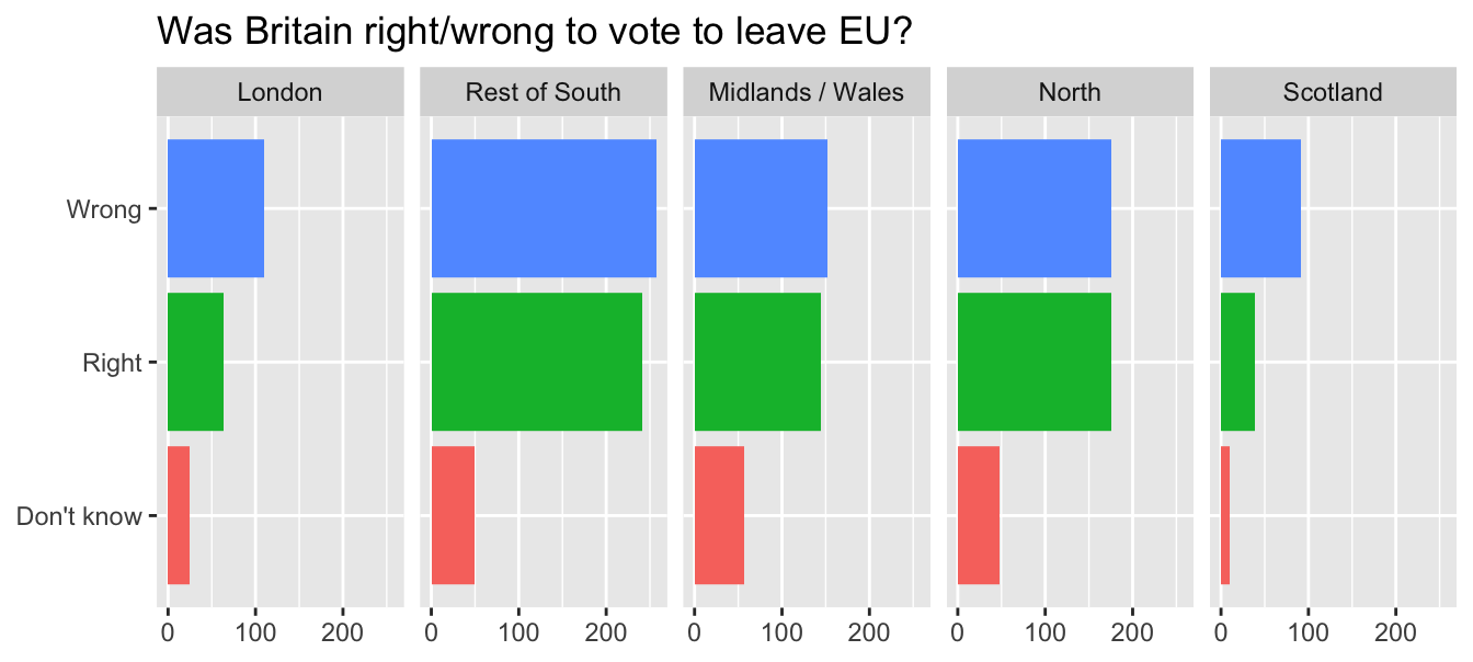
Fix up facet labels

ggplot(brexit, aes(y = opinion, fill = opinion)) +
  geom_bar() +
  facet_wrap(~region,
    nrow = 1,
    labeller = label_wrap_gen(width = 12) #<<
  ) +
  guides(fill = "none") +
  labs(
    title = "Was Britain right/wrong to vote to leave EU?",
    subtitle = "YouGov Survey Results, 2-3 September 2019",
    caption = "Source: bit.ly/2lCJZVg",
    x = NULL, y = NULL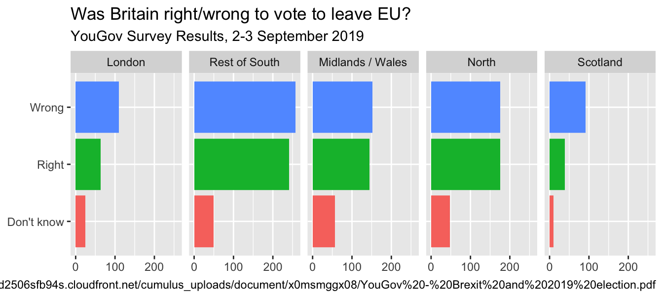
)Rainbow colors not always the right choice
Nicola Rennie’s Blog: Working with colours in R
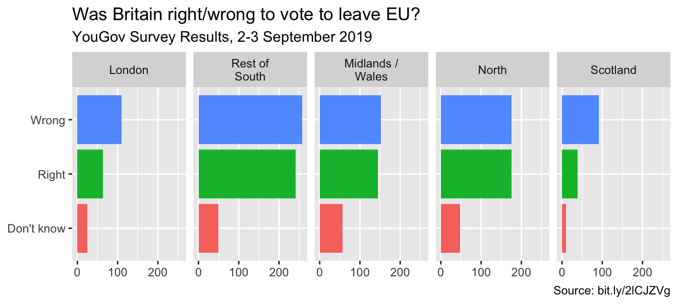
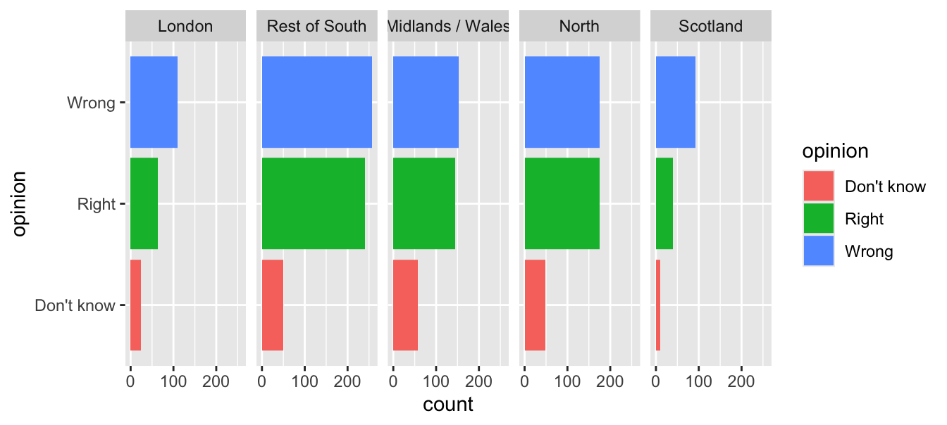
Manually choose colors when needed
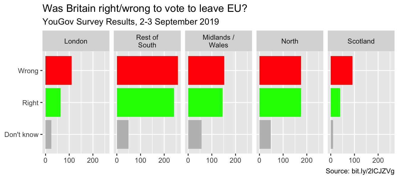
ggplot(brexit, aes(y = opinion, fill = opinion)) +
  geom_bar() +
  facet_wrap(~region, nrow = 1, labeller = label_wrap_gen(width = 12)) +
  guides(fill = "none") +
  labs(title = "Was Britain right/wrong to vote to leave EU?",
       subtitle = "YouGov Survey Results, 2-3 September 2019",
       caption = "Source: bit.ly/2lCJZVg",
       x = NULL, y = NULL) +
  scale_fill_manual(values = c( #<<
    "Wrong" = "red", #<<
    "Right" = "green", #<<
    "Don't know" = "gray" #<<
  )) #<<
Choosing better colors
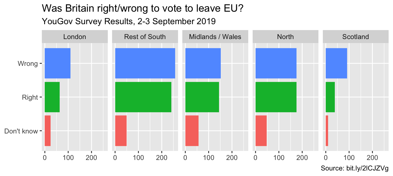
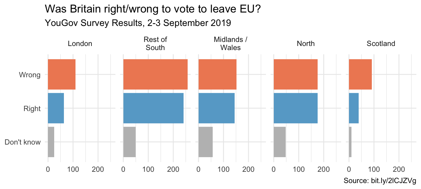
Use better colors
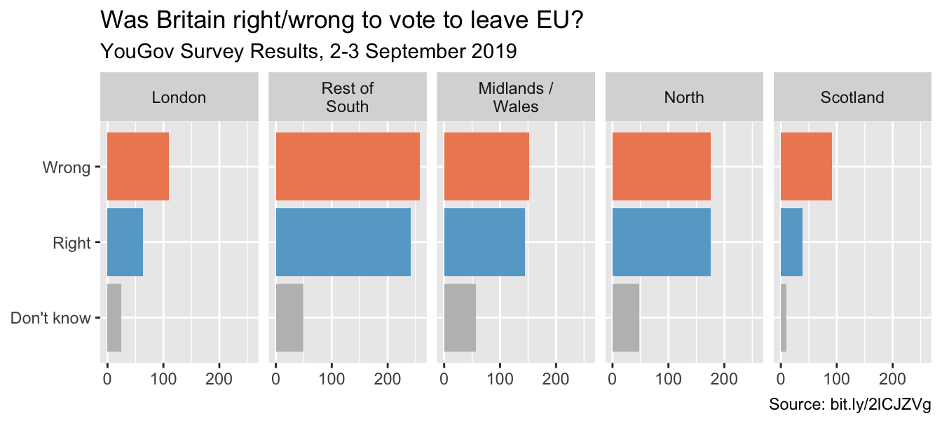
ggplot(brexit, aes(y = opinion, fill = opinion)) +
geom_bar() +
facet_wrap(~region, nrow = 1, labeller = label_wrap_gen(width = 12)) +
guides(fill = "none") +
labs(title = "Was Britain right/wrong to vote to leave EU?",
subtitle = "YouGov Survey Results, 2-3 September 2019",
caption = "Source: bit.ly/2lCJZVg",
x = NULL, y = NULL) +
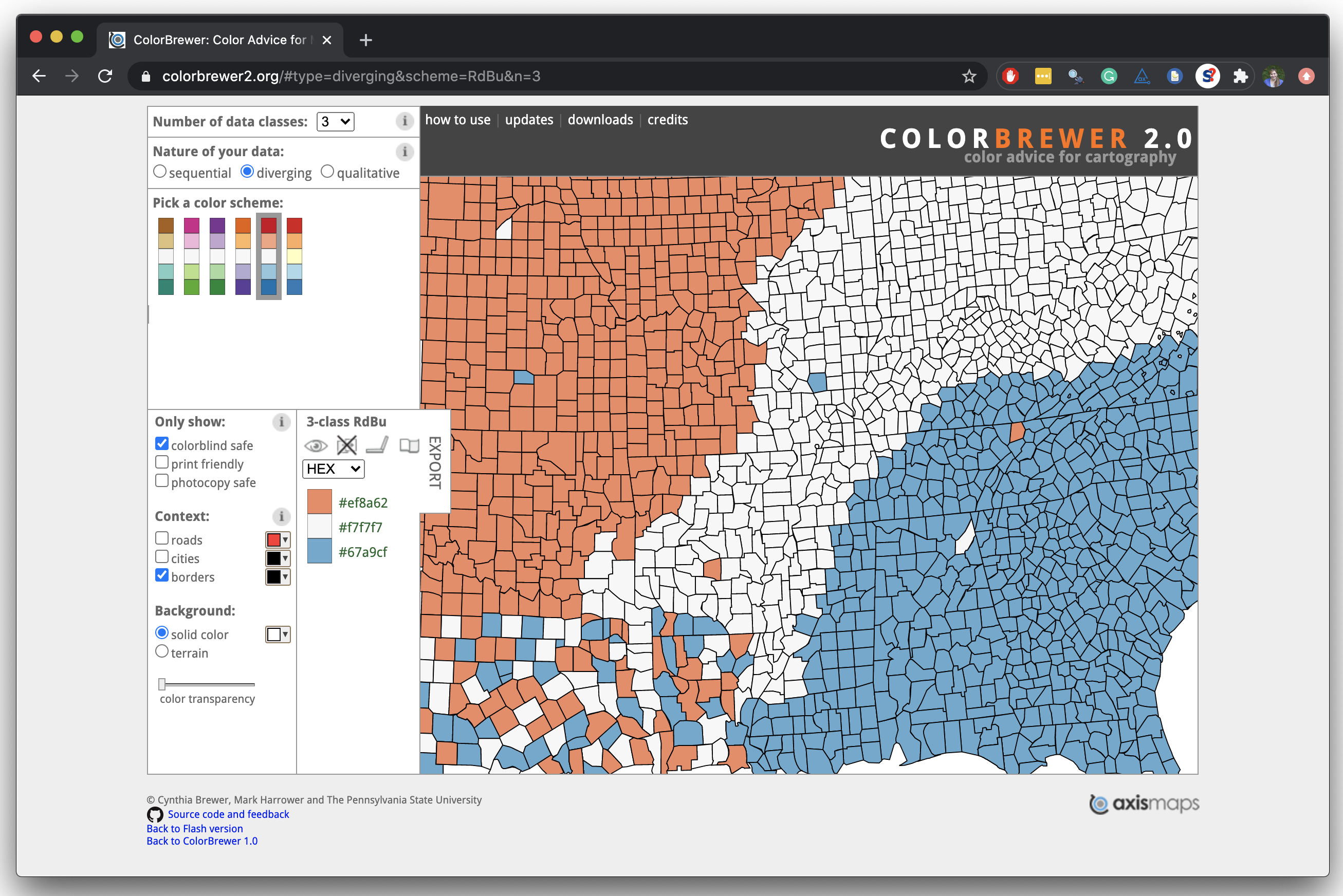
scale_fill_manual(values = c(
"Wrong" = "#ef8a62", #<<
"Right" = "#67a9cf", #<<
"Don't know" = "gray" #<<
))Select theme
ggplot(brexit, aes(y = opinion, fill = opinion)) +
  geom_bar() +
  facet_wrap(~region, nrow = 1, labeller = label_wrap_gen(width = 12)) +
  guides(fill = "none") +
  labs(title = "Was Britain right/wrong to vote to leave EU?",
       subtitle = "YouGov Survey Results, 2-3 September 2019",
       caption = "Source: bit.ly/2lCJZVg",
       x = NULL, y = NULL) +
  scale_fill_manual(values = c("Wrong" = "#ef8a62",
                               "Right" = "#67a9cf",
                               "Don't know" = "gray")) +
  theme_minimal() #<<