---
title: "Moving My Website to Quarto"
author: "Jihong Zhang"
date: "06/25/2023"
date-modified: "`{r} Sys.Date()`"
draft: false
categories:
- quarto
format:
html:
toc: true
toc-expand: 2 # expand to level 2
code-fold: false # hide code by default
code-overflow: wrap
---
::: objectives
## Overview {.unnumbered}
Since June 25, 2023, I start to move my website from hugo/rmarkdown/blogdown/wowchemy to quarto website. It is difficult to explain why I spend so much time on that. Perhaps because some reasons same as other bloggers: 1. Quarto is the next generation of rmarkdown. 2. Quarto is independent with R or Rstudio. 3. Quarto has a clean file tree for website building. 4. Quarto has cleaner command than hugo (i.e., `quarto publish netlify` for publishing website etc.).
This blog serves as a note how I customize quarto website bit by bit. It will not be a comprehensive tutorial (much online resources exists) but contain be some tricks.
:::
## Useful links {#useful-links}
1. Quarto official documentation is always the best place to starts with.
[{fig-align="center"}](https://quarto.org)
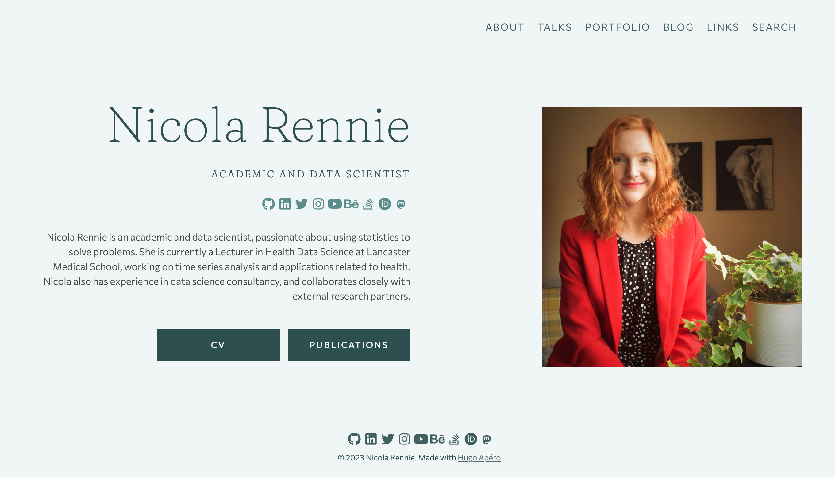
2. Nicola Rennie's blog is very inspiring. Nice font setting and background. I feel like [Hugo Apéro](https://github.com/hugo-apero/) is the best hugo theme in the market.
[{width="320" height="200"}](https://nrennie.rbind.io)
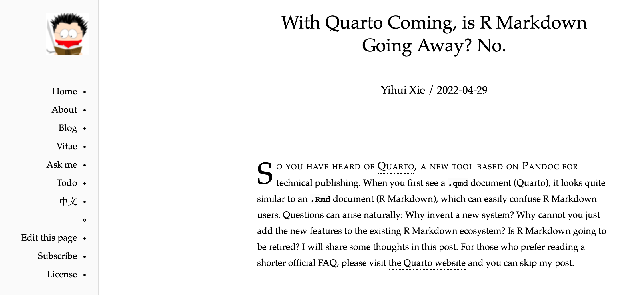
3. Yihui's blog. As the creator of blogdown, Yihui talked about why not transfer to Quarto :P I am a old player of hugo/blogdown, but I am not good at customizing the website from the scratch. Thus, quarto suits my needs very well. For those who is very experienced at JS, hugo is still a better choice.
[{width="320" height="200"}](https://yihui.org/en/2022/04/quarto-r-markdown/#should-you-switch)
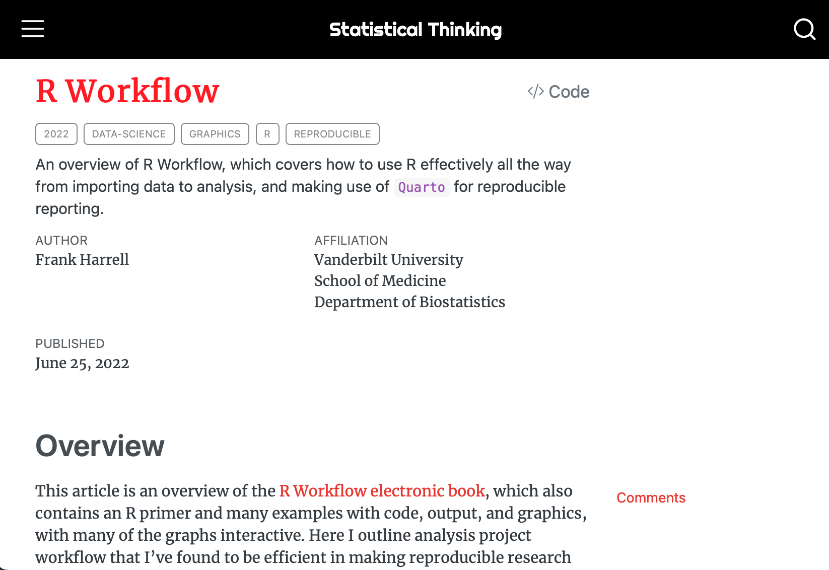
4. Frank Harrel's blog: R workflow.
[{width="320" height="200"}](https://www.fharrell.com/post/rflow/)
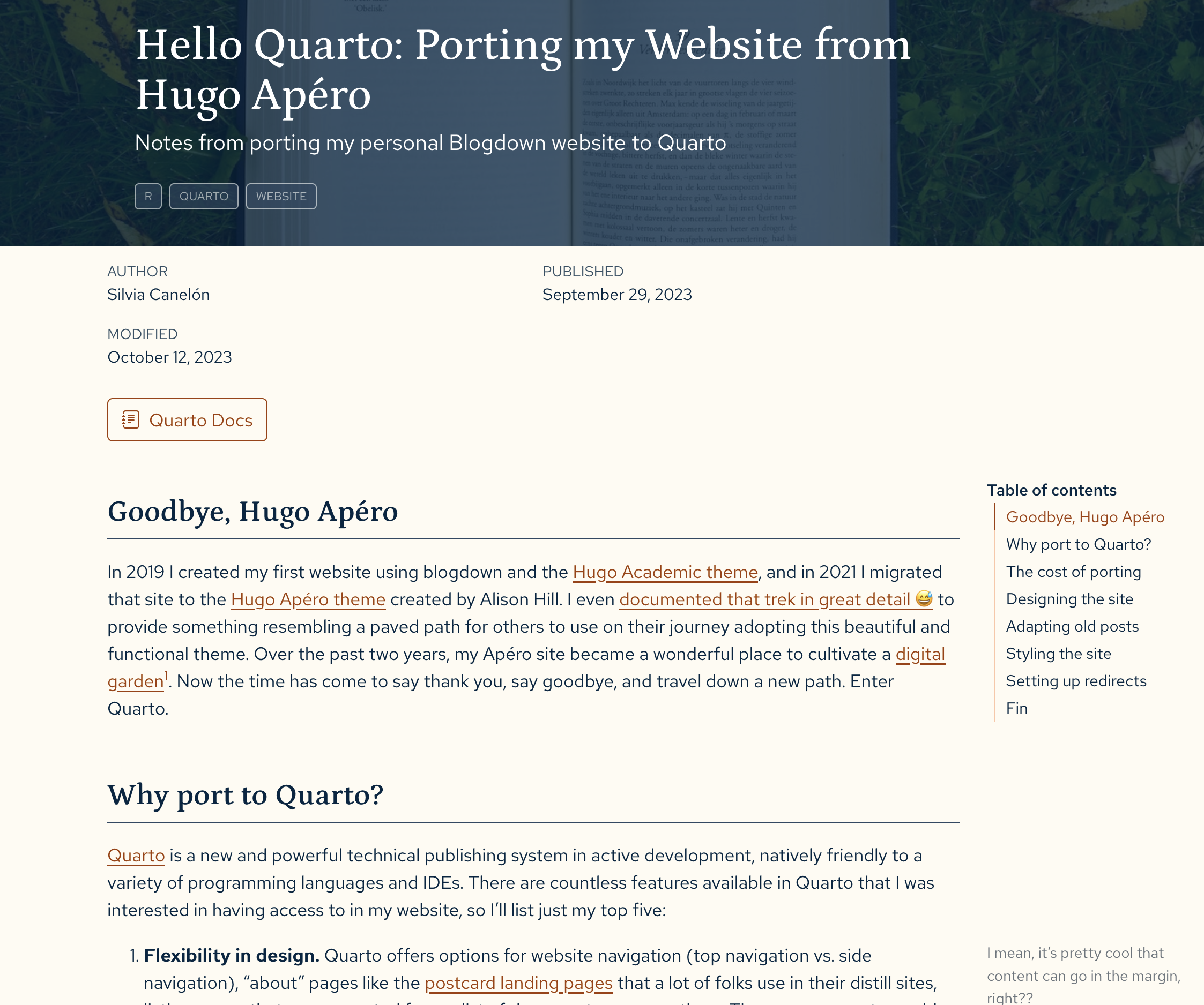
5. Silvia Canelón's blog: Hello Quarto: Porting my Website from Hugo Apéro
[{width="320" height="200"}](https://silviacanelon.com/blog/2023-09-29-hello-quarto/)
## Tricks of Quarto
### Code highlighting
The very first trick is using `format > html > code-fold: true` settings in YAML metadata in *\_quarto.yml* (global) or *.qmd* (local) to hide the code block as `|> Code`, like:
```{r}
library(kableExtra)
kbl(head(iris)) |>
  kable_styling(
    html_font = "Ysabeau Office",
    font_size = 11, full_width = TRUE)
```
Note that the code block can be numbered and added with a left border using `code-block-bg: true` and `code-block-border-left: "#31BAE9"`
Code block now also can be shown with language `#| echo: fenced`. As the code chunk shown below, `{r}` is explicitly presented. I don't hate `#|` as the new way of chuck option setup but when I test the code chuck, I found there is a space between `#|` and option keys. For example, it should be `#| echo: fenced` rather than `#|echo:fenced`. Otherwise, quarto will ignore chunk options.
```{r}
#| echo: fenced
#| eval: false
#| code-fold: false
kableExtra::kbl(head(iris)) |>
kableExtra::kable_styling(
html_font = "Ysabeau Office",
bootstrap_options = c('striped', 'hover'),
font_size = 10, full_width = TRUE)
```
```{python}
#| echo: fenced
#| eval: false
#| code-fold: show
import numpy as np
iris = np.array(iris)
```
### Visual model
Visual model is one of the most appealing feature for Quarto but I am far from a expert in that. It looks like a visual model version of markdown editor (so called WYSIWYM editing, What you see is What you mean) but slightly different. The shortcut of switching between source and visual model is `Cmd` + `Shift` + `F4` (Thanks to Yihui's [JS](https://yihui.org/en/2023/02/key-buttons/) for pretty keyboard styling).
::: callout-note {#keyborad} \## Keyboard Shortcut
You can use Shortcodes [keyboard shortcuts](https://quarto.org/docs/authoring/markdown-basics.html#keyboard-shortcuts) to display keyboard keys. For example, insert `{{{< kbd K >}}}` into Quarto documents displays {{< kbd K >}}. `{{{< kbd Shift-Ctrl-P >}}}` display {{< kbd Shift-Ctrl-P >}} after rendering. :::
I list some most frequently used keyboard for visual mode editing:
(a) Insert Hyperlink: `Cmd` + <kbd>K</kbd>
(b) Add footnote[^1]: `Shift`+`Cmd`+`F7`
(c) Insert picture: `Shift` +`Cmd` +<kbd>I</kbd>
(d) Insert code chunk[^2]: `Alt` +`Cmd` +<kbd>I</kbd>
(e) Edit attribute[^3]: `F4`
[^1]: Like this.
[^2]: By default, it will insert R code chunk. If another language is frequently, use `Tools > Modify keyboard shortcuts > filter 'Insert'`. There should be a place for setting shortcut for other language.
[^3]: Click \`F4\` in any place in the div works.
Please also refer to the [official document](https://quarto.org/docs/visual-editor/vscode/) for more shortcuts and features. One thing I found very interesting is single quote mark `` ` `` . First, I'm not sure how to escape this in visual model. Second, if you close quote before typing content, like \`\`, visual mode will escape both quote marks. However, if you type in left quote mark then content and then close quote (i.e., type in\``something` first, and type closing quote mark), it can quote content correctly.
Last but not least, perhaps just type `/` in rstudio is a better choice as it will pop up a list of elements to choose.
### giscus comments box theme toggle
::: callout-important
not work any more for Quarto 1.5.23
:::
giscus comments box needs some tweaks to switch light/dark based on the toggle switcher of quarto. Please find [Ella's post](https://ellakaye.co.uk/posts/2022-12-11_welcome-quarto/#giscus-comments-box-lightdark-toggle) and [Ella's giscus issue discussion](https://github.com/giscus/giscus/issues/336#issuecomment-1214401296) and [original Javascript](https://github.com/giscus/giscus/issues/336#issuecomment-1214366281).
```{html, filename="giscus-mode-toggle.html"}
<script>
function getGiscusTheme() {
  const quartoTheme = localStorage.getItem("quarto-color-scheme");
  const giscusTheme = quartoTheme === "alternate" ? "dark" : "light";
  return giscusTheme;
}

function setGiscusTheme() {
  function sendMessage(message) {
    const iframe = document.querySelector('iframe.giscus-frame');
    if (!iframe) return;
    iframe.contentWindow.postMessage({ giscus: message }, 'https://giscus.app');
  }
  sendMessage({
    setConfig: {
      theme: getGiscusTheme(),
    },
  });
}

document.addEventListener('DOMContentLoaded', function () {
  const giscusAttributes = {
    "src": "https://giscus.app/client.js",
    "data-repo": "[ENTER REPO HERE]",
    "data-repo-id": "[ENTER REPO ID HERE]",
    "data-category": "[ENTER CATEGORY NAME HERE]",
    "data-category-id": "[ENTER CATEGORY ID HERE]",
    "data-mapping": "pathname",
    "data-strict": "0",
    "data-reactions-enabled": "1",
    "data-emit-metadata": "0",
    "data-input-position": "top",
    "data-theme": getGiscusTheme(),
    "data-lang": "en",
    "crossorigin": "anonymous",
    "async": "",
  };

  // Dynamically create script tag
  const giscusScript = document.createElement("script");
  Object.entries(giscusAttributes).forEach(([key, value]) => giscusScript.setAttribute(key, value));
  document.body.appendChild(giscusScript);

  // Update giscus theme when theme switcher is clicked
  const toggle = document.querySelector('.quarto-color-scheme-toggle');
  if (toggle) {
    toggle.addEventListener('click', setGiscusTheme);
  }
});
</script>
```
```{html, filename="div-giscus.html"}
<div class="giscus">
```
``` yaml
include-in-header: giscus-mode-toggle.html
include-after-body: div-giscus.html
```
::: callout-note
## Note
Remember comment out giscus setting in \_quarto.yml
``` yaml
#comments:
#  giscus:
#    repo: JihongZ/quarto-academic-jihong
```
:::
## Collapsing Button
There is no direct way to display a collapsing button in quarto. I found a way to do that by using bootstrap collapse component. The following code is a simple example of a collapsing button. The button is linked to a collapse component with the id `collapseExample`. When the button is clicked, the collapse component is shown or hidden.
For more details of bootstrap collapse component, please refer to the [official documentation](https://getbootstrap.com/docs/5.3/components/collapse/).
[Link with href]{.btn .btn-primary role="button" title="Here's a tooltip" data-bs-toggle="collapse" href="#collapseExample" aria-expanded="false" aria-controls="collapseExample"}
:::: {#collapseExample .collapse}
::: {.card .card-body}
{{< lipsum 1 >}}
:::
::::
``` {.markdown filename="example.qmd"}
[Link with href]{.btn .btn-primary role="button" title="Here's a tooltip" data-bs-toggle="collapse" href="#collapseExample" aria-expanded="false" aria-controls="collapseExample"}
:::: {#collapseExample .collapse}
::: {.card .card-body}
{{< lipsum 1 >}}
:::
::::
```
### Horizontal Collapsing
``` markdown
[Button with horizontal collapse]{.btn .btn-primary type="button" title="Here's a tooltip" data-bs-toggle="collapse" data-bs-target="#collapseWidthExample" href="#collapseWidthExample" aria-expanded="false" aria-controls="collapseWidthExample"}
::::: {style="min-height: 120px;"}
:::: {#collapseWidthExample .collapse .collapse-horizontal}
::: {.card .card-body style="width: 500px;"}
{{< lipsum 1 >}}
:::
::::
:::::
```
[Button with horizontal collapse]{.btn .btn-primary type="button" title="Here's a tooltip" data-bs-toggle="collapse" href="#collapseWidthExample" aria-expanded="false" aria-controls="collapseWidthExample"}
::::: {style="min-height: 120px;"}
:::: {#collapseWidthExample .collapse .collapse-horizontal}
::: {.card .card-body style="width: 500px;"}
{{< lipsum 1 >}}
:::
::::
:::::
## Dropdown Menu
::: {.dropdown}
[Dropdown button]{.btn .btn-secondary .dropdown-toggle type="button" data-bs-toggle="dropdown" aria-expanded="false"}
::: dropdown-menu
- [Action]{.dropdown-item}
- [Another action]{.dropdown-item}
- [Something else here]{.dropdown-item}
:::
:::
```{=html}
<div class="dropdown">
  <button class="btn btn-secondary dropdown-toggle" type="button" data-bs-toggle="dropdown" aria-expanded="false">
    Table of Contents
  </button>
  <ul class="dropdown-menu">
    <li><a class="dropdown-item" href="#useful-links">Useful Link</a></li>
    <li><a class="dropdown-item" href="#keyborad">Keyboard Shortcut</a></li>
  </ul>
</div>
```
``` html
<div class="dropdown">
<button class="btn btn-secondary dropdown-toggle" type="button" data-bs-toggle="dropdown" aria-expanded="false">
Table of Contents
</button>
<ul class="dropdown-menu">
<li><a class="dropdown-item" href="#useful-links">Useful Link</a></li>
<li><a class="dropdown-item" href="#keyborad">Keyboard Shortcut</a></li>
</ul>
</div>
```

