Data Visualization Using survey Package: Survey Data

Many tutorials online are about general data visualization. This post aims to showcase some tricks for survey data
survey
ggplot2
Author
Affiliation

Jihong Zhang

Published

July 4, 2023

Overview

I am looking for R package than can analyze big data of survey.

1 R package - survey

The survey package in R is designed specifically for analysis of data from complex surveys. It provides functions for descriptive statistics and general regression models for survey data that includes design features such as clustering, stratification, and weighting.

Here are some of the core features of the survey package:

  1. Descriptive Statistics: The package provides functions for computing descriptive statistics on survey data, including mean, total, and quantiles.

  2. Regression Models: The package provides a variety of model fitting functions for binary and multi-category response, count data, survival data, and continuous response.

  3. Design Effects: It allows calculation of design effects for complex survey designs.

  4. Post-stratification and Raking: The package allows for adjusting the sampling weights to match known population margins.

  5. Subpopulation Analysis: It includes functions for correctly handling analyses that are limited to a subset of the population (a subpopulation).

  6. Variance Estimation: The survey package supports multiple methods of variance estimation, including Taylor series linearization, replication weights, and subbootstrap.

Remember that before you can use these functions, you will need to define a survey design object that specifies the features of your survey’s design (like the sampling method, strata, clustering, and weights).

Here’s an example of how you might use it to calculate the mean of a variable from a survey:

⌘+C
# Load the necessary package
library(survey)
Loading required package: grid
Loading required package: Matrix
Loading required package: survival

Attaching package: 'survey'
The following object is masked from 'package:graphics':

    dotchart
⌘+C
mydata <- iris

# Define the survey design
des <- svydesign(ids = ~1, data = mydata, weights = ~Sepal.Length)

# Calculate the mean of a variable
mean <- svymean(~Species, design = des)

mean
                     mean     SE
Speciessetosa     0.28557 0.0356
Speciesversicolor 0.33862 0.0392
Speciesvirginica  0.37581 0.0410
Note
variables Formula or data frame specifying the variables measured in the survey. If NULL, the data argument is used.
ids Formula or data frame specifying cluster ids from largest level to smallest level, ~0 or ~1 is a formula for no clusters.
probs Formula or data frame specifying cluster sampling probabilities

Please replace mydata, weight, and variable with your actual data frame, weight column, and the variable you’re interested in, respectively.

Remember, working with survey data can be complex due to the design features of surveys. The survey package in R provides a robust set of tools for dealing with this complexity.

2 An empirical example

The example I used here is a tody data exacted from a real data about eating disorders. The sample size is 500.

The measurement data contains 12 items, each ranging from 0 to 3. The demographic data contains 6 variables: age, gender, race, birthplace, height, weight. The very first thing is to visualize the characteristics of the samples to have a big picture of respondents.

⌘+C
knitr::opts_chunk$set(echo = TRUE, message=FALSE, warnings=FALSE, include = TRUE)
library(here)
library(glue)
library(readr)
library(bruceR)
library(xtable)
library(survey)
library(formattable) # format styles of table 
library(reshape2)
library(tidyverse)
library(ggtext) 
library(kableExtra)
options(knitr.kable.NA = '')
mycolors = c("#4682B4", "#B4464B", "#B4AF46", 
             "#1B9E77", "#D95F02", "#7570B3",
             "#E7298A", "#66A61E", "#B4F60A")
softcolors = c("#B4464B", "#F3DCD4", "#ECC9C7", 
               "#D9E3DA", "#D1CFC0", "#C2C2B4")
mykbl <- function(x, ...){
  kbl(x, digits = 2, ...) |> kable_styling(bootstrap_options = c("striped", "condensed")) }
⌘+C
dataDemo <- read.csv("~/Documents/Projects/website-jihong/posts/2023/2023-07-04-data-visualization-for-survey-data/DataDemo.csv")
dataT4 <- read.csv("~/Documents/Projects/website-jihong/posts/2023/2023-07-04-data-visualization-for-survey-data/DataT4.csv")
datList <- cbind(dataDemo, dataT4)
datList <- datList |> 
  select(colnames(dataDemo), starts_with("EDEQS") & ends_with("T1")) |> 
  select(-EDEQS_T1)
glimpse(datList)
Rows: 500
Columns: 17
$ Age_baseline       <int> 15, 15, 16, 15, 15, 16, 16, 15, 15, 15, 15, 16, 16,…
$ Sex                <chr> "boys", "girls", "boys", "boys", "boys", "boys", "b…
$ Ethnicity_baseline <int> 1, 1, 1, 1, 1, 1, 1, 1, 1, 1, 1, 1, 1, 1, 1, 1, 1, …
$ Origin_baseline    <int> 2, 2, 1, 2, 2, 1, 1, 2, 2, 1, 1, 1, 2, 1, 2, 2, 1, …
$ BMI_avg            <dbl> 15.58863, 25.35745, 34.67057, 30.76086, 26.52223, 2…
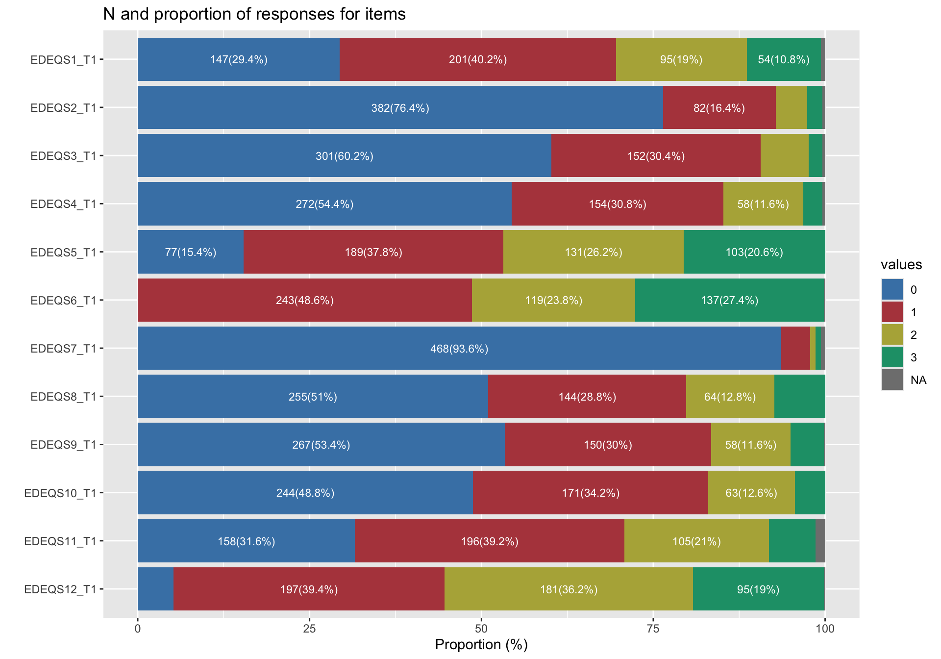
$ EDEQS1_T1          <int> 0, 3, 2, 2, 0, 1, 0, 2, 1, 3, 1, 1, 0, 0, 3, 2, 3, …
$ EDEQS2_T1          <int> 0, 0, 1, 0, 0, 1, 0, 0, 0, 3, 1, 0, 0, 0, 0, 1, 1, …
$ EDEQS3_T1          <int> 1, 1, 2, 0, 0, 0, 2, 0, 0, 0, 0, 0, 0, 0, 0, 2, 0, …
$ EDEQS4_T1          <int> 2, 0, 2, 0, 1, 0, 1, 0, 0, 0, 1, 0, 0, 0, 0, 2, 0, …
$ EDEQS5_T1          <int> 3, 3, 0, 3, 0, 1, 0, 3, 3, 3, 3, 2, 0, 2, 2, 3, 3, …
$ EDEQS6_T1          <int> NA, 3, 3, 3, 3, 3, 3, 3, 3, 3, 3, 3, 3, 3, 3, 3, 3,…
$ EDEQS7_T1          <int> 1, 0, 0, 0, 0, 0, 0, 0, 0, 0, 0, 0, 0, 0, 0, 0, 0, …
$ EDEQS8_T1          <int> 1, 2, 2, 1, 1, 2, 0, 0, 0, 0, 0, 2, 0, 3, 3, 2, 0, …
$ EDEQS9_T1          <int> 1, 0, 3, 3, 1, 0, 0, 0, 1, 2, 2, 1, 0, 0, 1, 1, 1, …
$ EDEQS10_T1         <int> 2, 0, 1, 2, 1, 0, 2, 0, 1, 3, 2, 0, 0, 0, 1, 2, 1, …
$ EDEQS11_T1         <int> 0, 2, 3, 0, 2, 1, 1, NA, 1, 1, 1, 0, 3, 0, 2, 2, 1,…
$ EDEQS12_T1         <int> 0, 2, 3, 3, 3, 3, 1, 3, 3, 3, 3, 1, 3, 3, 2, 3, 3, …

2.1 Descriptive statistics

We can use multiple R tools for descriptive statistics. bruceR is one of them.

⌘+C
datList |> 
  bruceR::Freq(varname = "Sex")
Frequency Statistics:
───────────────
         N    %
───────────────
boys   150 30.0
girls  350 70.0
───────────────
Total N = 500
⌘+C
freqTblVars = c("Sex", "Ethnicity_baseline", "Origin_baseline")
freqTable <- function(tbl, var) {
  tbl |> as.data.frame() |> 
    tibble::rownames_to_column("Levels") |> 
    dplyr::mutate(Variable = var)
}
freqTableComb = NULL
for (var in freqTblVars) {
  tbl = bruceR::Freq(datList, varname = var)
  freqTableComb = rbind(freqTableComb, freqTable(tbl = tbl, var = var))
  freqTableComb <- freqTableComb |> 
    relocate("Variable")
}
Frequency Statistics:
───────────────
         N    %
───────────────
boys   150 30.0
girls  350 70.0
───────────────
Total N = 500
Frequency Statistics:
───────────
     N    %
───────────
1  499 99.8
2    1  0.2
───────────
Total N = 500
Frequency Statistics:
───────────
     N    %
───────────
1  204 40.8
2  296 59.2
───────────
Total N = 500
⌘+C
mykbl(freqTableComb)
Variable Levels N %
Sex boys 150 30.0
Sex girls 350 70.0
Ethnicity_baseline 1 499 99.8
Ethnicity_baseline 2 1 0.2
Origin_baseline 1 204 40.8
Origin_baseline 2 296 59.2

Or we can use survey package for descriptive analysis

⌘+C
library(survey)
Measuremnt <- datList |> 
  select(starts_with("EDEQS")) |> 
  mutate(across(everything(), as.numeric))
dexample = svydesign(ids = ~1,
                     data = Measuremnt)
Warning in svydesign.default(ids = ~1, data = Measuremnt): No weights or
probabilities supplied, assuming equal probability
⌘+C
summary(dexample)
Independent Sampling design (with replacement)
svydesign(ids = ~1, data = Measuremnt)
Probabilities:
   Min. 1st Qu.  Median    Mean 3rd Qu.    Max. 
      1       1       1       1       1       1 
Data variables:
 [1] "EDEQS1_T1"  "EDEQS2_T1"  "EDEQS3_T1"  "EDEQS4_T1"  "EDEQS5_T1" 
 [6] "EDEQS6_T1"  "EDEQS7_T1"  "EDEQS8_T1"  "EDEQS9_T1"  "EDEQS10_T1"
[11] "EDEQS11_T1" "EDEQS12_T1"
⌘+C
## summay statistics for all measurement indicators
vars <- colnames(Measuremnt)
svymean(make.formula(vars), design = dexample, na.rm = TRUE)
               mean     SE
EDEQS1_T1  1.117155 0.0437
EDEQS2_T1  0.320084 0.0302
EDEQS3_T1  0.508368 0.0328
EDEQS4_T1  0.612971 0.0361
EDEQS5_T1  1.508368 0.0449
EDEQS6_T1  1.782427 0.0387
EDEQS7_T1  0.079498 0.0171
EDEQS8_T1  0.767782 0.0432
EDEQS9_T1  0.667364 0.0394
EDEQS10_T1 0.715481 0.0388
EDEQS11_T1 1.020921 0.0408
EDEQS12_T1 1.684100 0.0380
⌘+C
svytotal(make.formula(vars), design = dexample, na.rm = TRUE)
           total      SE
EDEQS1_T1    534 21.5084
EDEQS2_T1    153 14.5122
EDEQS3_T1    243 15.8558
EDEQS4_T1    293 17.4904
EDEQS5_T1    721 22.5463
EDEQS6_T1    852 20.2240
EDEQS7_T1     38  8.2004
EDEQS8_T1    367 20.9404
EDEQS9_T1    319 19.0842
EDEQS10_T1   342 18.8356
EDEQS11_T1   488 20.0628
EDEQS12_T1   805 19.7416

2.2 Stacked barplot for survey data responses

⌘+C
survey = Measuremnt
survey <- survey |> 
  mutate(ID = 1:nrow(survey)) |> 
  mutate(across(starts_with("EDEQS"), \(x) factor(x, levels = 0:3))) |> 
  pivot_longer(starts_with("EDEQS"), names_to = "items", values_to = "values") |> 
  group_by(items) |> 
  dplyr::count(values) |> 
  dplyr::mutate(perc = n/sum(n) * 100)
⌘+C
ggplot(survey) +
  geom_col(aes(y = factor(items, levels = paste0("EDEQS", 12:1, "_T1")),
               x = perc,
               fill = values), 
           position = position_stack(reverse = TRUE)) +
  labs(y = "", x = "Proportion (%)", title = "N and proportion of responses for items") + 
  geom_text(aes(y = factor(items, levels = paste0("EDEQS", 12:1, "_T1")),
                  x = perc, group = items,
                  label = ifelse(n >= 50, paste0(n, "(", round(perc, 1), "%)"), "")), 
              size = 3, color = "white",
              position = position_stack(reverse = TRUE, vjust = 0.5)) +
  scale_fill_manual(values = mycolors)

We can clearly identify item 7 has highest proportion of level 0, and needed to be theoretically justified.

Back to top