
Interactive editor
Interactive code sections look like this. Make changes in the text box and click on the green “Run Code” button to see the results. Sometimes there will be a tab with a hint or solution.
- Run selected code:
- macOS: ⌘ + ↩︎/Return
- Windows/Linux: Ctrl + ↩︎/Enter
- To run the entire code cell, you can simply click the “Run code” button, or use the keyboard shortcut:
- Shift + ↩︎
If you’re curious how this works, each interactive code section uses the amazing {quarto-webr} package to run R directly in your browser.
CautionSet Up
Overview
Terminology
- Univariate data analysis - distribution of single variable
- Bivariate data analysis - relationship between two variables
- Multivariate data analysis - relationship between many variables at once, usually focusing on the relationship between two while conditioning for others
- Numerical variables can be classified as continuous or discrete based on whether or not the variable can take on an infinite number of values or only non-negative whole numbers, respectively.
- If the variable is categorical, we can determine if it is ordinal based on whether or not the levels have a natural ordering.
Data: Lending Club
Thousands of loans made through the Lending Club, which is a platform that allows individuals to lend to other individuals
Not all loans are created equal – ease of getting a loan depends on (apparent) ability to pay back the loan
Data includes loans made, these are not loan applications
Take a peek at data
library(openintro)
library(tidyverse)
glimpse(loans_full_schema)
Rows: 10,000
Columns: 55
$ emp_title <chr> "global config engineer ", "warehouse…
$ emp_length <dbl> 3, 10, 3, 1, 10, NA, 10, 10, 10, 3, 1…
$ state <fct> NJ, HI, WI, PA, CA, KY, MI, AZ, NV, I…
$ homeownership <fct> MORTGAGE, RENT, RENT, RENT, RENT, OWN…
$ annual_income <dbl> 90000, 40000, 40000, 30000, 35000, 34…
$ verified_income <fct> Verified, Not Verified, Source Verifi…
$ debt_to_income <dbl> 18.01, 5.04, 21.15, 10.16, 57.96, 6.4…
$ annual_income_joint <dbl> NA, NA, NA, NA, 57000, NA, 155000, NA…
$ verification_income_joint <fct> , , , , Verified, , Not Verified, , ,…
$ debt_to_income_joint <dbl> NA, NA, NA, NA, 37.66, NA, 13.12, NA,…
$ delinq_2y <int> 0, 0, 0, 0, 0, 1, 0, 1, 1, 0, 0, 0, 0…
$ months_since_last_delinq <int> 38, NA, 28, NA, NA, 3, NA, 19, 18, NA…
$ earliest_credit_line <dbl> 2001, 1996, 2006, 2007, 2008, 1990, 2…
$ inquiries_last_12m <int> 6, 1, 4, 0, 7, 6, 1, 1, 3, 0, 4, 4, 8…
$ total_credit_lines <int> 28, 30, 31, 4, 22, 32, 12, 30, 35, 9,…
$ open_credit_lines <int> 10, 14, 10, 4, 16, 12, 10, 15, 21, 6,…
$ total_credit_limit <int> 70795, 28800, 24193, 25400, 69839, 42…
$ total_credit_utilized <int> 38767, 4321, 16000, 4997, 52722, 3898…
$ num_collections_last_12m <int> 0, 0, 0, 0, 0, 0, 0, 0, 0, 0, 0, 0, 0…
$ num_historical_failed_to_pay <int> 0, 1, 0, 1, 0, 0, 0, 0, 0, 0, 1, 0, 0…
$ months_since_90d_late <int> 38, NA, 28, NA, NA, 60, NA, 71, 18, N…
$ current_accounts_delinq <int> 0, 0, 0, 0, 0, 0, 0, 0, 0, 0, 0, 0, 0…
$ total_collection_amount_ever <int> 1250, 0, 432, 0, 0, 0, 0, 0, 0, 0, 0,…
$ current_installment_accounts <int> 2, 0, 1, 1, 1, 0, 2, 2, 6, 1, 2, 1, 2…
$ accounts_opened_24m <int> 5, 11, 13, 1, 6, 2, 1, 4, 10, 5, 6, 7…
$ months_since_last_credit_inquiry <int> 5, 8, 7, 15, 4, 5, 9, 7, 4, 17, 3, 4,…
$ num_satisfactory_accounts <int> 10, 14, 10, 4, 16, 12, 10, 15, 21, 6,…
$ num_accounts_120d_past_due <int> 0, 0, 0, 0, 0, 0, 0, NA, 0, 0, 0, 0, …
$ num_accounts_30d_past_due <int> 0, 0, 0, 0, 0, 0, 0, 0, 0, 0, 0, 0, 0…
$ num_active_debit_accounts <int> 2, 3, 3, 2, 10, 1, 3, 5, 11, 3, 2, 2,…
$ total_debit_limit <int> 11100, 16500, 4300, 19400, 32700, 272…
$ num_total_cc_accounts <int> 14, 24, 14, 3, 20, 27, 8, 16, 19, 7, …
$ num_open_cc_accounts <int> 8, 14, 8, 3, 15, 12, 7, 12, 14, 5, 8,…
$ num_cc_carrying_balance <int> 6, 4, 6, 2, 13, 5, 6, 10, 14, 3, 5, 3…
$ num_mort_accounts <int> 1, 0, 0, 0, 0, 3, 2, 7, 2, 0, 2, 3, 3…
$ account_never_delinq_percent <dbl> 92.9, 100.0, 93.5, 100.0, 100.0, 78.1…
$ tax_liens <int> 0, 0, 0, 1, 0, 0, 0, 0, 0, 0, 0, 0, 0…
$ public_record_bankrupt <int> 0, 1, 0, 0, 0, 0, 0, 0, 0, 0, 1, 0, 0…
$ loan_purpose <fct> moving, debt_consolidation, other, de…
$ application_type <fct> individual, individual, individual, i…
$ loan_amount <int> 28000, 5000, 2000, 21600, 23000, 5000…
$ term <dbl> 60, 36, 36, 36, 36, 36, 60, 60, 36, 3…
$ interest_rate <dbl> 14.07, 12.61, 17.09, 6.72, 14.07, 6.7…
$ installment <dbl> 652.53, 167.54, 71.40, 664.19, 786.87…
$ grade <ord> C, C, D, A, C, A, C, B, C, A, C, B, C…
$ sub_grade <fct> C3, C1, D1, A3, C3, A3, C2, B5, C2, A…
$ issue_month <fct> Mar-2018, Feb-2018, Feb-2018, Jan-201…
$ loan_status <fct> Current, Current, Current, Current, C…
$ initial_listing_status <fct> whole, whole, fractional, whole, whol…
$ disbursement_method <fct> Cash, Cash, Cash, Cash, Cash, Cash, C…
$ balance <dbl> 27015.86, 4651.37, 1824.63, 18853.26,…
$ paid_total <dbl> 1999.330, 499.120, 281.800, 3312.890,…
$ paid_principal <dbl> 984.14, 348.63, 175.37, 2746.74, 1569…
$ paid_interest <dbl> 1015.19, 150.49, 106.43, 566.15, 754.…
$ paid_late_fees <dbl> 0, 0, 0, 0, 0, 0, 0, 0, 0, 0, 0, 0, 0…Selected variables
loans <- loans_full_schema %>%
  select(loan_amount, interest_rate, term, grade,
         state, annual_income, homeownership, debt_to_income)
glimpse(loans)
Rows: 10,000
Columns: 8
$ loan_amount <int> 28000, 5000, 2000, 21600, 23000, 5000, 24000, 20000, 20…
$ interest_rate <dbl> 14.07, 12.61, 17.09, 6.72, 14.07, 6.72, 13.59, 11.99, 1…
$ term <dbl> 60, 36, 36, 36, 36, 36, 60, 60, 36, 36, 60, 60, 36, 60,…
$ grade <ord> C, C, D, A, C, A, C, B, C, A, C, B, C, B, D, D, D, F, E…
$ state <fct> NJ, HI, WI, PA, CA, KY, MI, AZ, NV, IL, IL, FL, SC, CO,…
$ annual_income <dbl> 90000, 40000, 40000, 30000, 35000, 34000, 35000, 110000…
$ homeownership <fct> MORTGAGE, RENT, RENT, RENT, RENT, OWN, MORTGAGE, MORTGA…
$ debt_to_income <dbl> 18.01, 5.04, 21.15, 10.16, 57.96, 6.46, 23.66, 16.19, 3…Selected variables
| variable | type | description |
|---|---|---|
loan_amount |
numerical, continuous | Amount of the loan received, in US dollars |
interest_rate |
numerical, continuous | Interest rate on the loan, in an annual percentage |
term |
numerical, discrete | The length of the loan, which is always set as a whole number of months |
grade |
categorical, ordinal | Loan grade, which takes a values A through G and represents the quality of the loan and its likelihood of being repaid |
state |
categorical, not ordinal | US state where the borrower resides |
annual_income |
numerical, continuous | Borrower’s annual income, including any second income, in US dollars |
homeownership |
categorical, not ordinal | Indicates whether the person owns, owns but has a mortgage, or rents |
debt_to_income |
numerical, continuous | Debt-to-income ratio |
Visualizing Continous data
Describing shapes of numerical distributions
- shape:
- skewness: right-skewed, left-skewed, symmetric (skew is to the side of the longer tail)
- modality: unimodal, bimodal, multimodal, uniform
- center: mean (
mean), median (median), mode (not always useful) - spread: range (
range), standard deviation (sd), inter-quartile range (IQR) - unusual observations
Histogram
Histogram
summary(loans$loan_amount) Min. 1st Qu. Median Mean 3rd Qu. Max.
1000 8000 14500 16362 24000 40000 ggplot(loans, aes(x = loan_amount)) +
geom_histogram()`stat_bin()` using `bins = 30`. Pick better value with `binwidth`.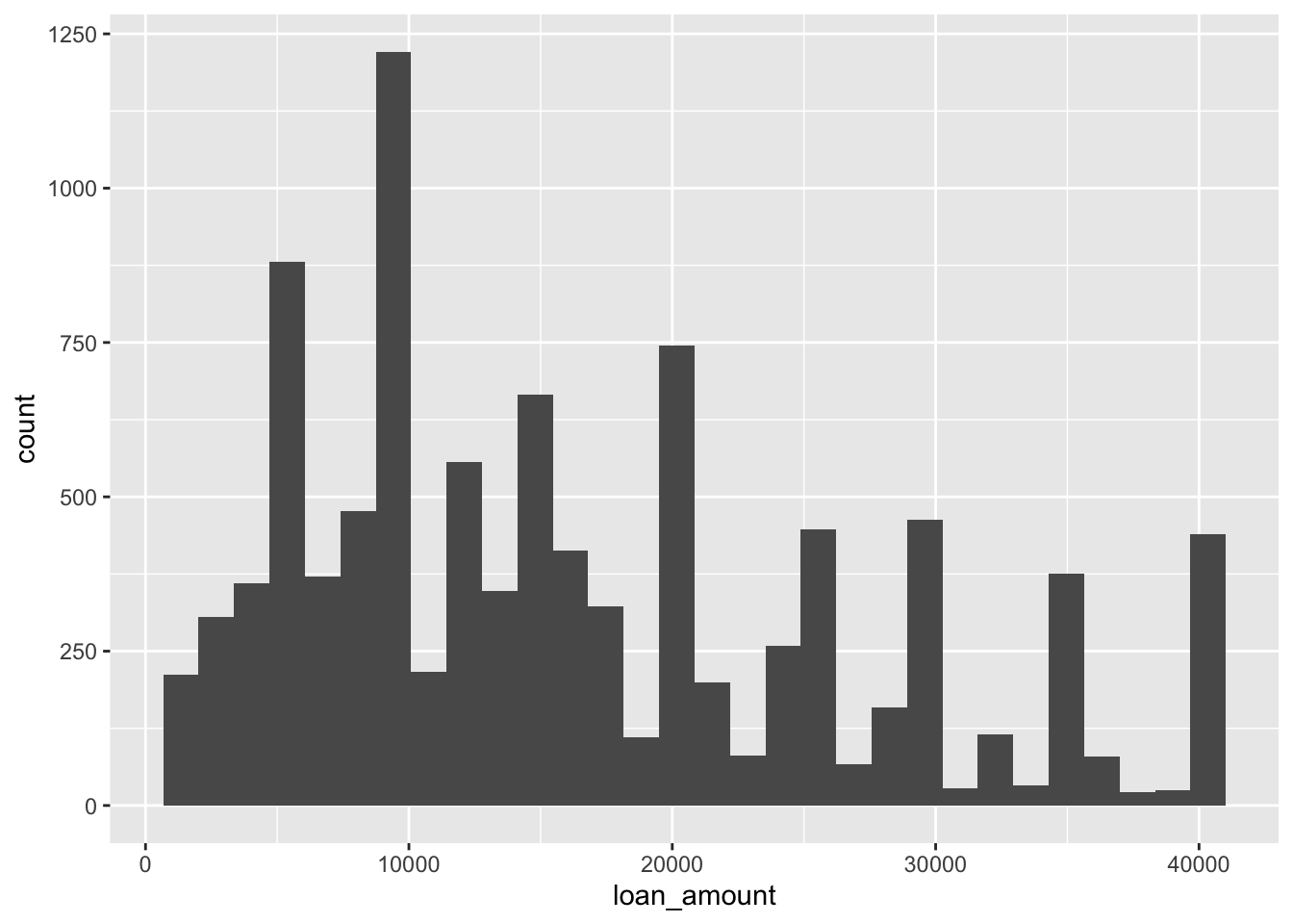
CautionYour turn
Create a histogram for the interest_rate variable.
Histograms and binwidth
ggplot(loans, aes(x = loan_amount)) +
  geom_histogram(binwidth = 1000)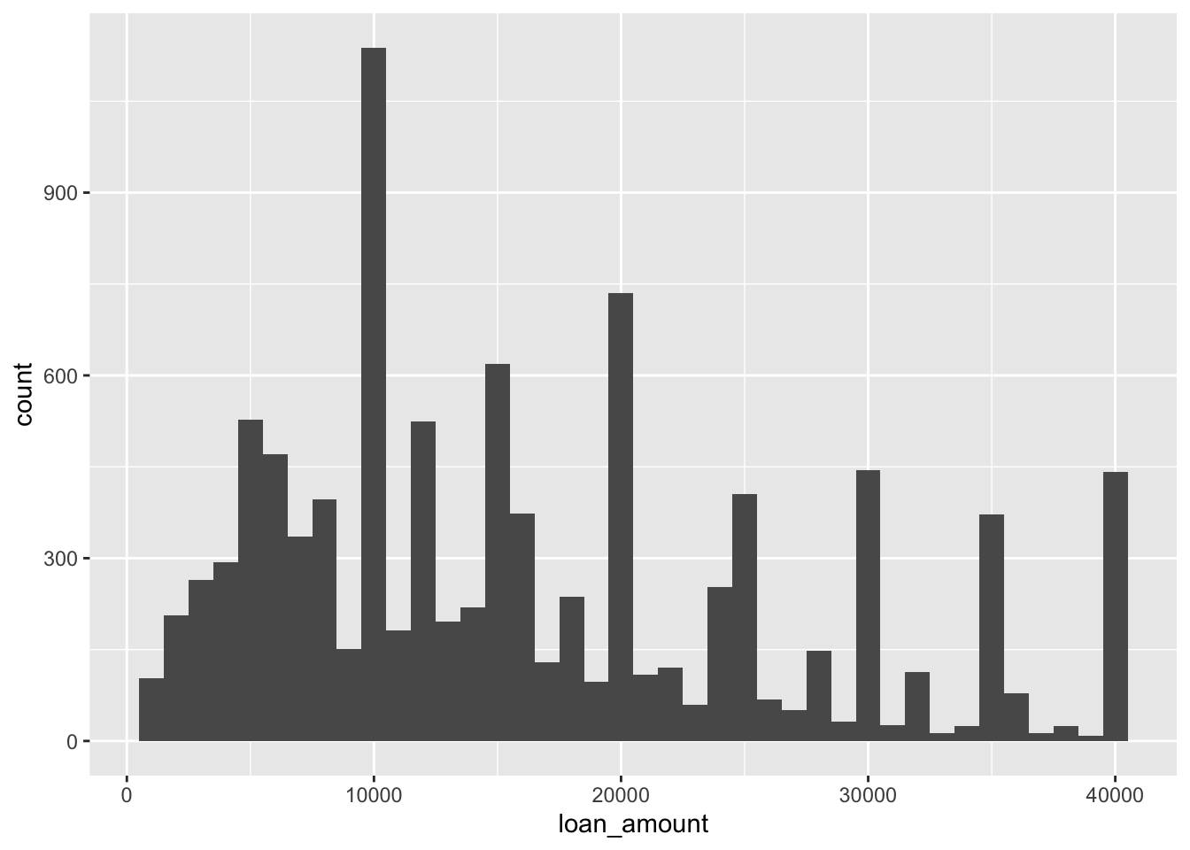
ggplot(loans, aes(x = loan_amount)) +
  geom_histogram(binwidth = 5000)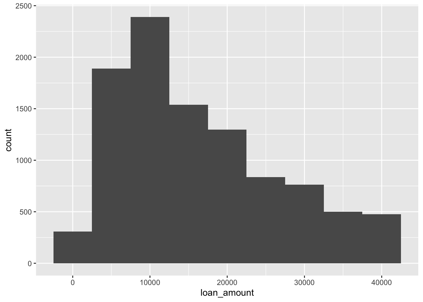
ggplot(loans, aes(x = loan_amount)) +
  geom_histogram(binwidth = 20000)
CautionYour turn
Visualized the histogram and interest_rate and modify the binwidth to \frac{1}{20} of the range of of the interest_rate variable.
ggplot(loans) +
  geom_histogram(aes(x = interest_rate),
                 binwidth = diff(range(loans$interest_rate))/20)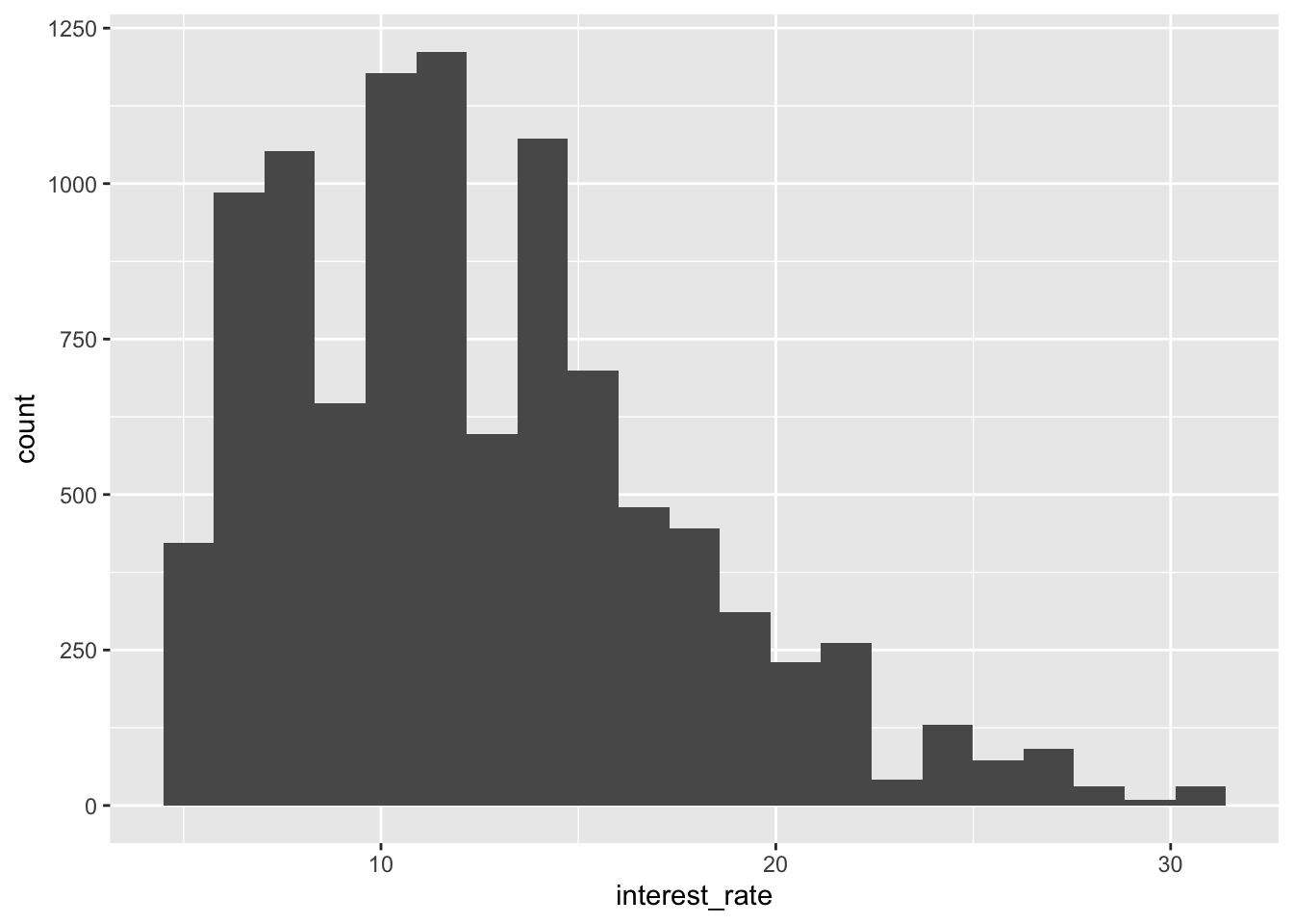
Customizing labels of histograms
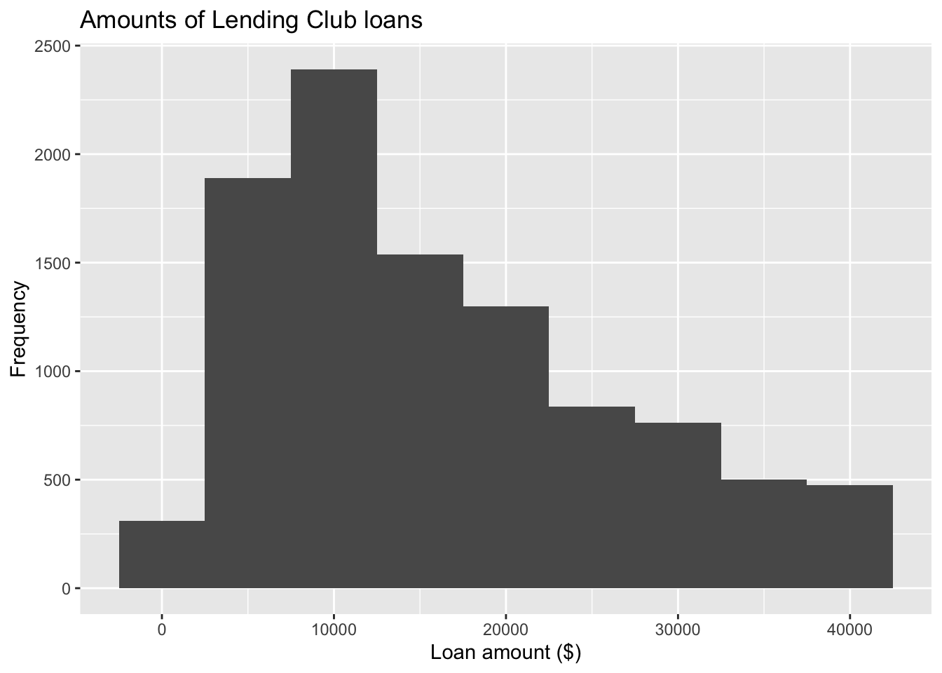
ggplot(loans, aes(x = loan_amount)) +
  geom_histogram(binwidth = 5000) +
1  labs(
    x = "Loan amount ($)",
    y = "Frequency",
    title = "Amounts of Lending Club loans"
) - 1
-
labs()can modify axis, legend, and plot labels. You can also usexlabandylabto modify labels for x and y axis, respectively.
CautionYour turn
Change x-axis label to ‘Interest Rate (%)’.
ggplot(loans) +
  geom_histogram(aes(x = interest_rate)) +
  xlab("Interest Rate (%)")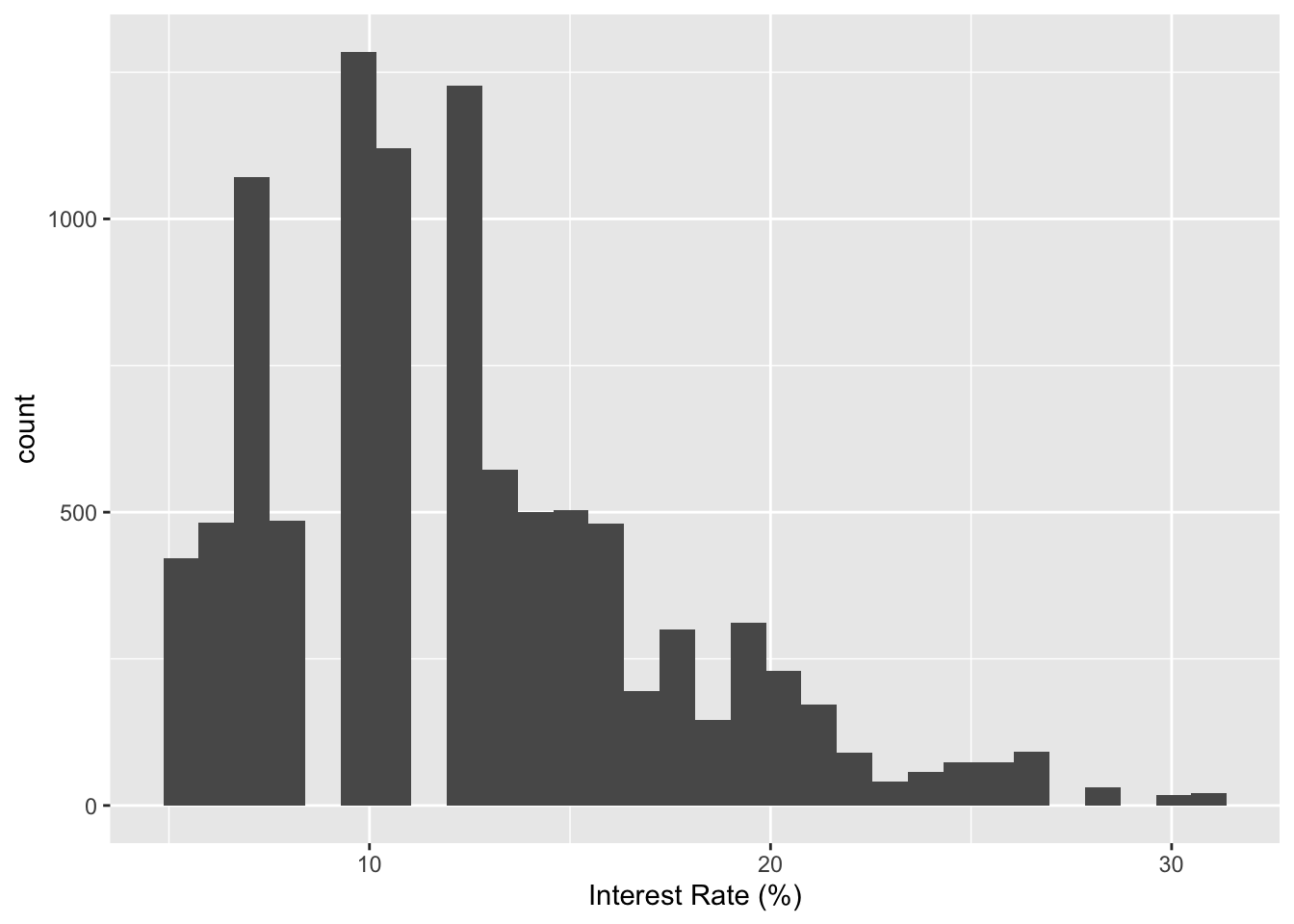
Fill with a categorical variable
- 1
-
Add
homeownershipto fill with certain category - 2
-
Add
alpha=argument to set up transparency for the figure
CautionYour turn
Use grade to highlight histograms with different grades. Set up the the transparency level to 80%.
ggplot(loans) +
  geom_histogram(aes(x = interest_rate, fill = grade), alpha = 0.8) +
  xlab("Interest Rate (%)")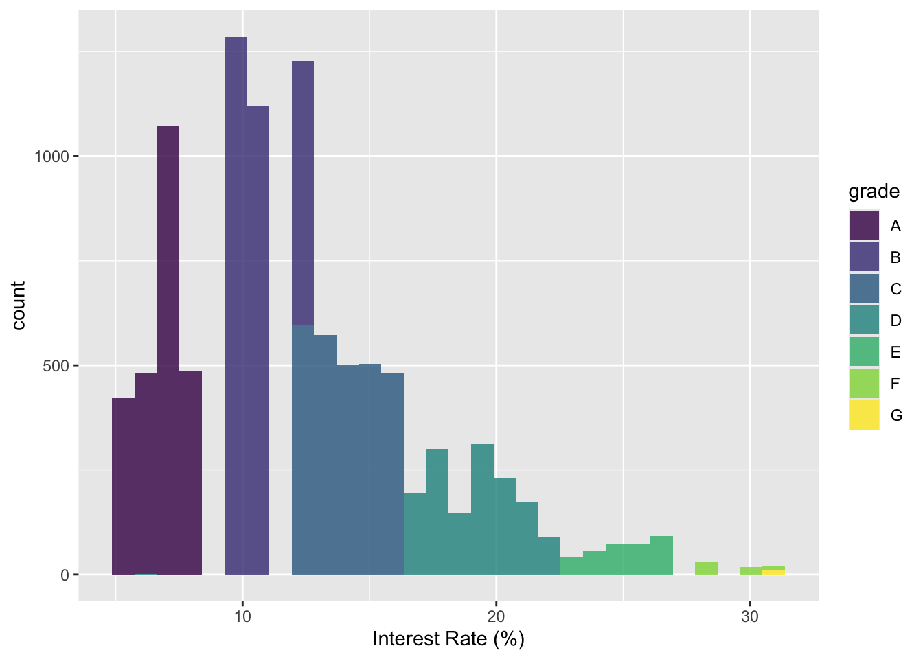
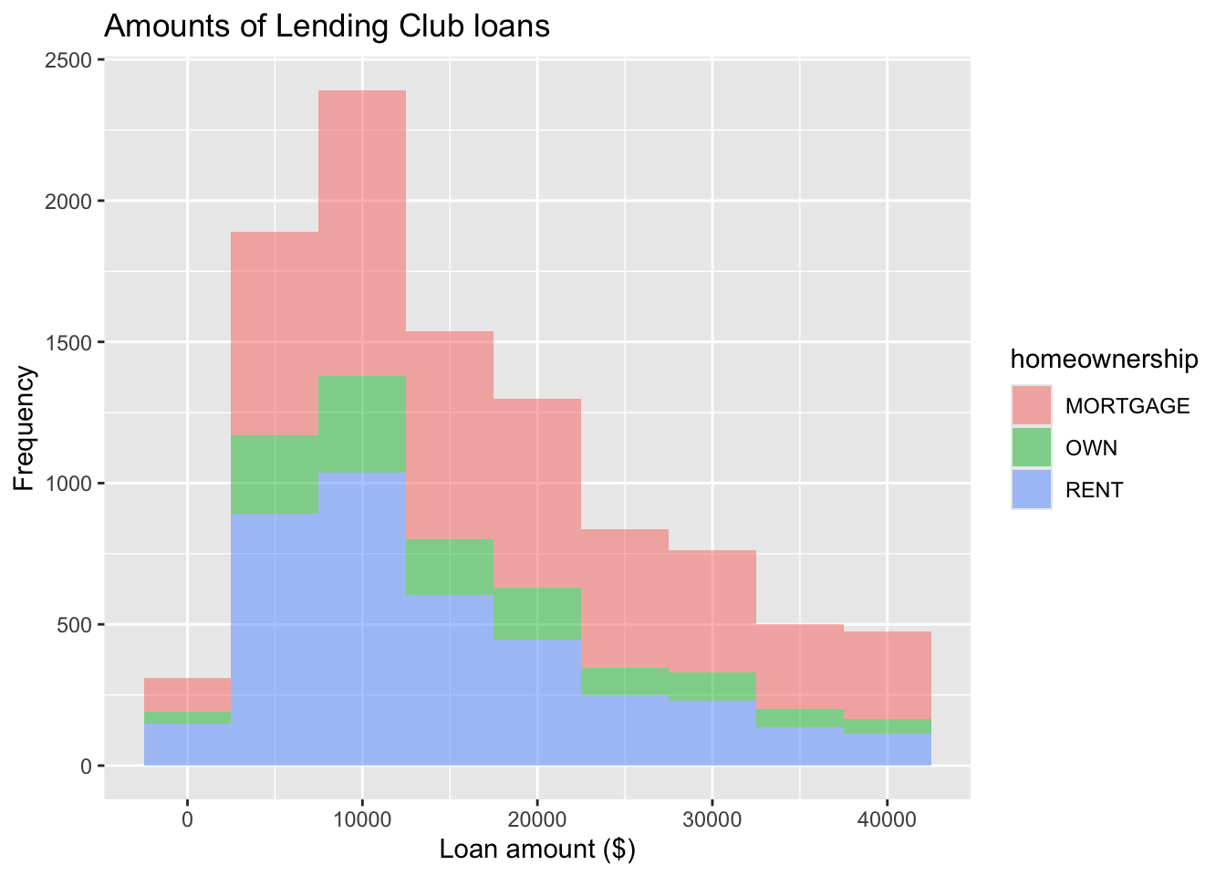
Facet with a categorical variable

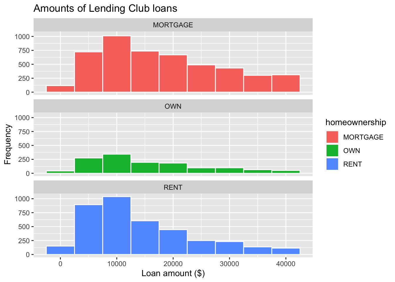
ggplot(loans, aes(x = loan_amount, fill = homeownership)) +
  geom_histogram(binwidth = 5000) +
  labs(
    x = "Loan amount ($)",
    y = "Frequency",
    title = "Amounts of Lending Club loans"
  ) +
  facet_wrap(~ homeownership, nrow = 3) #<<
Color of bar borders
ggplot(loans, aes(x = loan_amount, fill = homeownership)) +
  geom_histogram(binwidth = 5000, color = "white") +
  labs(
    x = "Loan amount ($)",
    y = "Frequency",
    title = "Amounts of Lending Club loans"
  ) +
  facet_wrap(~ homeownership, nrow = 3) #<<
Position of Histogram Bars
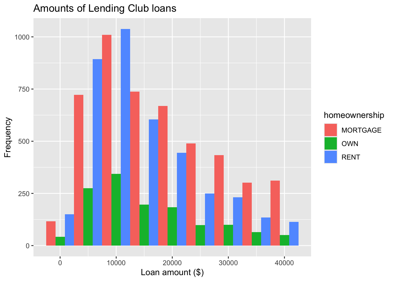
ggplot(loans, aes(x = loan_amount, fill = homeownership)) +
  geom_histogram(binwidth = 5000, position = position_dodge()) +
  labs(
    x = "Loan amount ($)",
    y = "Frequency",
    title = "Amounts of Lending Club loans"
  )
Density plot
Density plot
ggplot(loans, aes(x = loan_amount)) +
  geom_density()
Density plots and adjusting bandwidth
ggplot(loans, aes(x = loan_amount)) +
  geom_density(adjust = 0.5)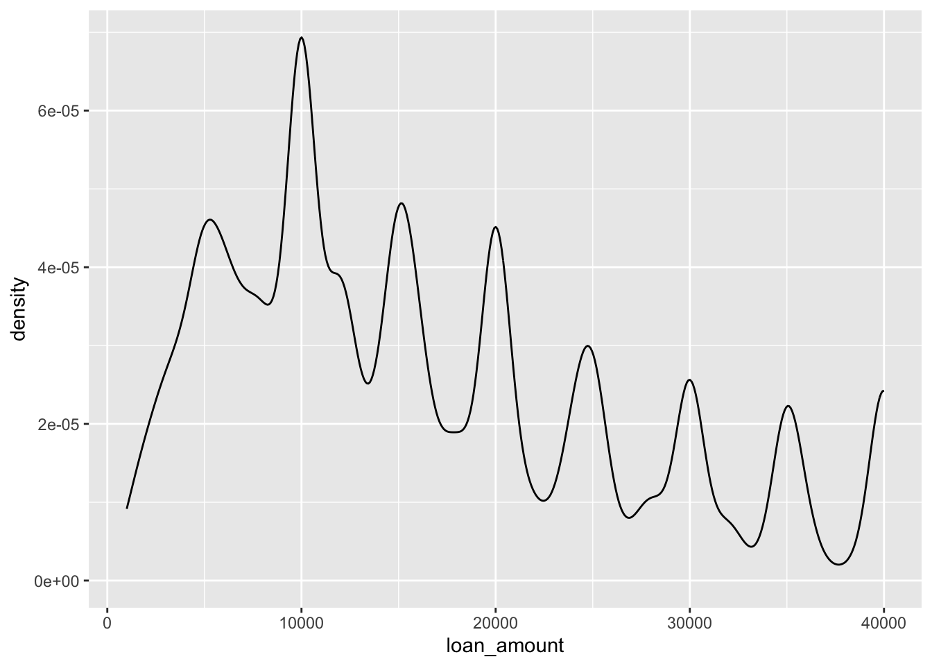
ggplot(loans, aes(x = loan_amount)) +
  geom_density(adjust = 1) # default bandwidth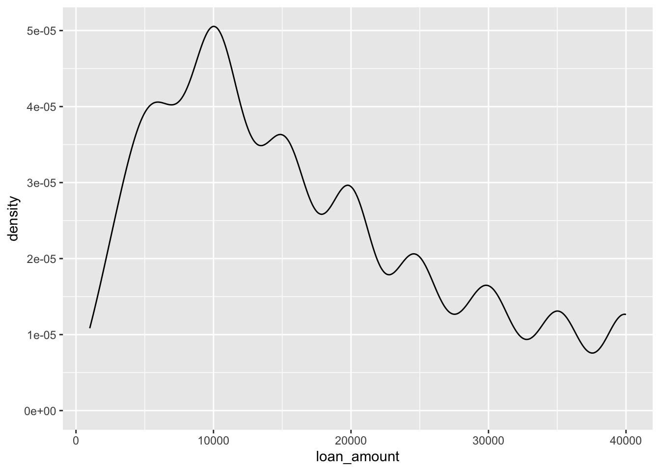
ggplot(loans, aes(x = loan_amount)) +
  geom_density(adjust = 2)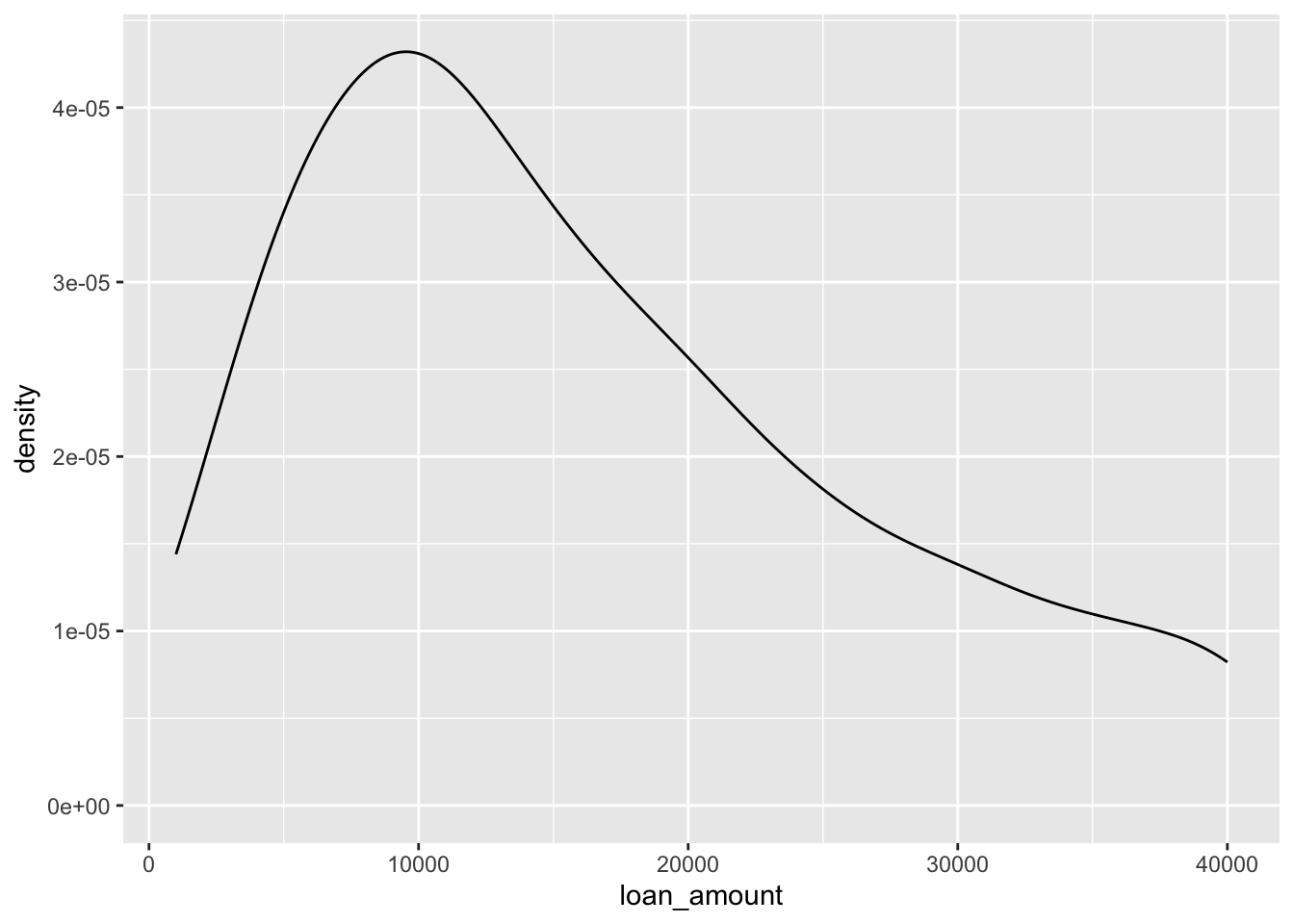
Customizing density plots
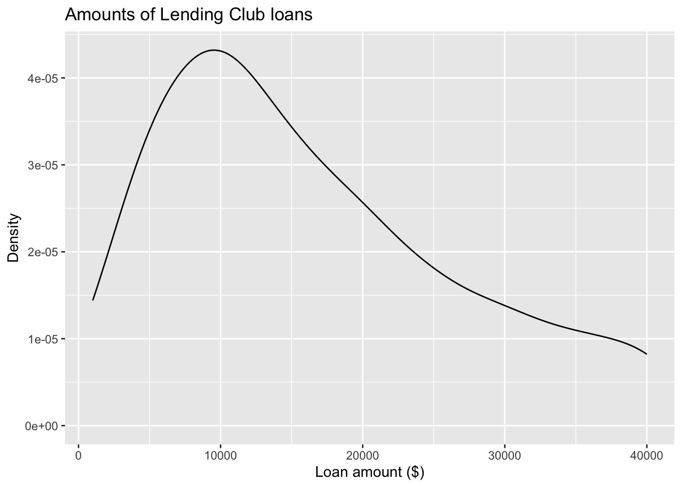
ggplot(loans, aes(x = loan_amount)) +
  geom_density(adjust = 2) +
  labs( #<<
    x = "Loan amount ($)", #<<
    y = "Density", #<<
    title = "Amounts of Lending Club loans" #<<
  ) #<<
Adding a categorical variable
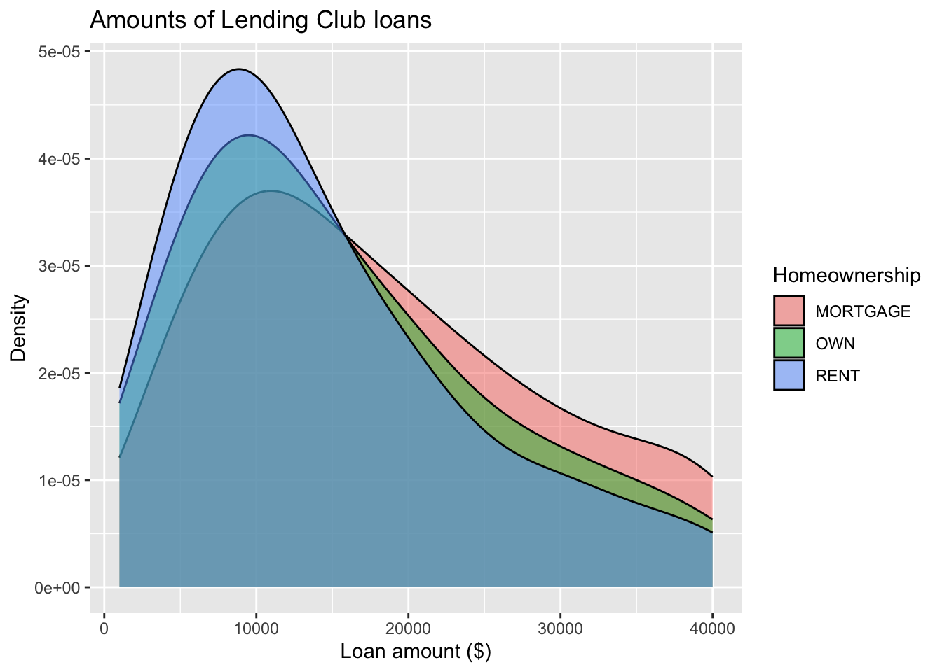
ggplot(loans, aes(x = loan_amount,
                  fill = homeownership)) + #<<
  geom_density(adjust = 2,
               alpha = 0.5) + #<<
  labs(
    x = "Loan amount ($)",
    y = "Density",
    title = "Amounts of Lending Club loans",
    fill = "Homeownership" #<<
  )
Box plot
Box plot
- Boxplot visualises five summary statistics (the median, two hinges and two whiskers), and all “outlying” points individually.
- The lower and upper hinges correspond to the first and third quartiles (the 25th and 75th percentiles).
- The whiskers extend from the hinge to the smallest and largest value no further than 1.5 * IQR from the hinge (where IQR is the inter-quartile range, or distance between the first and third quartiles).
ggplot(loans, aes(x = interest_rate)) +
  geom_boxplot()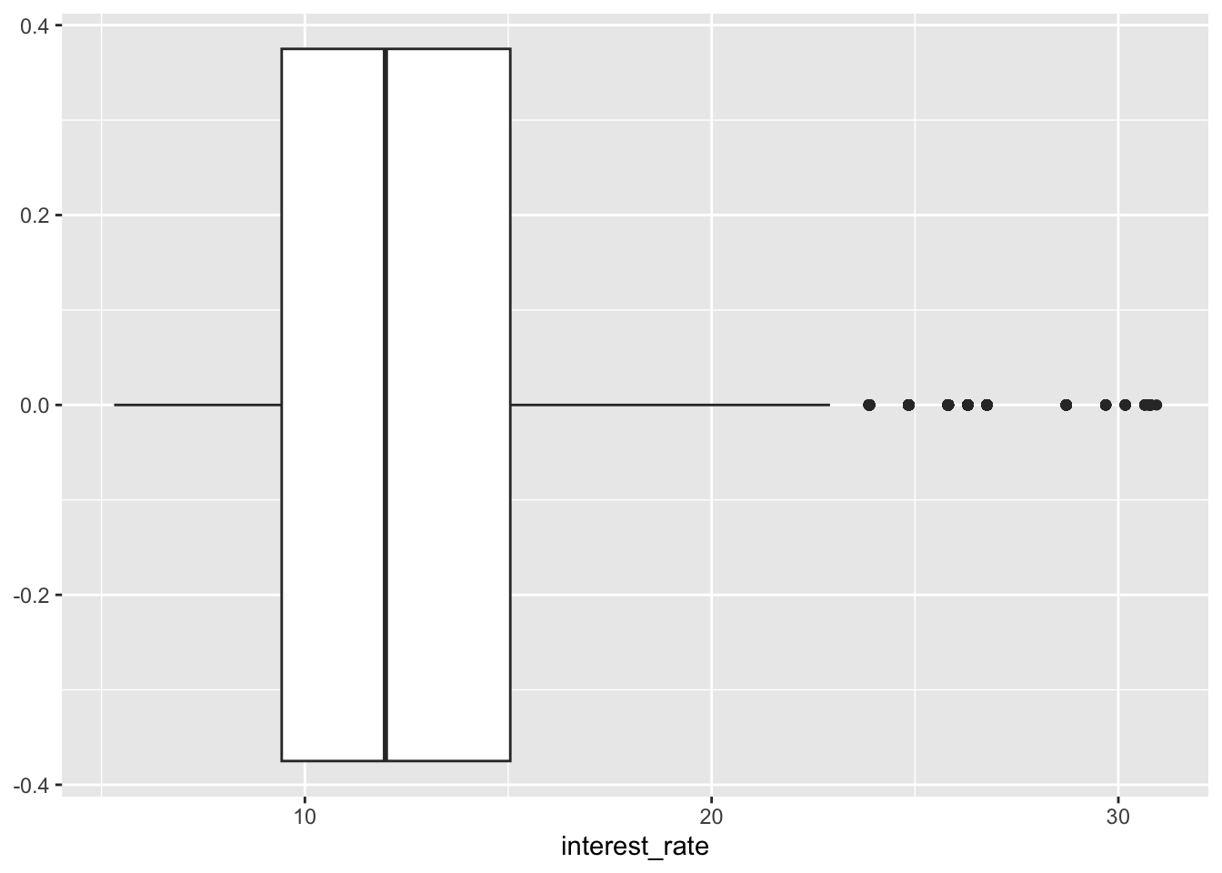
Box plot and outliers
ggplot(loans, aes(x = annual_income)) +
  geom_boxplot()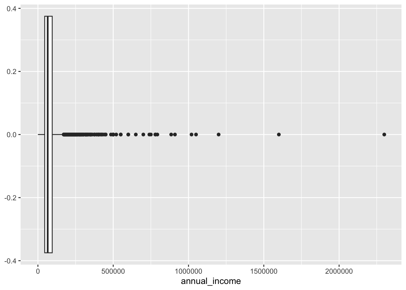
Customizing box plots
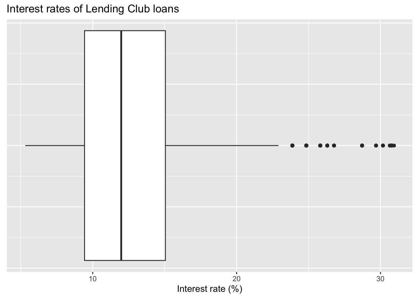
ggplot(loans, aes(x = interest_rate)) +
  geom_boxplot() +
  labs(
    x = "Interest rate (%)",
    y = NULL,
    title = "Interest rates of Lending Club loans"
  ) +
  theme( #<<
    axis.ticks.y = element_blank(), #<<
    axis.text.y = element_blank() #<<
  ) #<<
Adding a categorical variable
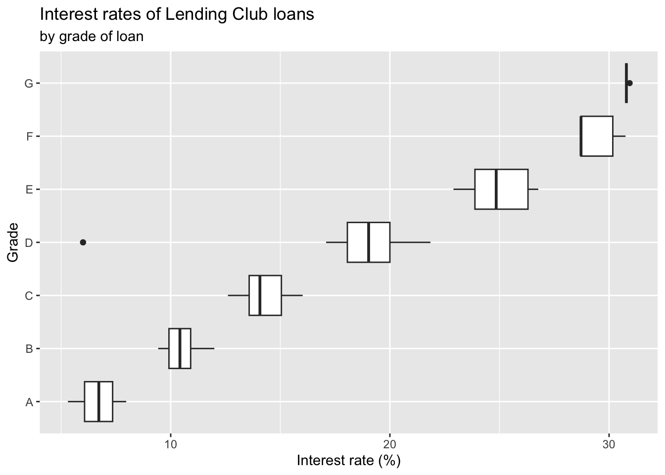
ggplot(loans, aes(x = interest_rate,
                  y = grade)) + #<<
  geom_boxplot() +
  labs(
    x = "Interest rate (%)",
    y = "Grade",
    title = "Interest rates of Lending Club loans",
    subtitle = "by grade of loan" #<<
  )
Relationships numerical variables
Scatterplot
ggplot(loans, aes(x = debt_to_income, y = interest_rate)) +
  geom_point()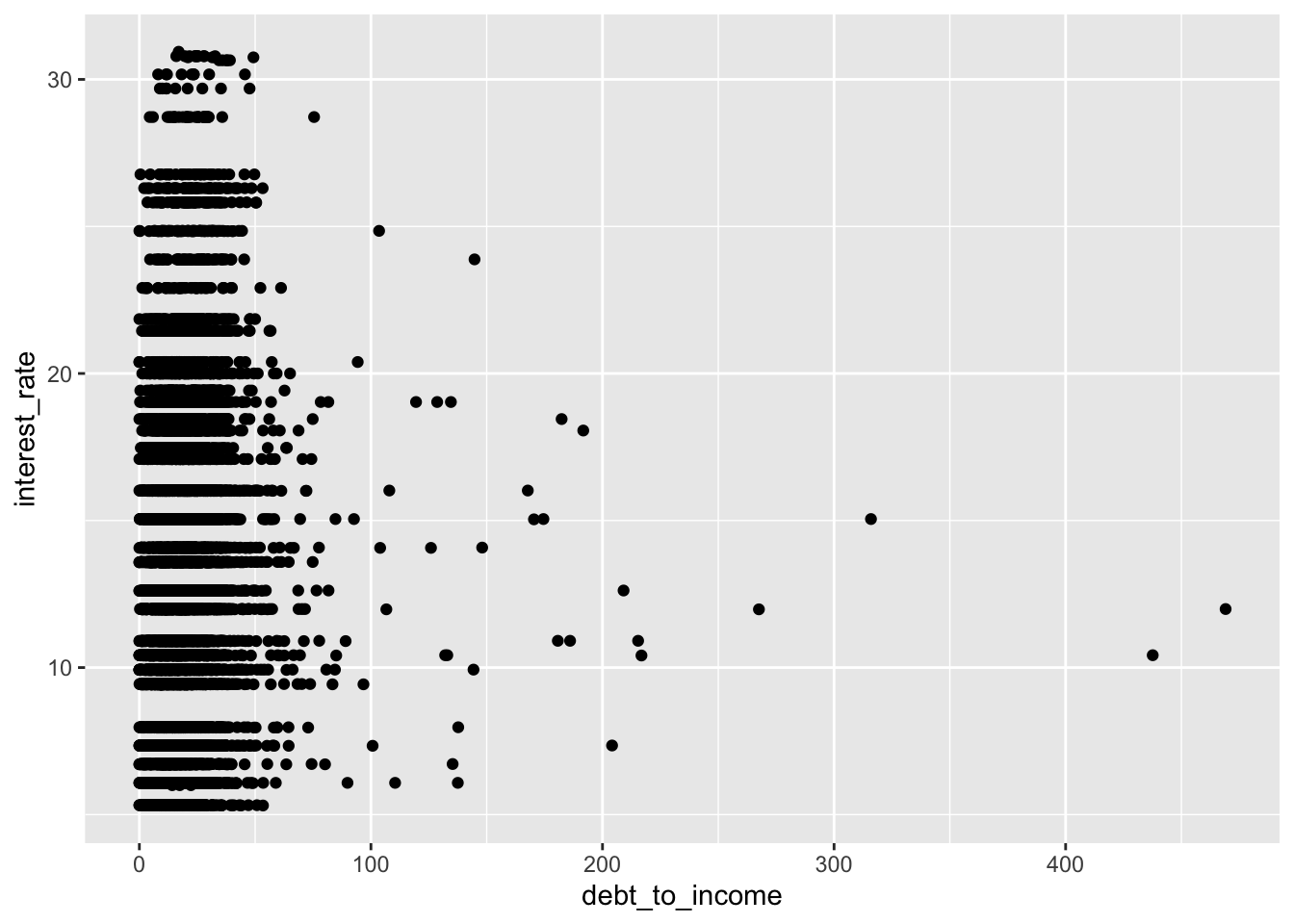
Hex plot
ggplot(loans, aes(x = debt_to_income, y = interest_rate)) +
  geom_hex()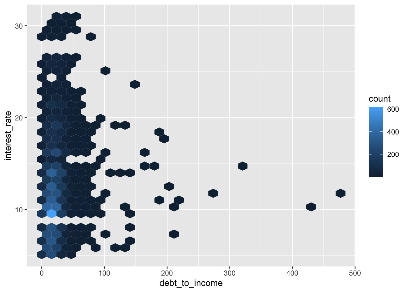
Hex plot
ggplot(loans %>% filter(debt_to_income < 100),
       aes(x = debt_to_income, y = interest_rate)) +
  geom_hex()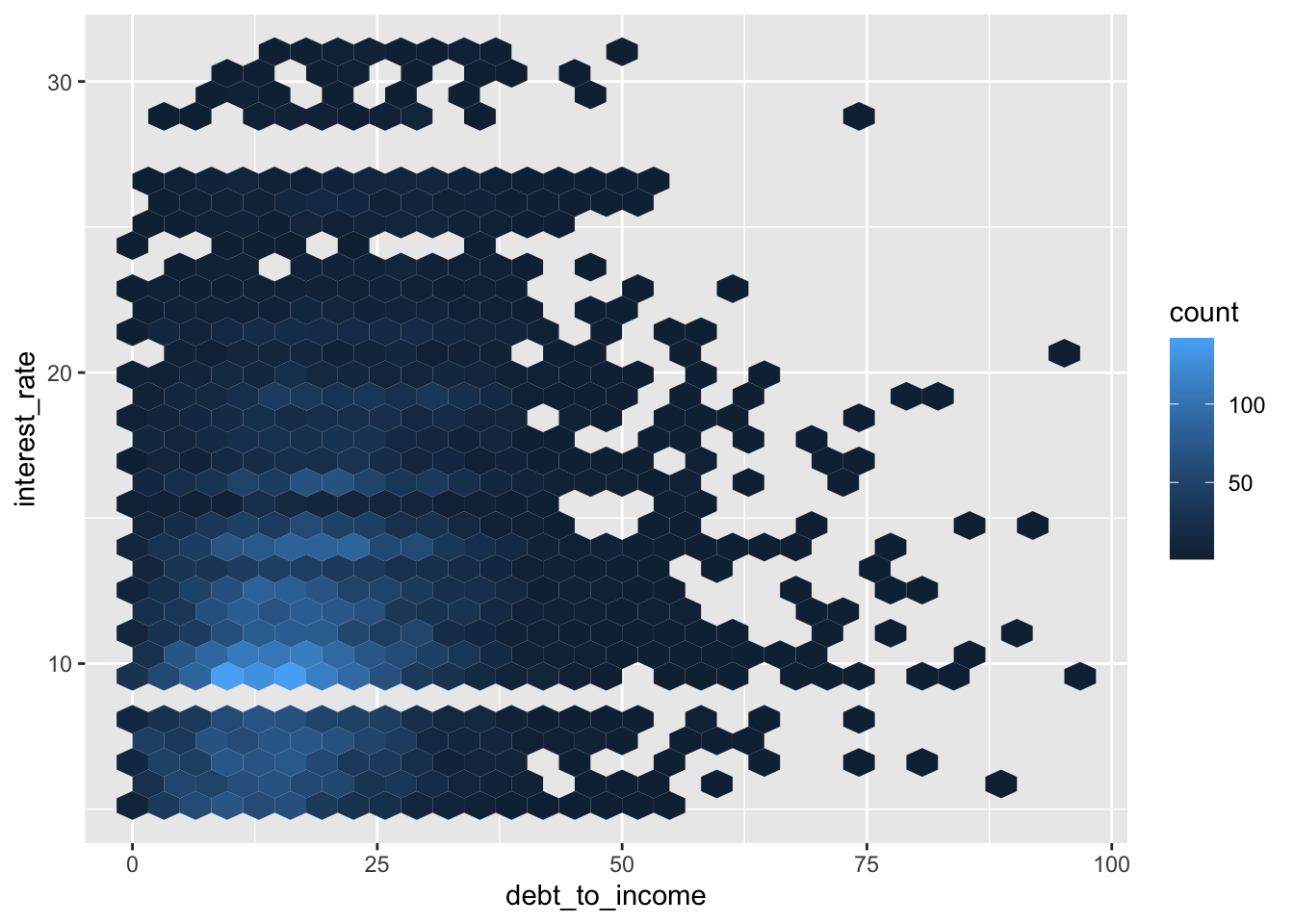
Visualize Categorical Variable
Bar plot
ggplot(loans, aes(x = homeownership)) +
  geom_bar()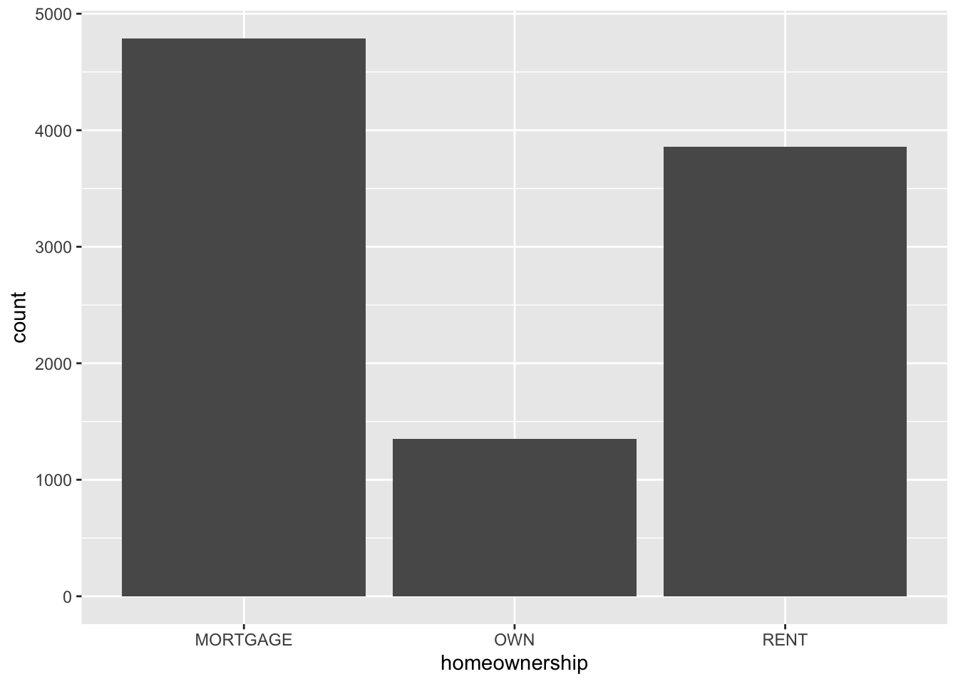
Segmented bar plot
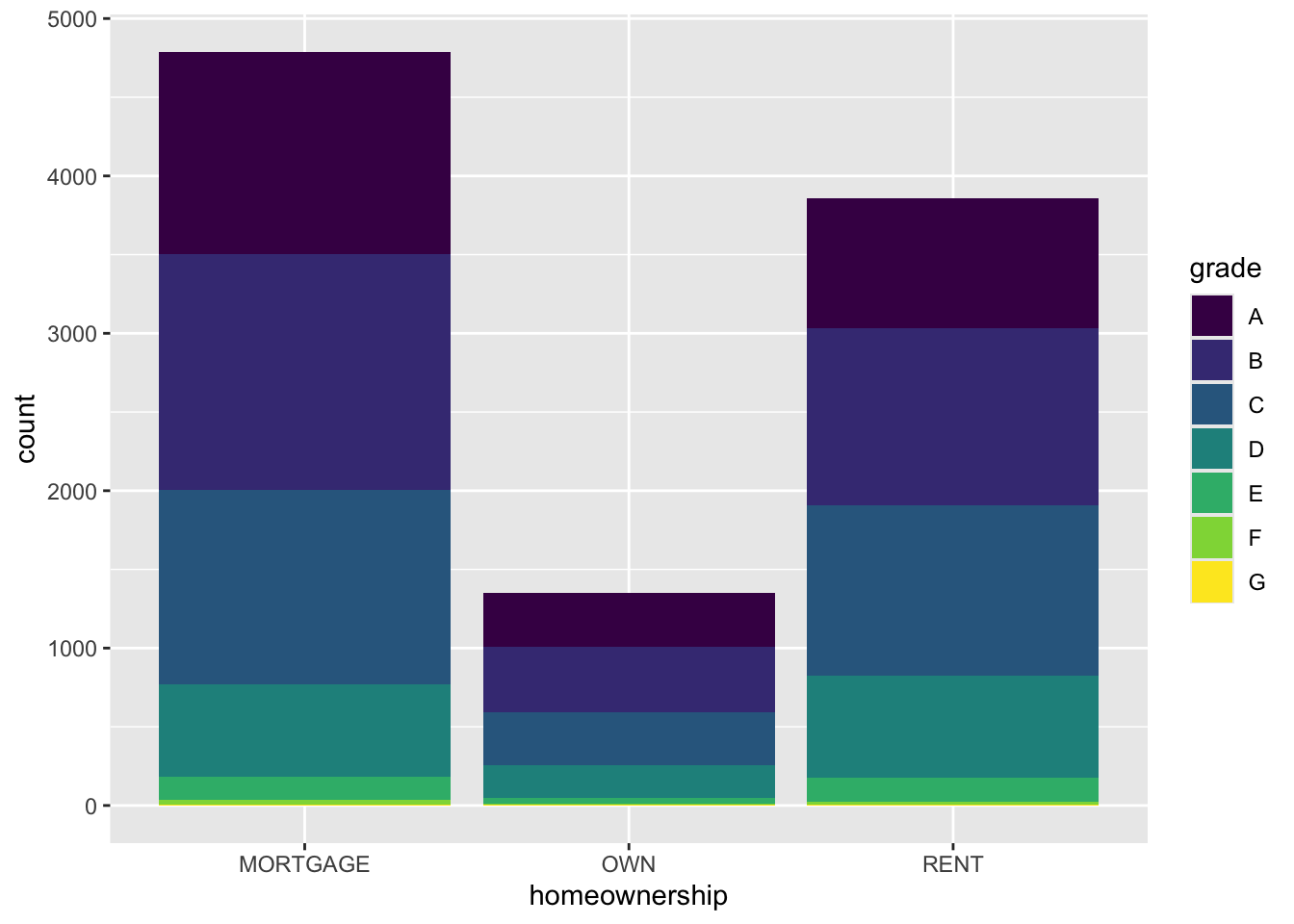
ggplot(loans, aes(x = homeownership,
                  fill = grade)) + #<<
  geom_bar()
Segmented bar plot
ggplot(loans, aes(x = homeownership, fill = grade)) +
  geom_bar(position = "fill") #<<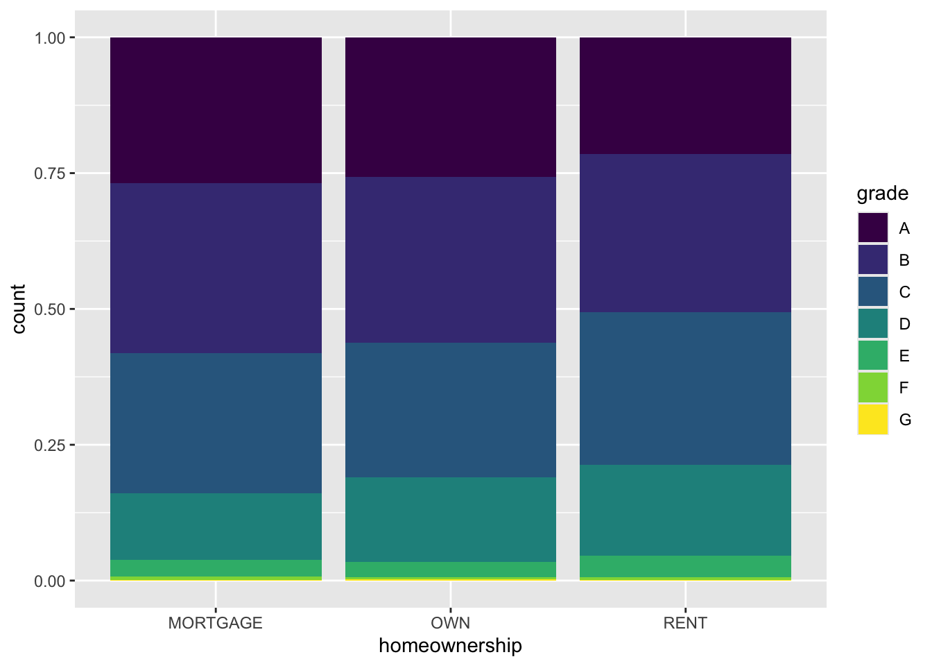
NoteQuestion
Which bar plot is a more useful representation for visualizing the relationship between homeownership and grade?

Customizing bar plots
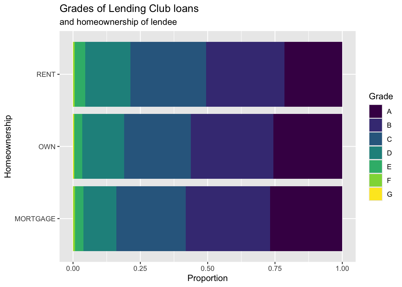
ggplot(loans, aes(y = homeownership, #<<
                  fill = grade)) +
  geom_bar(position = "fill") +
  labs( #<<
    x = "Proportion", #<<
    y = "Homeownership", #<<
    fill = "Grade", #<<
    title = "Grades of Lending Club loans", #<<
    subtitle = "and homeownership of lendee" #<<
  ) #<<
Relationships between numerical and categorical variables
Already talked about…
- Colouring and faceting histograms and density plots
- Side-by-side box plots
Violin plots
ggplot(loans, aes(x = homeownership, y = loan_amount)) +
  geom_violin()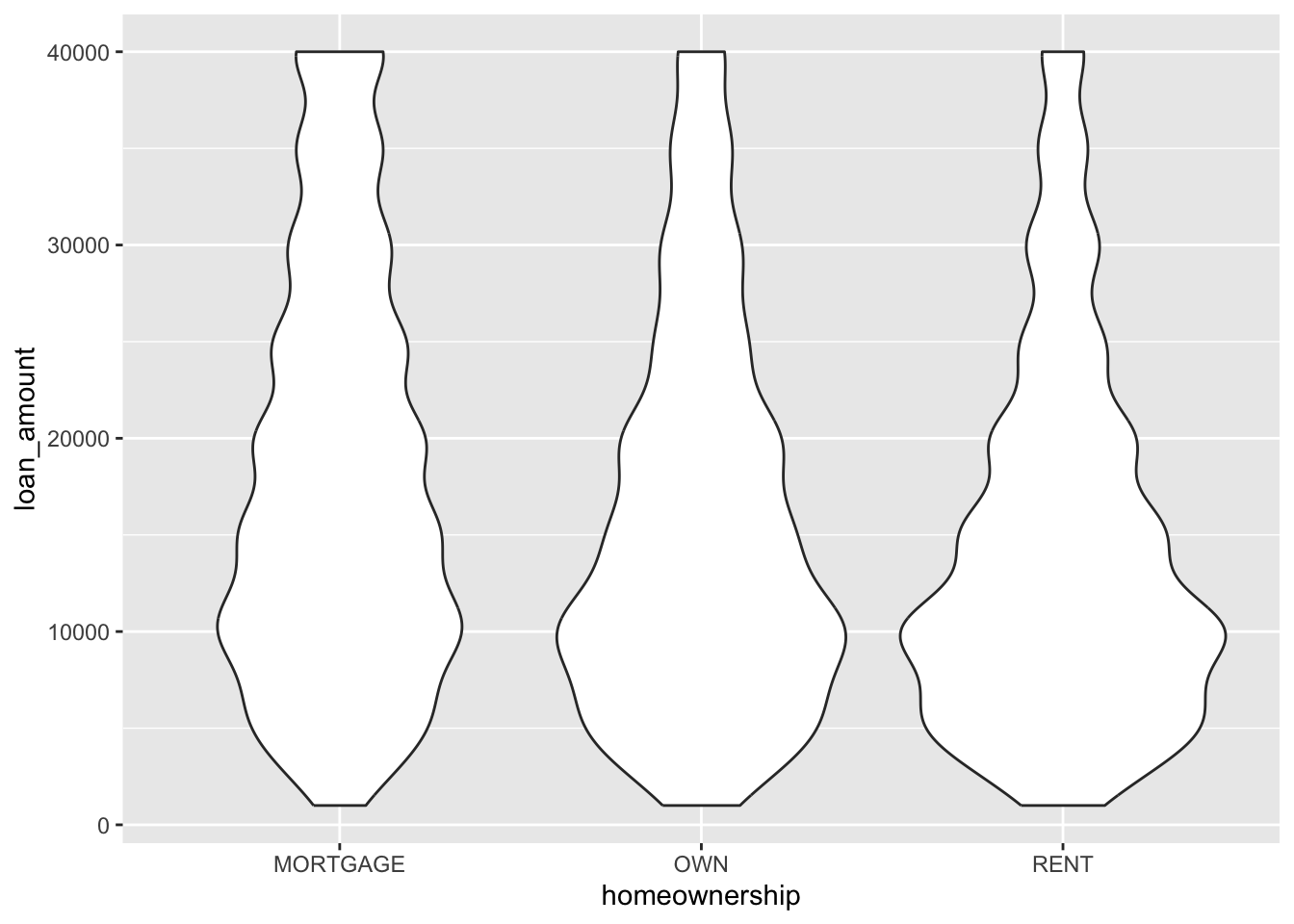
Ridge plots
library(ggridges)
ggplot(loans, aes(x = loan_amount, y = grade, fill = grade, color = grade)) +
  geom_density_ridges(alpha = 0.5)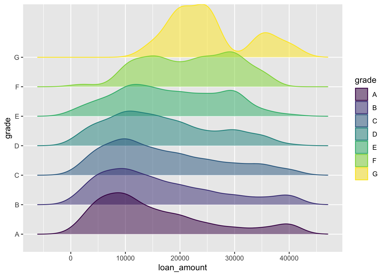
Designing effective visualizations
Keep it simple
Use color to draw attention
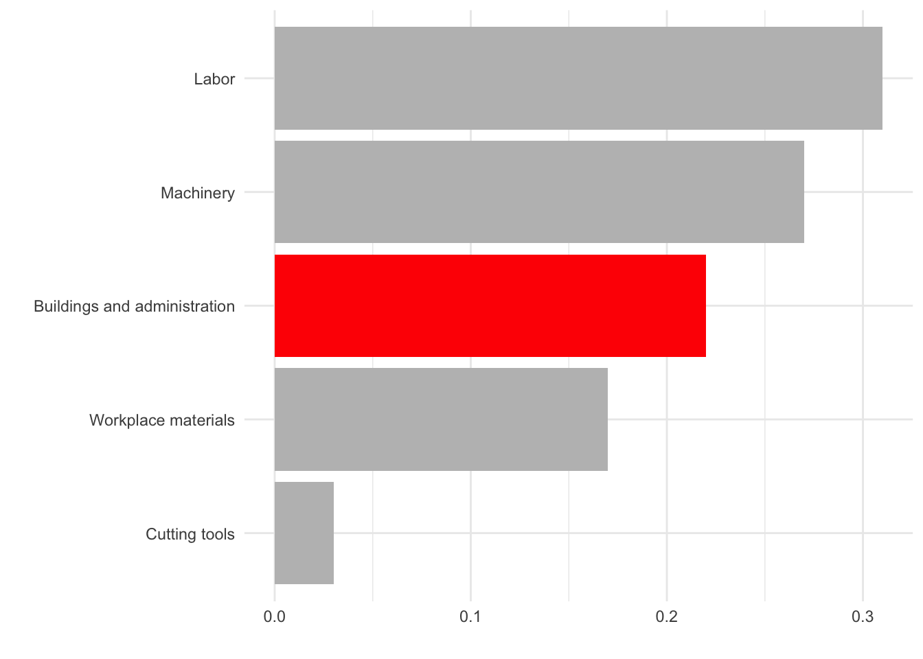
Tell a story
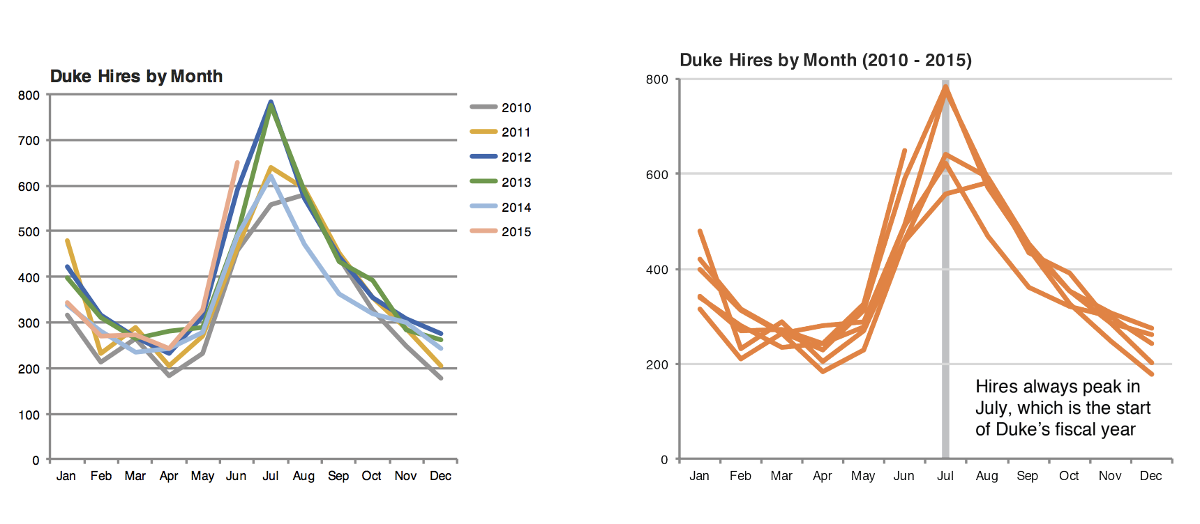
Credit: Angela Zoss and Eric Monson, Duke DVS
Principles for effective visualizations
Principles for effective visualizations
- Order matters
- Put long categories on the y-axis
- Keep scales consistent
- Select meaningful colors
- Use meaningful and nonredundant labels
Data
In September 2019, YouGov survey asked 1,639 GB adults the following question:
In hindsight, do you think Britain was right/wrong to vote to leave EU?
- Right to leave
- Wrong to leave
- Don’t know

Source: YouGov Survey Results, retrieved Oct 7, 2019
Order matters
Alphabetical order is rarely ideal

ggplot(brexit, aes(x = opinion)) +
  geom_bar()
Order by frequency
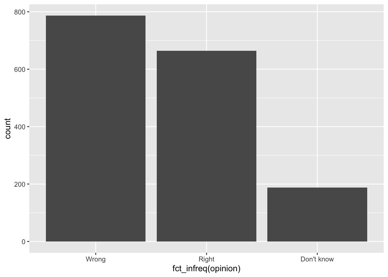
fct_infreq: Reorder factors’ levels by frequency
ggplot(brexit, aes(x = fct_infreq(opinion))) + #<<
  geom_bar()
Clean up labels
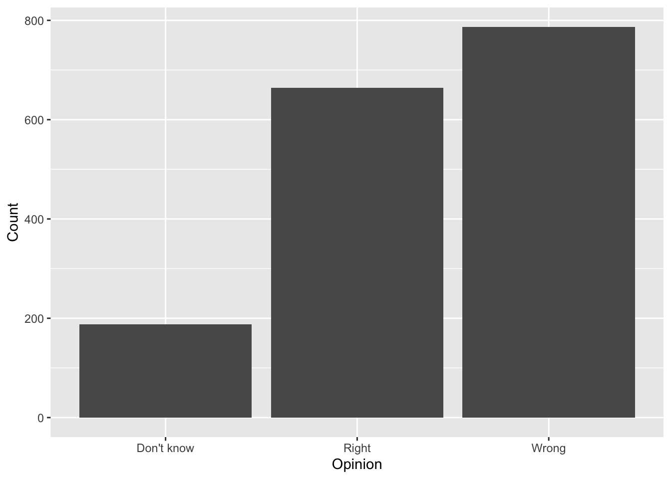
ggplot(brexit, aes(x = opinion)) +
  geom_bar() +
  labs( #<<
    x = "Opinion", #<<
    y = "Count" #<<
  ) #<<
Alphabetical order is rarely ideal
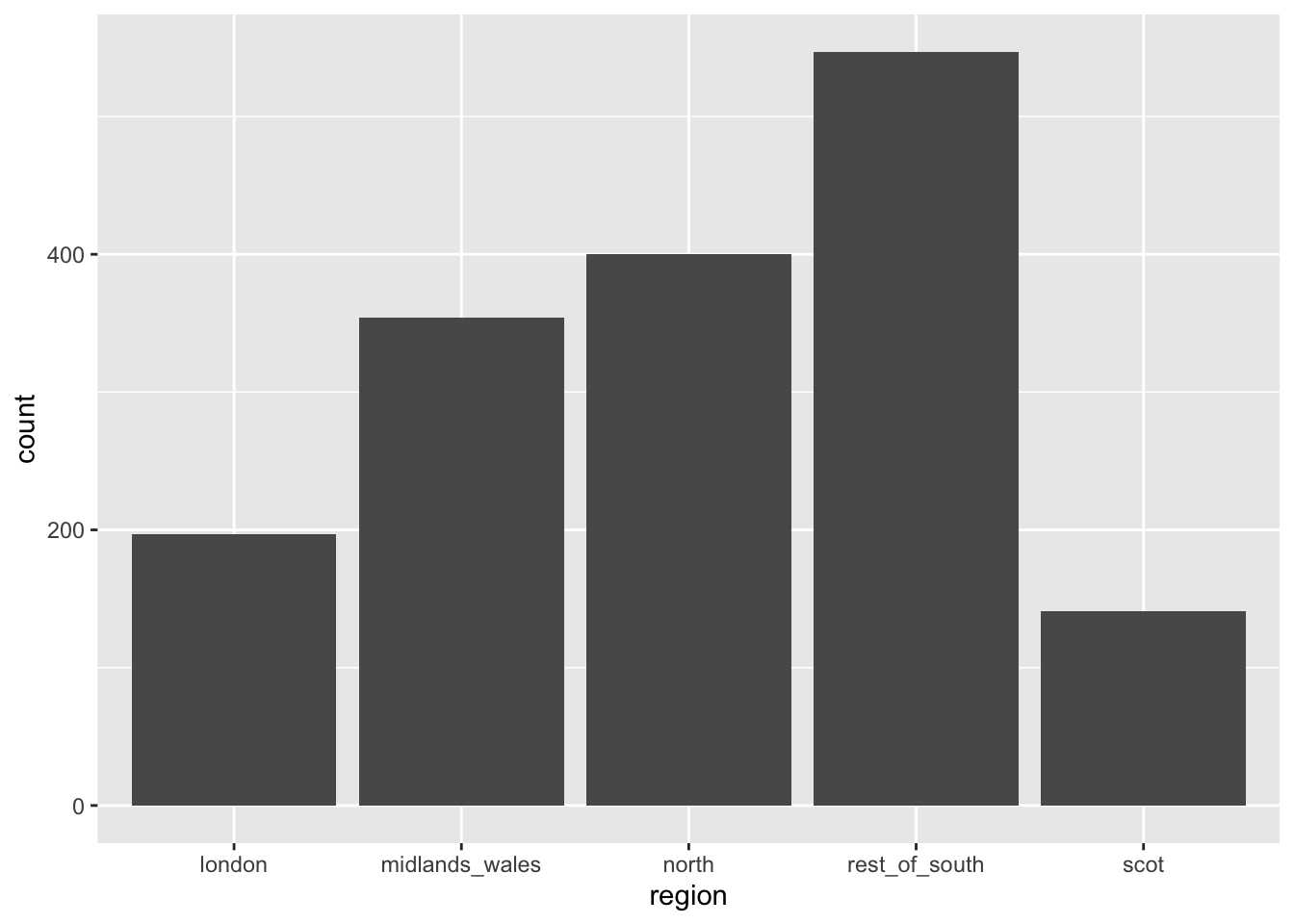
ggplot(brexit, aes(x = region)) +
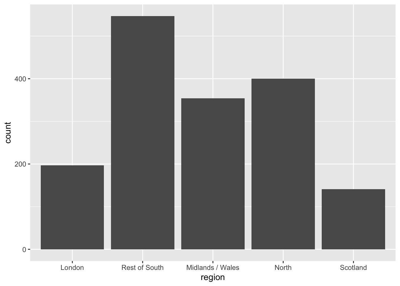
geom_bar()Use inherent level order
fct_relevel: Reorder factor levels using a custom order
brexit <- brexit %>%
  mutate(
    region = fct_relevel( #<<
      region,
      "london", "rest_of_south", "midlands_wales", "north", "scot"
    )
  )
Clean up labels
fct_recode: Change factor levels by hand
brexit <- brexit %>%
  mutate(
    region = fct_recode( #<<
      region,
      London = "london",
      `Rest of South` = "rest_of_south",
      `Midlands / Wales` = "midlands_wales",
      North = "north",
      Scotland = "scot"
    )
  )
Put long categories on the y-axis
Long categories can be hard to read

Move them to the y-axis
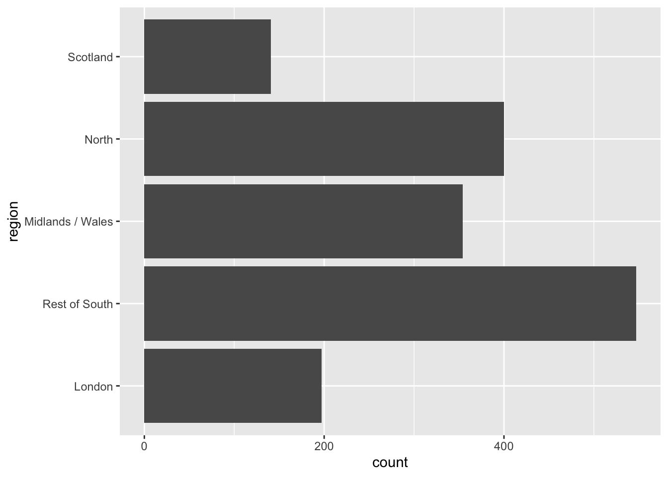
ggplot(brexit, aes(y = region)) + #<<
  geom_bar()
And reverse the order of levels
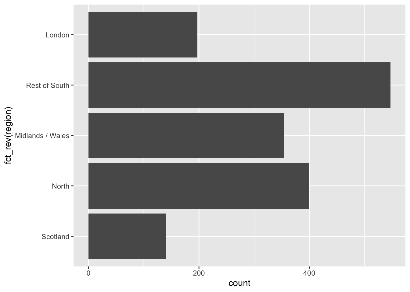
fct_rev: Reverse order of factor levels
ggplot(brexit, aes(y = fct_rev(region))) + #<<
  geom_bar()
Clean up labels

]
ggplot(brexit, aes(y = fct_rev(region))) +
  geom_bar() +
  labs( #<<
    x = "Count", #<<
    y = "Region" #<<
  ) #<<
Pick a purpose
Segmented bar plots can be hard to read
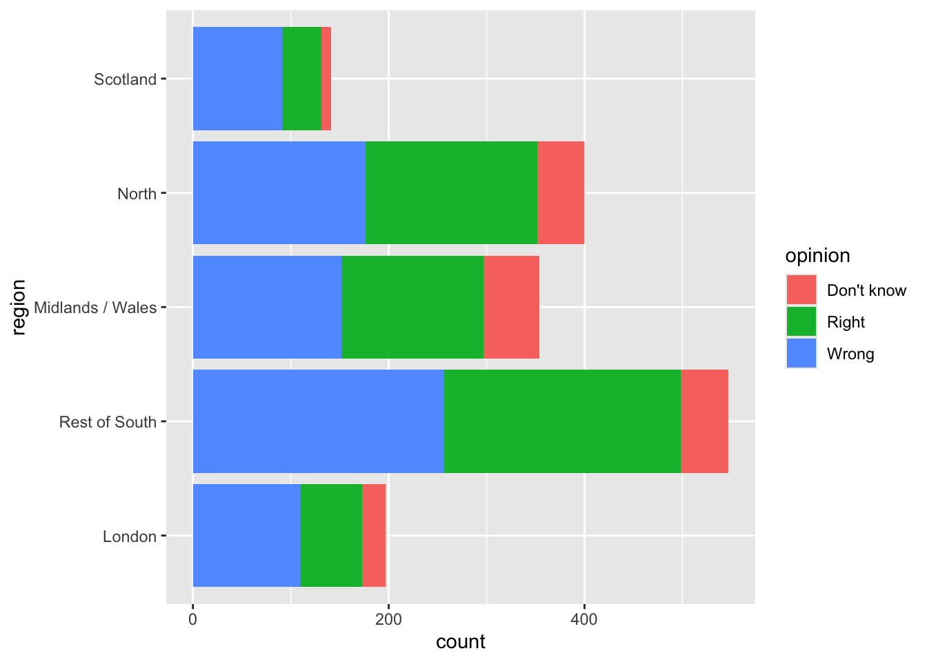
ggplot(brexit, aes(y = region, fill = opinion)) + #<<
  geom_bar()
Use facets
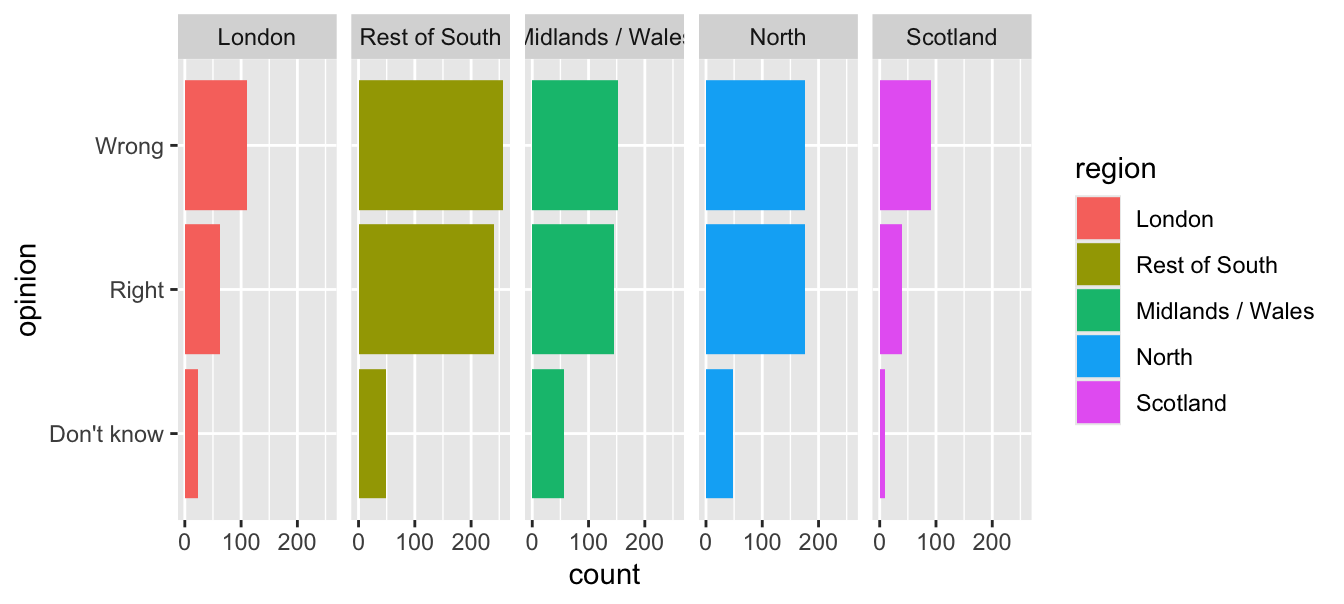
ggplot(brexit, aes(y = opinion, fill = region)) +
  geom_bar() +
  facet_wrap(~region, nrow = 1) #<<
Avoid redundancy?
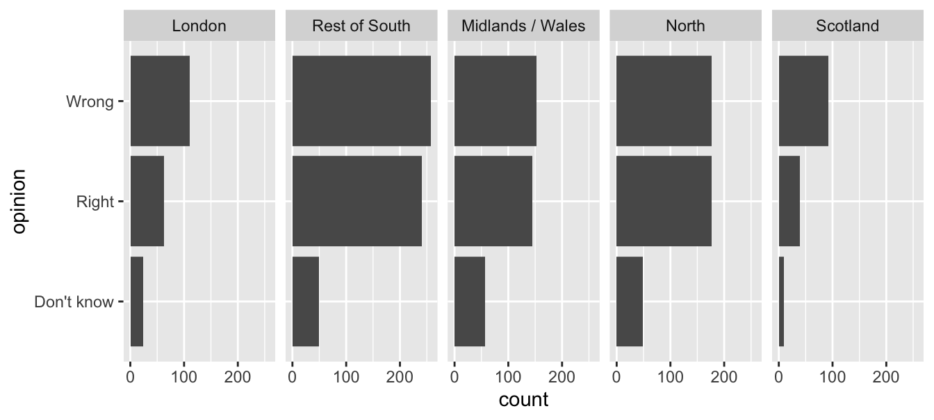
Redundancy can help tell a story
ggplot(brexit, aes(y = opinion, fill = opinion)) +
  geom_bar() +
  facet_wrap(~region, nrow = 1)
Be selective with redundancy
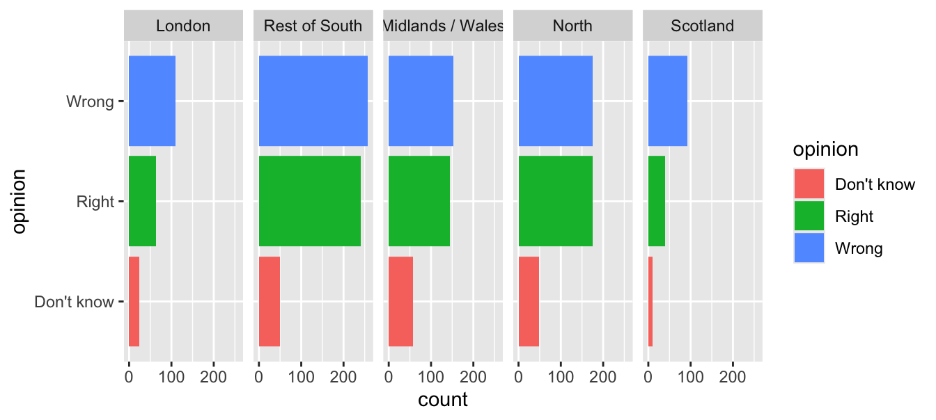
ggplot(brexit, aes(y = opinion, fill = opinion)) +
geom_bar() +
facet_wrap(~region, nrow = 1) +
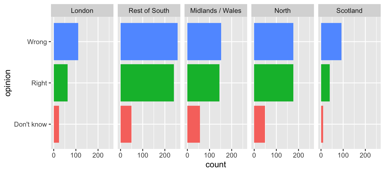
guides(fill = "none") #<<Use informative labels
ggplot(brexit, aes(y = opinion, fill = opinion)) +
geom_bar() +
facet_wrap(~region, nrow = 1) +
guides(fill = "none") +
labs(
title = "Was Britain right/wrong to vote to leave EU?", #<<
x = NULL, y = NULL
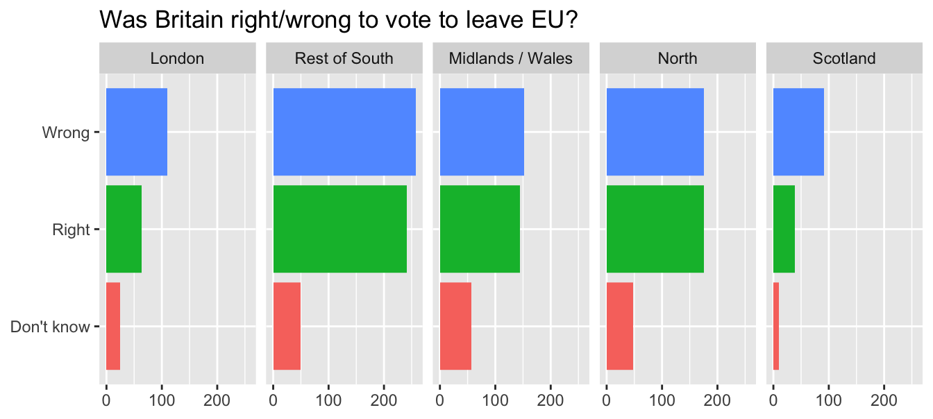
)A bit more info
ggplot(brexit, aes(y = opinion, fill = opinion)) +
geom_bar() +
facet_wrap(~region, nrow = 1) +
guides(fill = "none") +
labs(
title = "Was Britain right/wrong to vote to leave EU?",
subtitle = "YouGov Survey Results, 2-3 September 2019", #<<
caption = "Source: https://d25d2506sfb94s.cloudfront.net/cumulus_uploads/document/x0msmggx08/YouGov%20-%20Brexit%20and%202019%20election.pdf", #<<
x = NULL, y = NULL
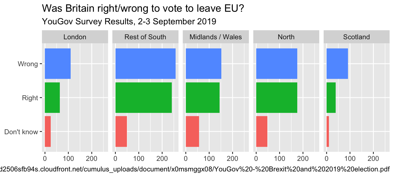
)Let’s do better
ggplot(brexit, aes(y = opinion, fill = opinion)) +
geom_bar() +
facet_wrap(~region, nrow = 1) +
guides(fill = "none") +
labs(
title = "Was Britain right/wrong to vote to leave EU?",
subtitle = "YouGov Survey Results, 2-3 September 2019",
caption = "Source: bit.ly/2lCJZVg", #<<
x = NULL, y = NULL
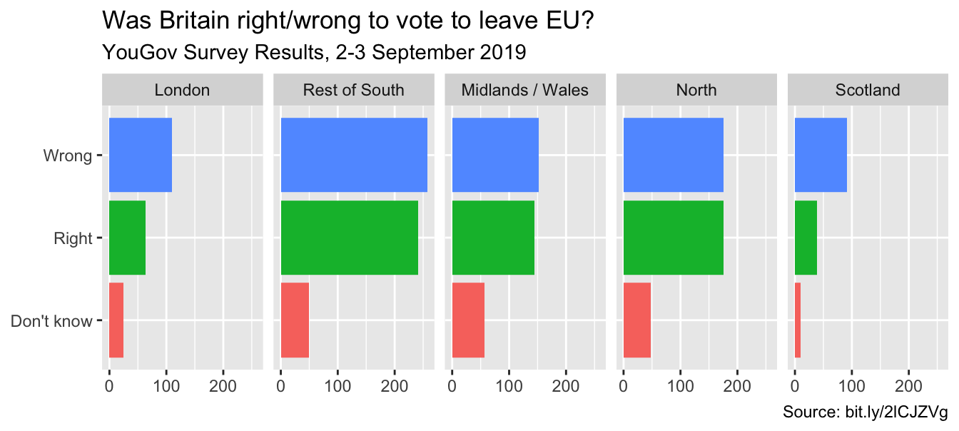
)Fix up facet labels

ggplot(brexit, aes(y = opinion, fill = opinion)) +
geom_bar() +
facet_wrap(~region,
nrow = 1,
labeller = label_wrap_gen(width = 12) #<<
) +
guides(fill = "none") +
labs(
title = "Was Britain right/wrong to vote to leave EU?",
subtitle = "YouGov Survey Results, 2-3 September 2019",
caption = "Source: bit.ly/2lCJZVg",
x = NULL, y = NULL
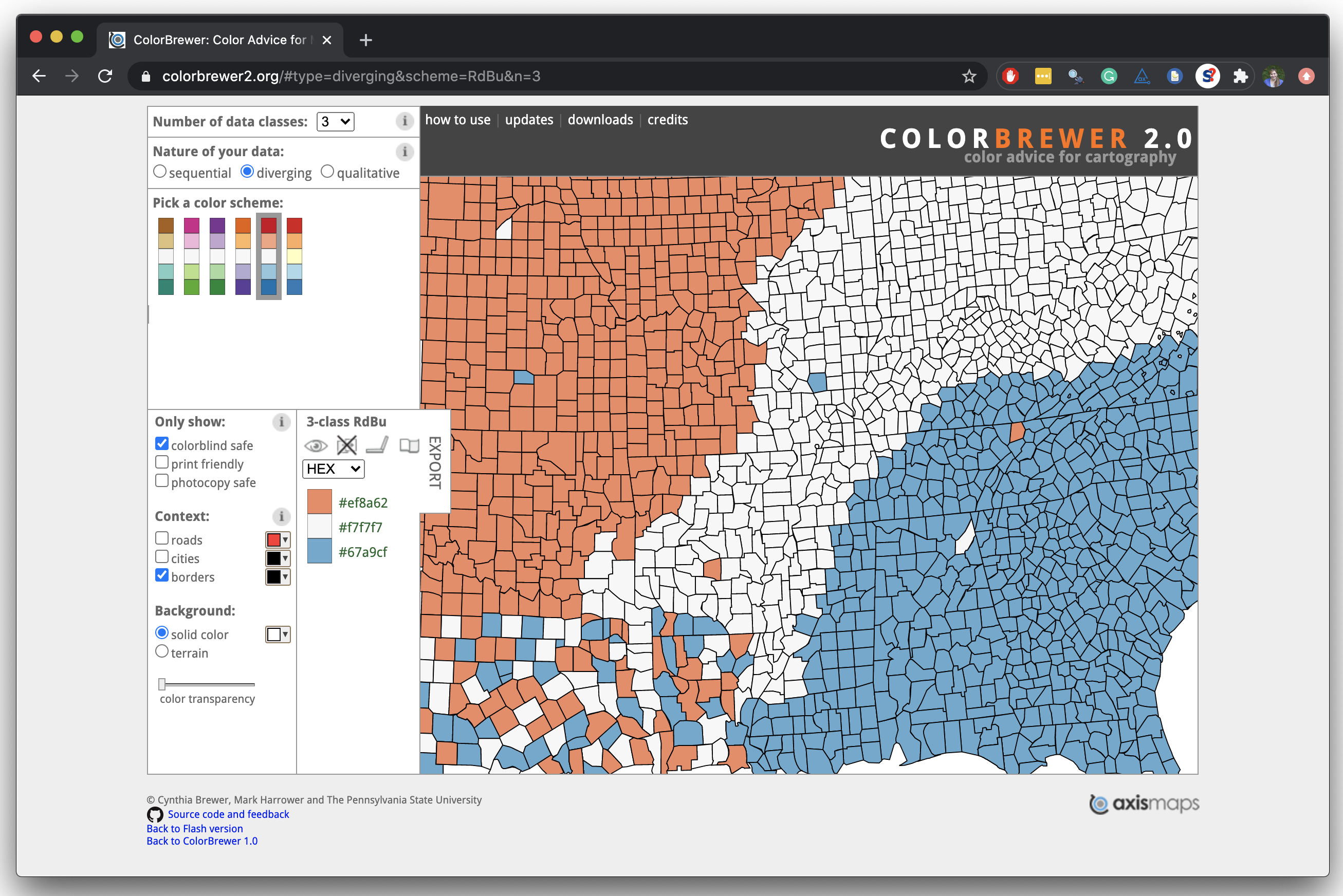
)Select meaningful colors
Rainbow colors not always the right choice
Nicola Rennie’s Blog: Working with colours in R
Manually choose colors when needed
ggplot(brexit, aes(y = opinion, fill = opinion)) +
geom_bar() +
facet_wrap(~region, nrow = 1, labeller = label_wrap_gen(width = 12)) +
guides(fill = "none") +
labs(title = "Was Britain right/wrong to vote to leave EU?",
subtitle = "YouGov Survey Results, 2-3 September 2019",
caption = "Source: bit.ly/2lCJZVg",
x = NULL, y = NULL) +
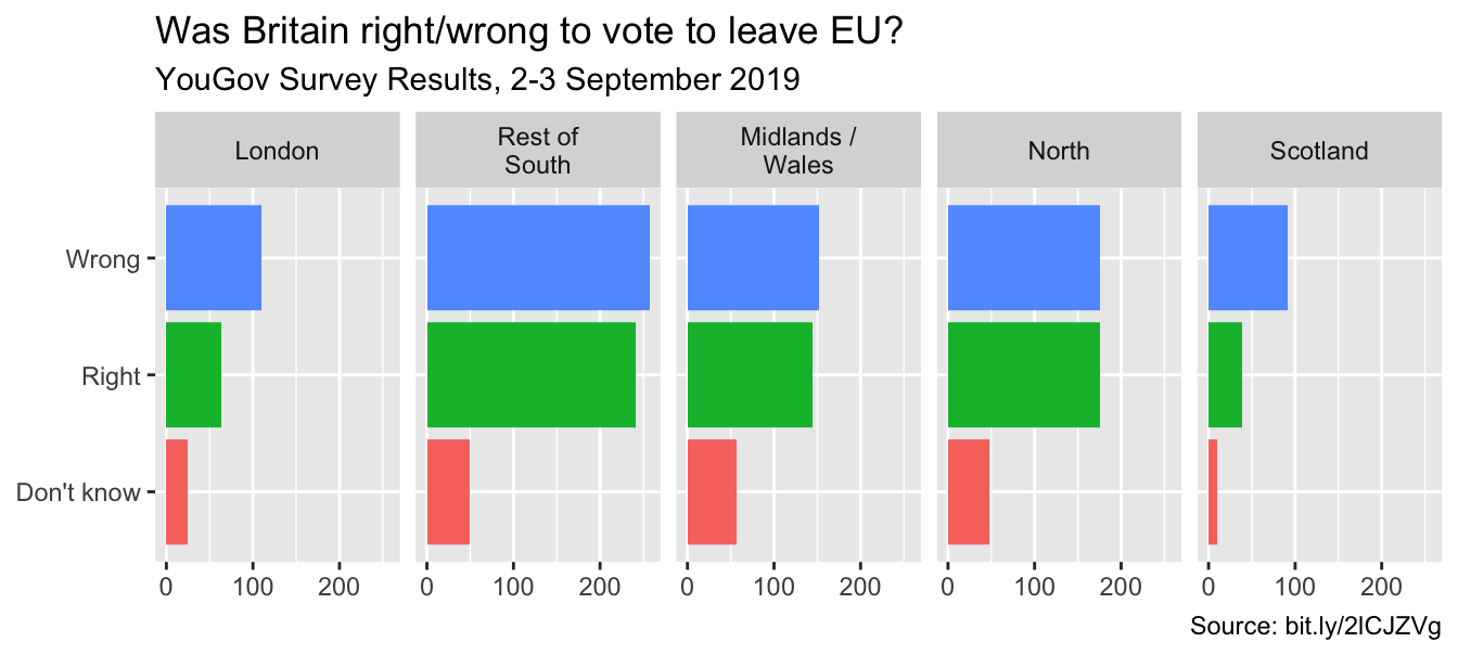
scale_fill_manual(values = c( #<<
"Wrong" = "red", #<<
"Right" = "green", #<<
"Don't know" = "gray" #<<
)) #<<Choosing better colors
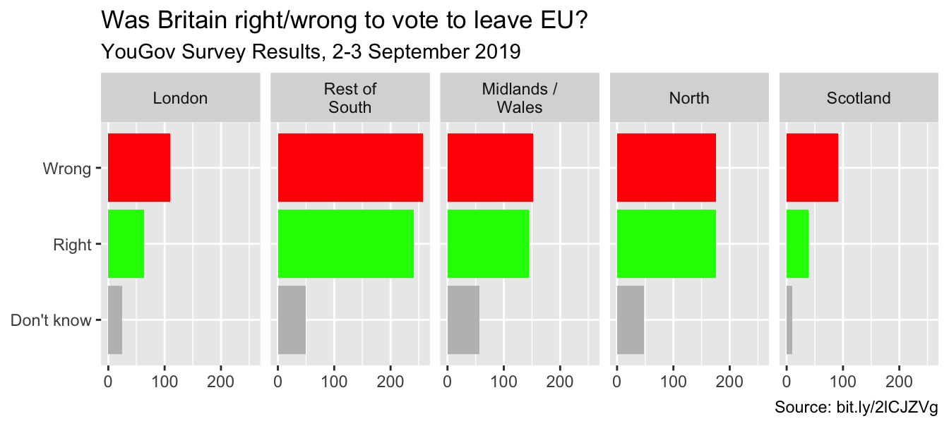
Use better colors
ggplot(brexit, aes(y = opinion, fill = opinion)) +
geom_bar() +
facet_wrap(~region, nrow = 1, labeller = label_wrap_gen(width = 12)) +
guides(fill = "none") +
labs(title = "Was Britain right/wrong to vote to leave EU?",
subtitle = "YouGov Survey Results, 2-3 September 2019",
caption = "Source: bit.ly/2lCJZVg",
x = NULL, y = NULL) +
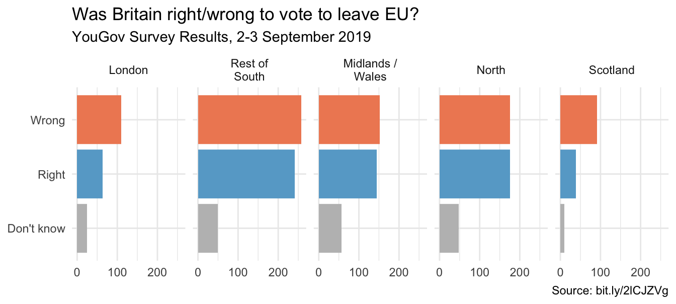
scale_fill_manual(values = c(
"Wrong" = "#ef8a62", #<<
"Right" = "#67a9cf", #<<
"Don't know" = "gray" #<<
))Select theme
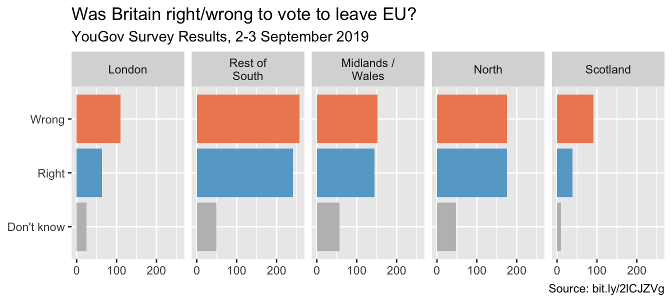
ggplot(brexit, aes(y = opinion, fill = opinion)) +
  geom_bar() +
  facet_wrap(~region, nrow = 1, labeller = label_wrap_gen(width = 12)) +
  guides(fill = "none") +
  labs(title = "Was Britain right/wrong to vote to leave EU?",
       subtitle = "YouGov Survey Results, 2-3 September 2019",
       caption = "Source: bit.ly/2lCJZVg",
       x = NULL, y = NULL) +
  scale_fill_manual(values = c("Wrong" = "#ef8a62",
                               "Right" = "#67a9cf",
                               "Don't know" = "gray")) +
  theme_minimal() #<<